Buttons
This will create a button on your analysis sheet. You can assign a lot of different functionalities to the button and use it as an action button to perform a certain action or to display a message (to offer hints or further information to the users of the analysis).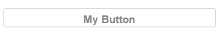
Configuration
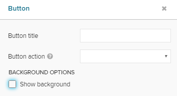
The following configuration options are available:
Button title
Enter your desired button title. It will appear on the button.
 |
After entering a title, the formatting options will appear.
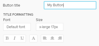 |
Use these options to adopt the font, its size, the text highlighting, its color, and the alignment of the title.
Button action
We do furthermore need to justify the action, that is performed when clicking the button.
Choose your action in the dropdown menu Button action. According to your choice, further options will appear.
The following options are available:
Open Tab
The Open Tab option opens another Analysis Sheet.
You can specify the target sheet in another dropdown menu:
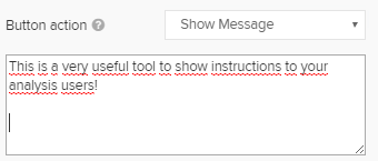
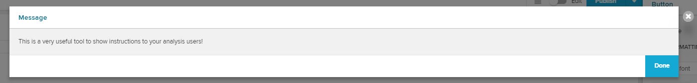
Show Message
Show Message will open a pop-up window with a pre-defined message.
You can set a custom message in the text field:
 |
 |
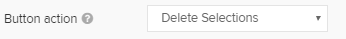
Delete Selections
Delete Selections will remove all Selections from the current analysis document.
If you defined selections in advance, they will be removed for this user's session, too. However, they won't be deleted from the document and will re-appear when reopening the analysis document.
 |
No further configuration is available.
Load Bookmarks
You can load a certain bookmark using a button.
Select Load Bookmark and specify the bookmark:
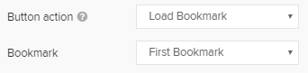 |
The bookmark and its associated selections will be activated.
Open Document
With Open Document you can use the button as a link to another analysis sheet in another analysis document.
Therefore, the ID of the analysis sheet and the ID of the analysis document, that is to be targeted, is required.
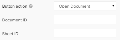 |
Both IDs can be obtained from the URL.
The URLs are built up following this syntax:
https://team.cluster.celonis.cloud/process-mining/analysis/d6526a34-9ebd-499c-9c88-fb08ab00e53f/#/frontend/documents/d6526a34-9ebd-499c-9c88-fb08ab00e53f/view/sheets/32ad3bb2-eccc-4253-9d25-3101a1c91496
This is your Document ID, this is your Sheet ID.
Open External Link
Add a link to another section within Celonis Platform or not an external URL.
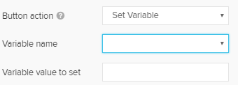
Set Variable
Use your button to set a variable.
 |
Launch Sheet Indexing
Refresh all Analysis Sheets.