Single KPI components
Single KPI components overview
The single KPI components help you display and keep track of an individual metric of your analysis.
Celonis has four single KPI components: Number, Fill, Radial and Gauge.
We will explore their differences by comparing how they display information relative to the same KPI example.
KPI example: Count of cases with a change of price
The selected KPI for demonstration is the number of cases that flow through the 'Change Price' activity.
We will also add coloring thresholds to the Single KPIs components for when this KPI passes 10%, 15%, 20%, and 30% of the total case count.
KPI
Formula: SUM(MATCH_ACTIVITIES(NODE['Change Price'] ))
Count: 55,567 cases (19.9% of total)
Total case count (threshold)
Formula: COUNT_TABLE("EKPO")
Count: 279,020 cases
Number
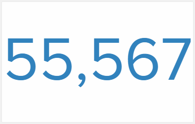 |
The Number is the most simple Single KPI component.
It displays only the value of the KPI and changes color automatically as it raises over the defined threshold values.
Fill
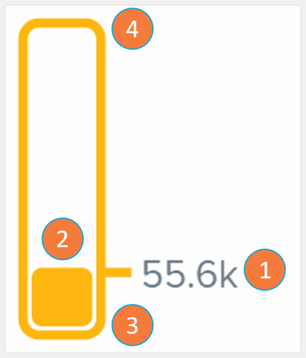 |
The Fill component is a bar whose content linearly fills as the KPI value grows closer to the threshold's upper bound. The Fill bar changes color automatically as it raises over the defined threshold values.
KPI numerical value: the value of the single KPI in analysis.
KPI relative value: graphical representation of how close the KPI is to the defined maximum threshold value.
Lower bound threshold: minimum value the KPI may have.
Upper bound threshold: maximum value the KPI may have (in this example: total case count).
Radial
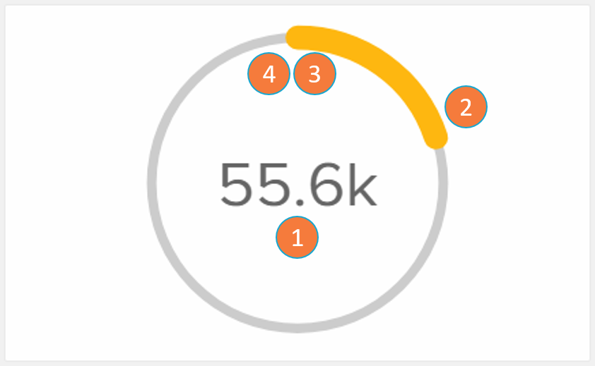 |
The Radial component is a circle whose content fills as the KPI value grows closer to the threshold's upper bound. The Radial filled arc changes color automatically as it raises over the defined threshold values.
KPI numerical value: the value of the single KPI in analysis.
KPI relative value: graphical representation of how close the KPI is to the defined maximum threshold value.
Lower bound threshold (beginning or circle): minimum value the KPI may have.
Upper bound threshold (end of the circle): maximum value the KPI may have (in this example: total case count).
Gauge
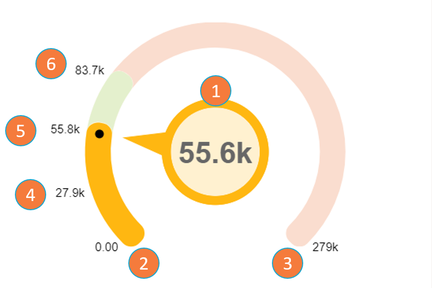 |
The Gauge component gives a visual display of how close a KPI is to a given threshold dimension.
KPI value: the value of the single KPI in analysis.
Lower bound threshold: minimum value the KPI may have.
Upper bound threshold: maximum value the KPI may have (in this example: total case count).
10% threshold: since the KPI value is between the 10% and 20% thresholds, the color of the Gauge component becomes one assigned to the 10% threshold.
20% threshold.
30% threshold.
Note
The main differentiation point of Gauge relative to the other KPIs is that it is the only one that exhibits on screen the thresholds set by the user (items 2 to 6). The thresholds are shown both by their numerical value and by the difference in the color swatch in the Gauge arc. Each threshold is also positioned on the arc according to its relative value to the upper bound threshold.