Creating charts
Charts allow you to visualize and analyze your process data based on comparisons between categories, over a time period, and by frequency distribution. Charts can be added to your Views and configured to suit your data and use cases.
For an overview of available Studio chart types and recommendations on chart colors, see Available chart types.
And for chart coloring options, see Color themes
To add a chart to your View:
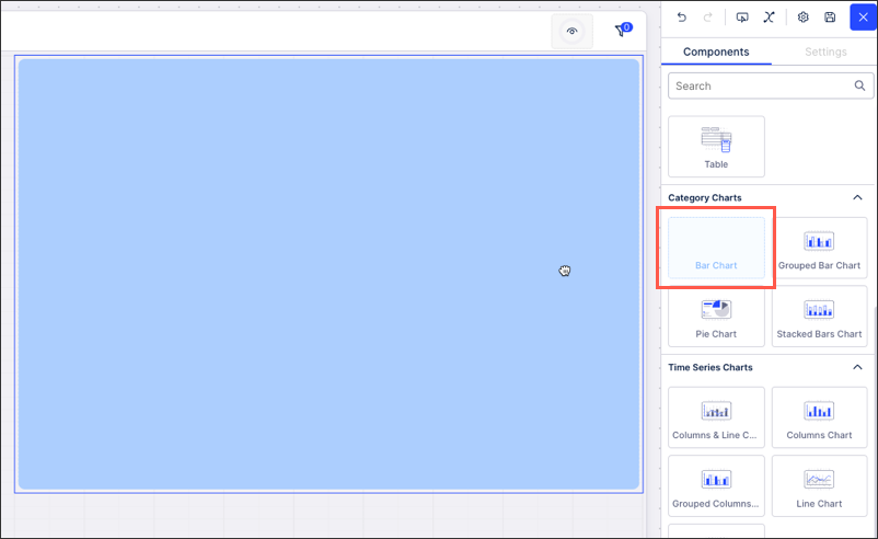
Drag and drop your chosen chart type from the components menu to your View layout.
Using the component settings menu - select the data and metrics you want to display in your chart.
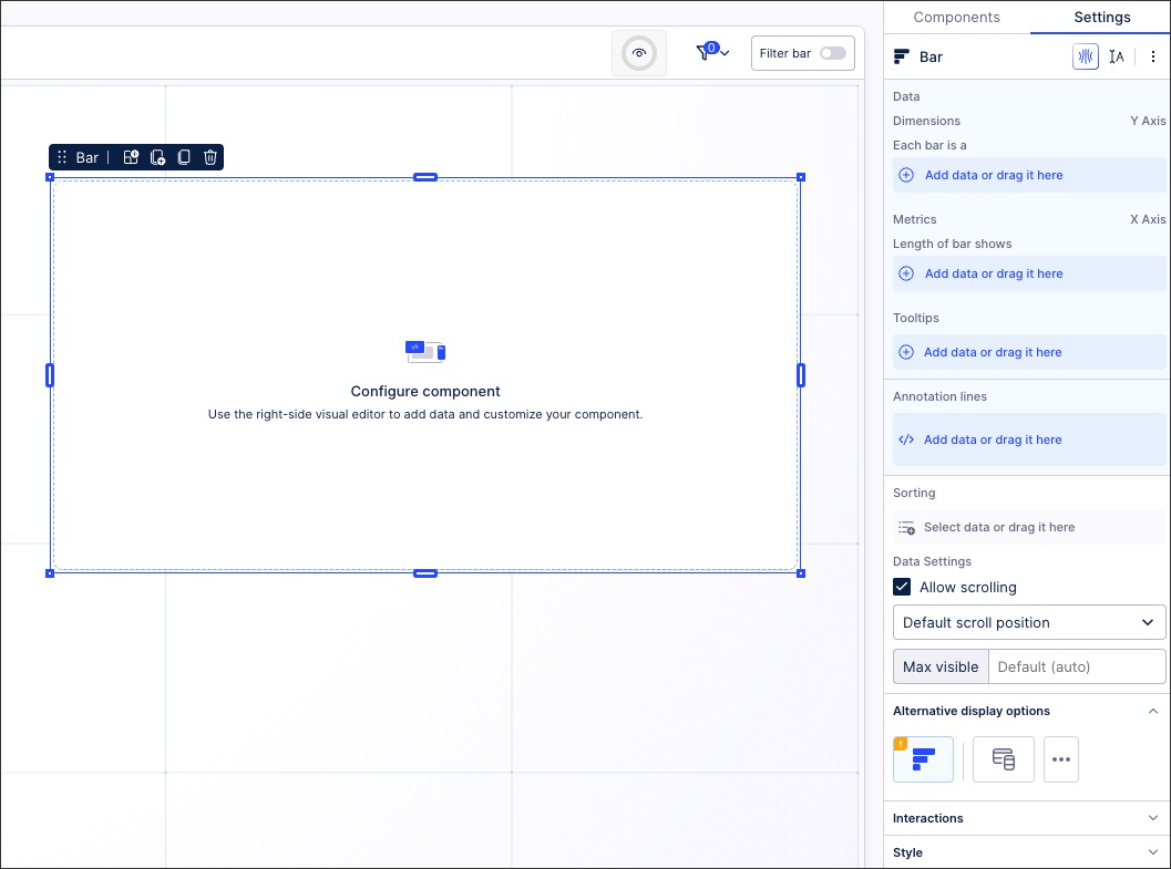
Once data has been added, your chart preview will update in the View.
Optional: Add and configure other chart options, including tooltips, sorting, colors, and chart interactions.
Depending on your chart type, you have the following settings available:
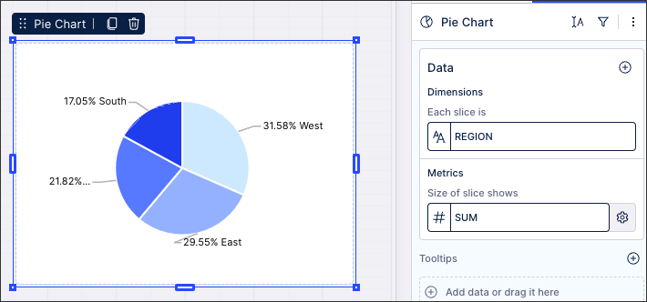
This is where you control what data fields you want your chart to be based on. The dimensions controls what the bar, column, or pie slice is based on, whereas the metrics control how long or large they are in your chart.
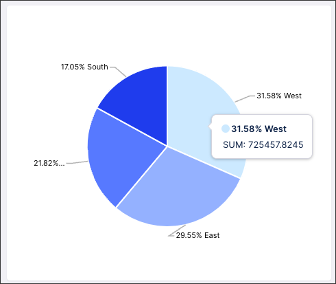
In this example of a pie chart - the dimensions are based on region and the size of the slice is the sum or total percentage for each region:
 |
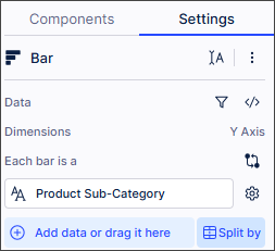
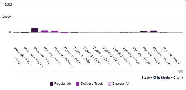
In bar and column charts, you can also stack or group data across dimensions using the Split by option in Settings:
 |
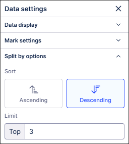
In the Split by options section of Data settings, you can set how the data is ordered and use the Limit field to define how many categories of stacks or groups are displayed, up to a maximum of 20.
 |
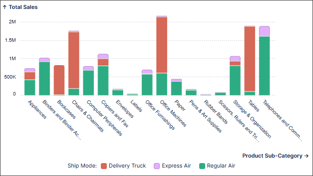
In this example, total sales for each product sub-category has been split by Ship Mode, with the different shipping modes displayed for each product sub-category. Hovering over each stack displays the number of items shipped for each ship mode, as well as the average sales for each ship mode.
 |
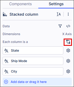
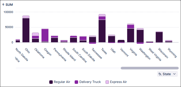
You can enable dimension switching for bar, column, line and area chart types. Once enabled, users can change the dimensions displayed on the chart axes using a dropdown.
Note
When dimension switching is enabled, sorting by dimensions is automatically disabled. Color mappings configured for specific chart dimensions may not be valid when dimensions are switched.
Open a View containing a supported chart type in edit mode.
In Settings, enable dimension switching.
Tip
Use the column Settings button
 to change how the column displays in your chart.
In the Chart component, select the dropdown on the relevant axis.
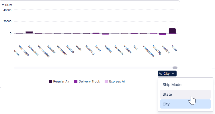
Select the dimension you want to use for your axis.
The chart component updates to display the data for the selected dimension.
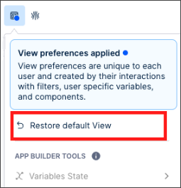
Select View preferences >Restore default View to restore the chart's orginal dimensions.
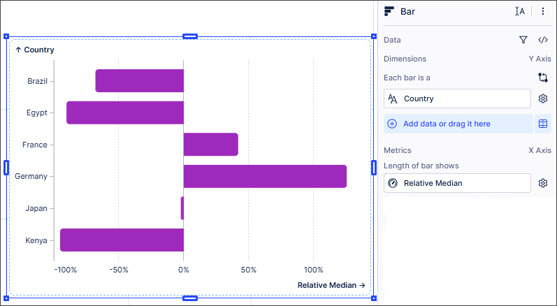
You can display values in your chart as:
A percentage of the overall value (Relative Sum).
The difference between each value and the overall value (Relative Average and Relative Median).
This applies to all chart types listed as Category charts in Components but does not apply to KPIs.
Add a supported chart type to a View.
Drag a metric from the Knowledge sidebar to Settings >Metrics.
The Aggregations popup appears.
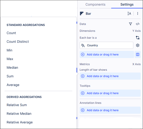
Select the aggregation type required from Derived Aggregations.
The chart displays the data as a percentage of the overall aggregation type.
These options control how much extra information you want your chart to display.
Tooltips: Use tooltips to add hover over information to your chart. For example, the sum information displayed for each slice of this pie chart:
 |
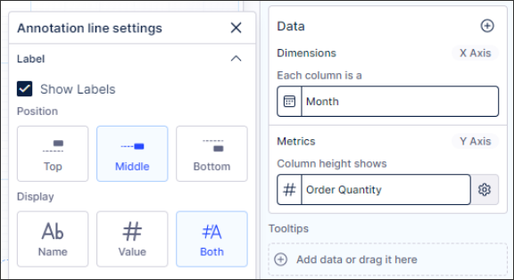
Annotation lines: Annotation lines are used to draw lines on the chart area. This can be useful for highlighting information such as a threshold. You can also choose to display your lines by name, value, or using both.
Note
If you add an annotation line to a chart that uses a discrete scale and the annotation line value doesn’t match the domain of the axis, the annotation line will not display in your chart. Annotation lines will always display in charts with continuous scales.
Top categories: For pie charts only, a maximum number of four categories can be shown. Other categories will be grouped as “others”.
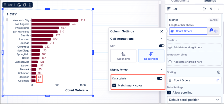
You can add data labels to your chart metrics, allowing users to read the exact value per metric.
In this example, the data labels show the exact number of orders per city (Jackson has 82, Colombus has 81). The mark color is also matched to the metric color.
 |
You can change the positioning and appearance of data labels using the Data Labels panel which is accessed from Metrics Settings.
From the Data Labels panel, you can:
Toggle data labels on and off.
Move the position of data labels, including rotating them.
Change the color of data labels and the color contrast.
Change the size of the text in data labels.
Change the offset of data labels (in pixels) to prevent overlap.
Charttype | Positioning options | Default |
|---|---|---|
Bar |
| Outside End (with no rotation) |
Column |
| Outside End (with no rotation) |
Stacked bar and column |
| Inside Center (stacks) Outside Top (totals) |
Line |
| Above (with no rotation) |
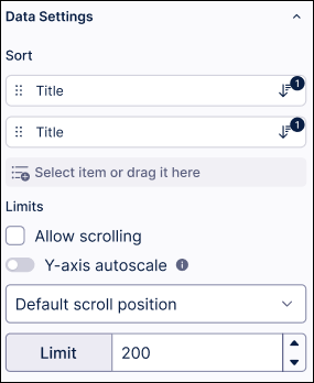
Choose how the columns in your table are sorted by selecting the data fields then choosing the order of sorting. The selected fields will be shown in a separate sorting section, allowing you to change the order in which multiple fields are sorted.
Allow scrolling: You can also allow scrolling through the chart limit the number of chart entries displayed. When allowing scrolling, you can select where the scrolling start position is by selecting between default, scroll from top, and scroll from bottom.
Y-axis autoscale: Enable autoscaling to adjust the Y-axis dynamically based on the visible data range, which can help when working with large spikes. When disabled, the Y-axis remains fixed to provide a consistent view of the entire dataset, ensuring smooth scrolling and easier data comparison.
Limit: Sets the maximum number of data points that are displayed in a chart where a data point can be, for example, a bar, column or time period. Once the maximum number of data points is reached, the subsequent data points will not be displayed. Limiting the number of data points may be useful when working with large data sets.
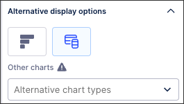
Based on the data you've selected, you may be prompted here to try visualizing this data using an alternative component.
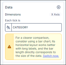 |
If you select an alternative component, you may then need to make additional configurations.
 |
These settings allow you to configure what type of interactions a user can have with your chart. By default, your chart can be filtered by users and used to set filters.
Exclude from pre-defined filters: When enabled, this removes the component from any filters that are set on a View and tab level.
Exclude from user filtering: When enabled, this prevents the app user from apply a temporary filter to the data within the component.
Can't be used to set filters: When enabled, this prevents the app user from using the component to set temporary filters for the whole View.
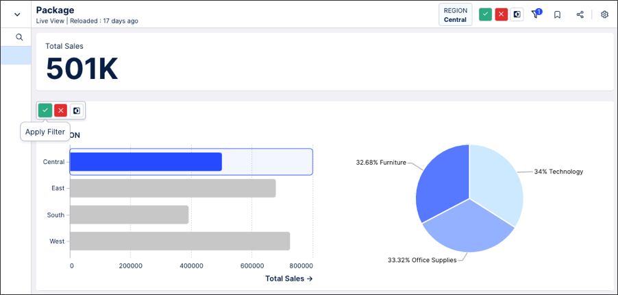
In this example, the user has clicked on the central region and the app has prompted them to apply this filter to the whole View. This can be disabled by selecting 'Can't be used to set filters' in the chart interaction settings.
 |
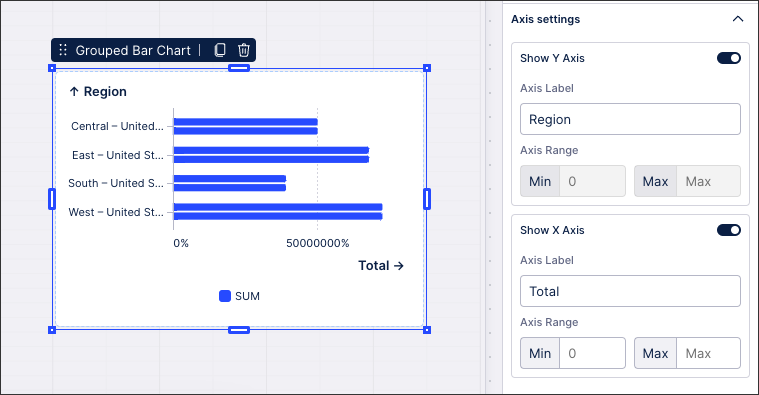
Here you can configure your Y and X chart axis, allowing you to enabled / disable labels, edit the label, and select an axis range (from minimum to maximum).
 |
When configuring labels, you can choose their position and their type:
 |
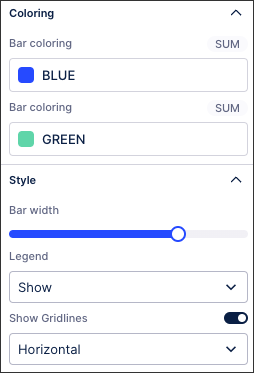
Choose how your bars or slices are colored, sized, and whether to display chart legends and gridlines.
For more information about chart coloring, see: Coloring charts.
 |