Studio App Building Guidelines - Management view
Management views or executive dashboards take siloed data and combine them into a single view, allowing executives and managers to identify issues and track progress towards company goals. When creating a management view, you should consider who the main user will be and whether it should be a broad overview or one more focused on that user's area of responsibility. For example, the difference between the needs of a CFO and the needs of a VP of a Supply Chain.
When creating a management view, consider the following:
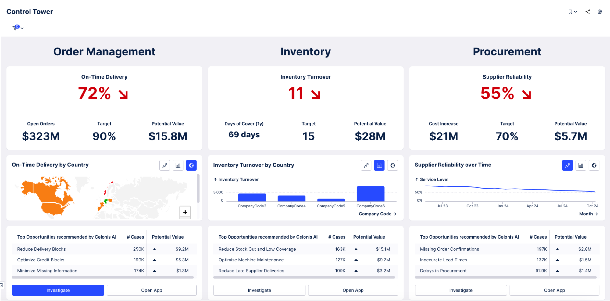
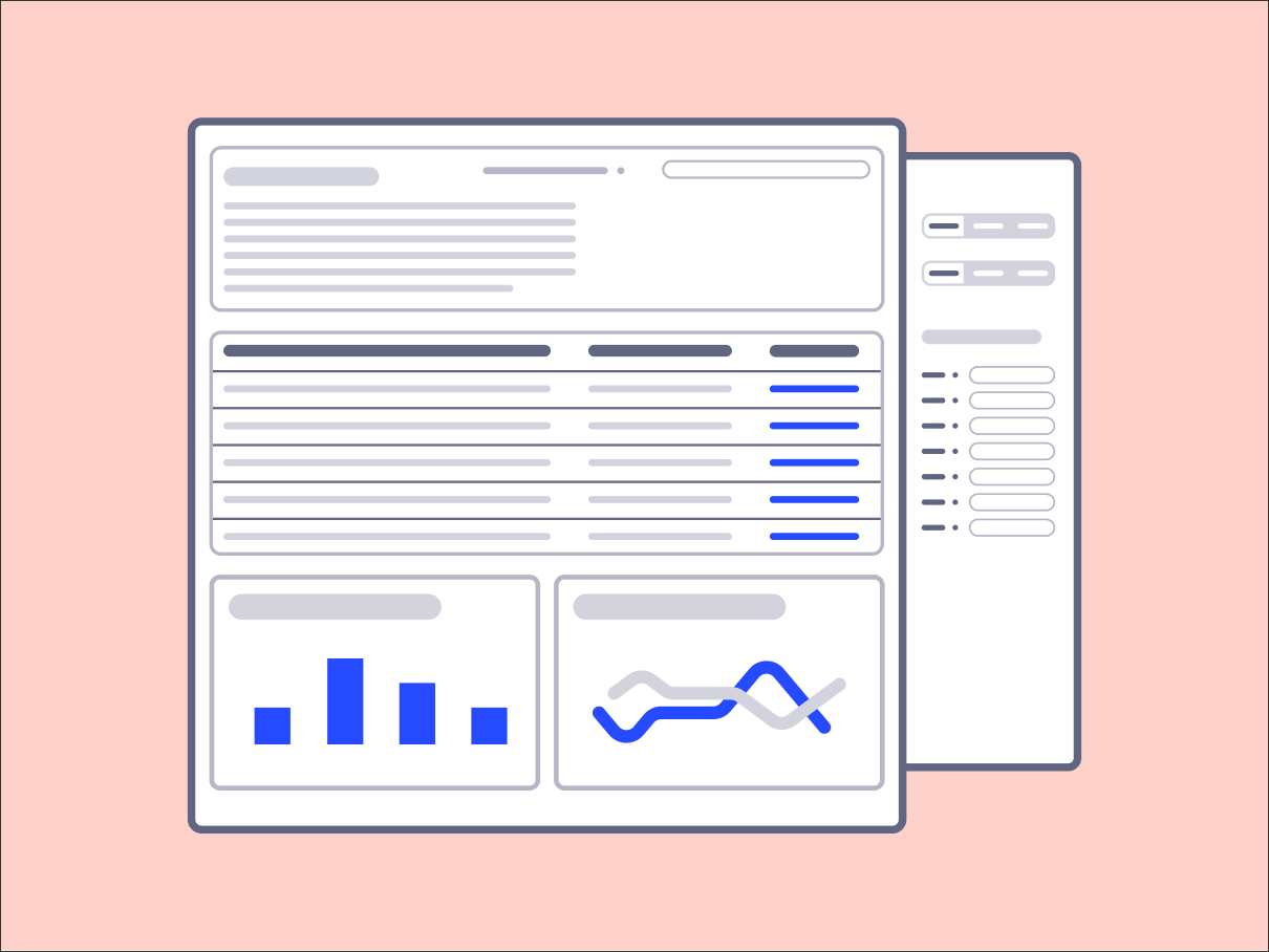
As an example of a management view, this Control Tower view offers an overview of Order Management, Inventory, and Procurement metrics. A manager might use this view to identify and investigate the declining trend in supplier reliability:
 |
Management views layout, areas, and content
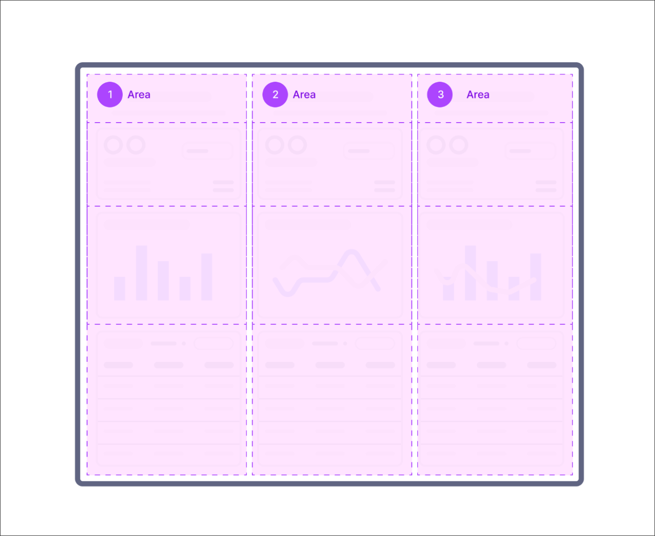
We recommend defining layout sections based on business objectives. A business objective could be around improving efficiency, increasing revenue, or reducing costs. Use a new section for every business objective and group them visually (e.g. by spacing within and between sections or a shared background via containers).
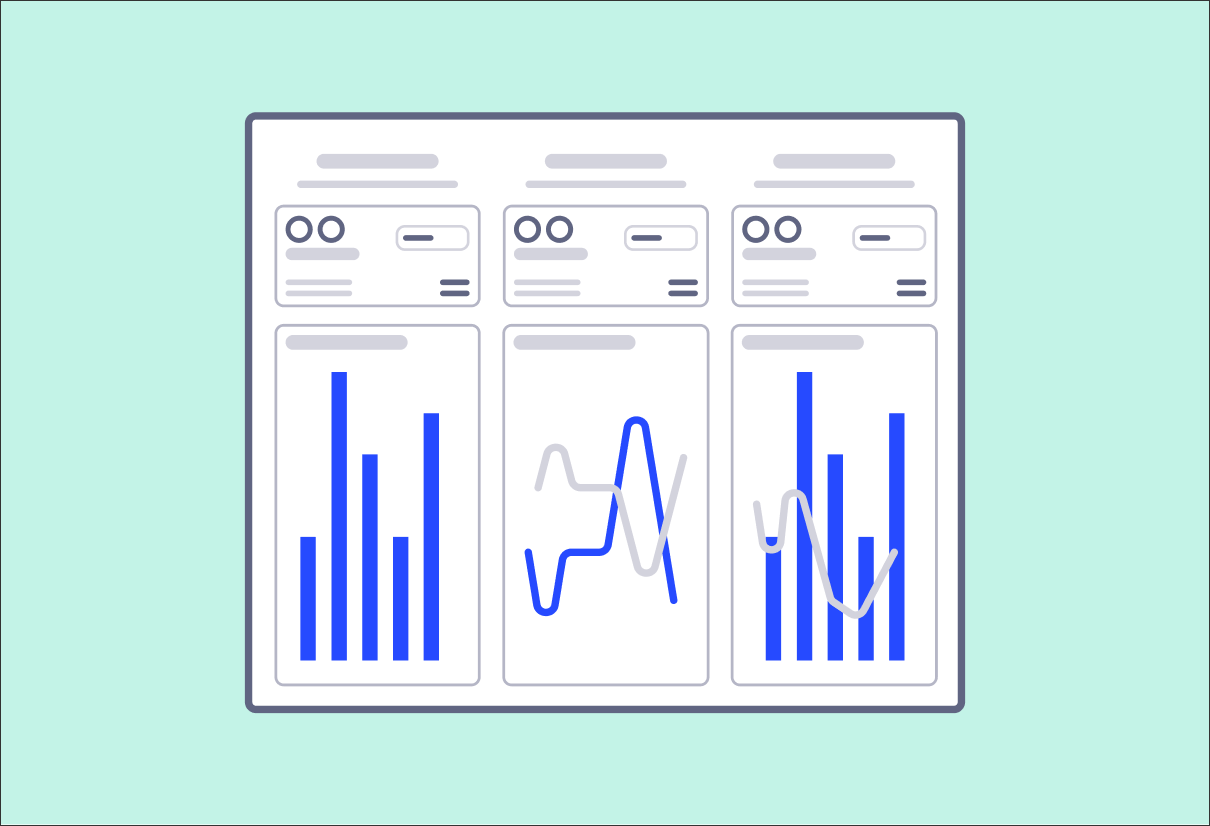
For every business objective, the same patterns are used to visualize the data (areas 1, 2, 3 should have the same structure and components)
 |
These areas can then be created using a combination of Studio components:
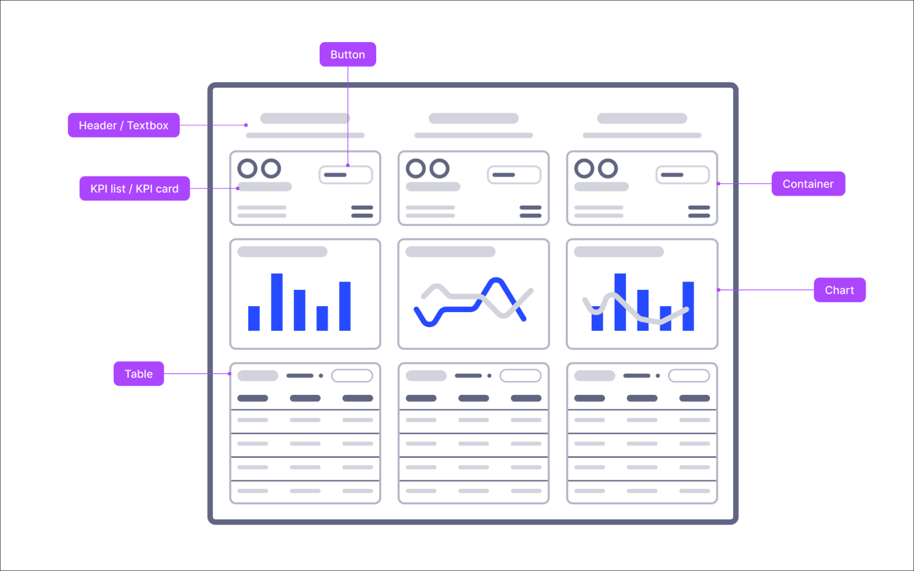 |
Text box to state business objective
State clearly the business objective this section represents. You can display the title using a text box component. For the font size, use an appropriate heading style (Heading 1 or 2). If you need to add supporting information (e.g. a definition, description or information about the time frame), use normal font respectively.
KPI card or KPI list to show core metric
Use either a KPI card or KPI list component to show the most important metric per business objective. Due to their importance, they should be on top of the View (users read from top to bottom) and take appropriate screen space. Don’t confuse your users with too many supporting or scope KPIs (max of 3). In case you have targets defined, it is a good practice to add them to the KPI definition. An out-of-the-box color-coding will help see at first glance if the KPIs are meeting their targets. You could also add custom coloring to your KPIs, depending on conditions.
Time series chart to show trends over time
Showing progress over time with a time series chart gives a quick and fast answer to the question “is my business objective going better or worse?”. Ensure that the main KPI is visually more prominent (e.g. bars tend to be more prominent than lines, bold colors tend to be more prominent than bleak ones).
Table to compare between core entities
Additionally, you could add a table that allows for a first analysis of business objective performance broken down by attributes such as company code, region, customer, or similar object-relevant attributes. This table should not include raw cases but rather an aggregation that allows executives and managers to decide where their attention is needed. Think: How do my different organizations perform relative to each other?
Management views best practice
When creating your management views, we recommend:
Tailoring your view to the needs of your target user. In theory, the circle of users for a management view is small, so you can ensure that it is targeted to their specific needs (e.g. through predefined filters). In case different managers need different filters applied, you could also create tailored bookmarks for them.
The more business objectives you need to show, the less detail we recommend using per business objective. Instead, use buttons to link to more details if needed. Always group business objectives visually (e.g. by using containers) and ensure every business objective has the same components and formatting.
 |
And when creating your management views, we discourage:
Providing too many data points scattered across visualizations. Your target audience probably does not have the time to look across multiple charts to find an insight.
Overwhelming users with too many filter options. While the filter bar is a handy feature of more analytical Views which allows end users to drill down deep into their data, we cannot assume that high-level leadership roles use it. Instead, tailor the View to their specific needs and work with predefined filters.
Scattering information across tabs or Views. This Management View should work standalone and provide the core information without the need to click between tabs, open overlays or scroll.
 |