Studio App Building Guidelines - Initial App Setup and data validation guidelines
Initial App setup and data validation Views are used to set App-specific parameters and to validate definitions that will be used in the App. After configuring parameters and definitions, the users can see a version of the App tailored to their specific use case.
When creating your initial app setup and data validation content, we recommend building two separate views:
Settings: By offering a Settings View, you allow your users to configure the app-specific parameters and business metrics they want to see for their specific use cases. By limiting this View to your process or data analysts, you can allow them to change settings that will affect all users when they're using the App. Alternatively, you can open this up to all users - allowing them to configure the settings for their use only.
See: Settings View layout and content.
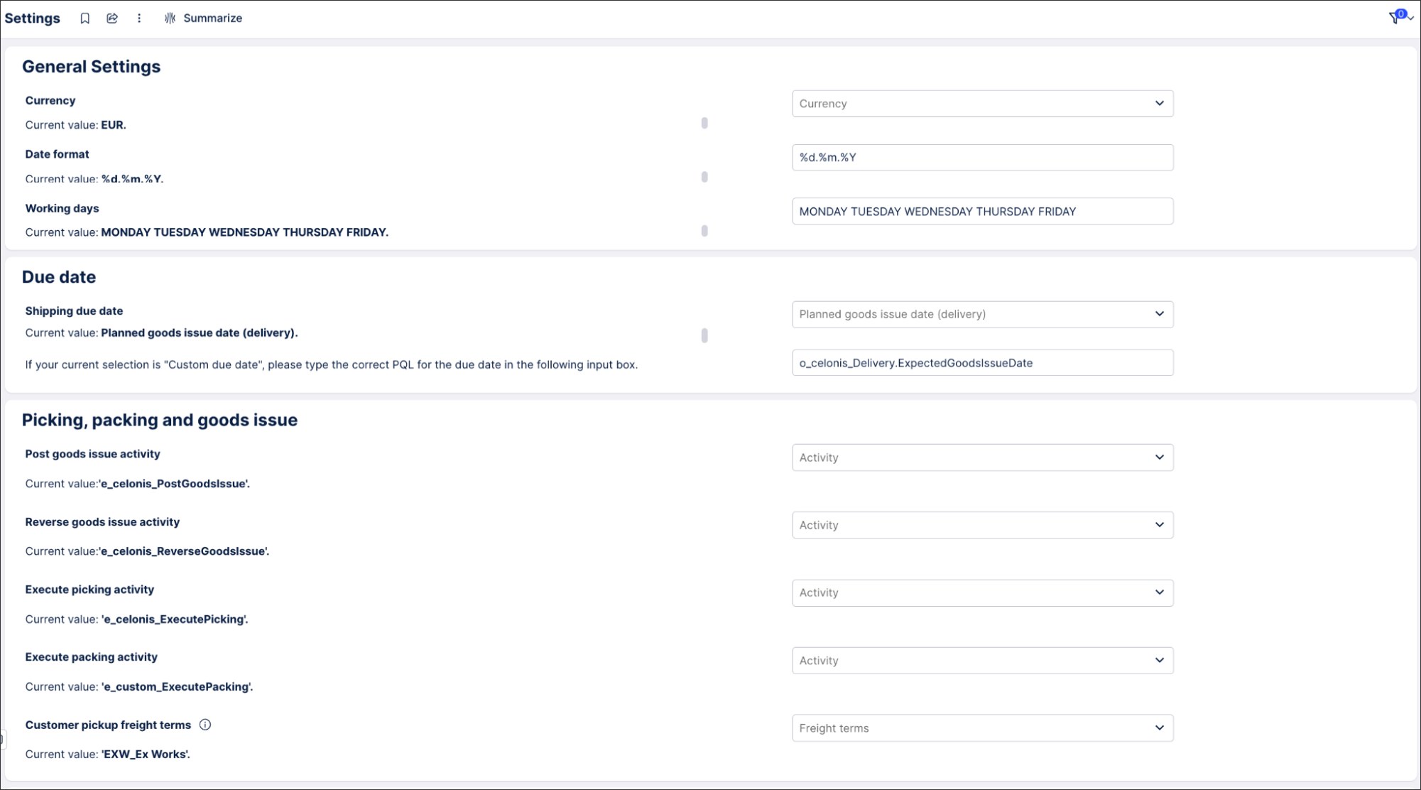
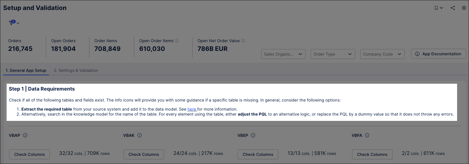
The following is an example of a General App Setup View, allowing users to check the columns are matched to columns in the Data Model:
Validating Data: By offering a validating data View, you help your users understand the data they're using and learn how to get the best of of your App. For this View type, your main person would be a Center of Excellence analyst, who'd validate the data with the help of a business expert.
See: Data validation View layout and content.
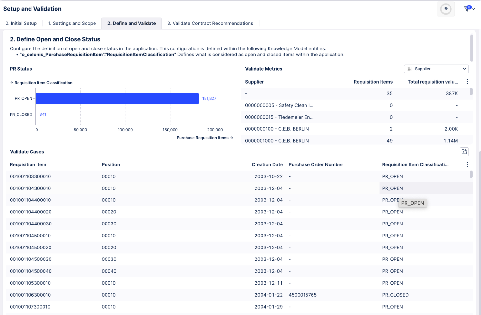
The following is an example of a Validating Data View:
Your Settings View should be customized based on the specific requirements and user needs. In general, we recommend breaking your content down into two main sections:
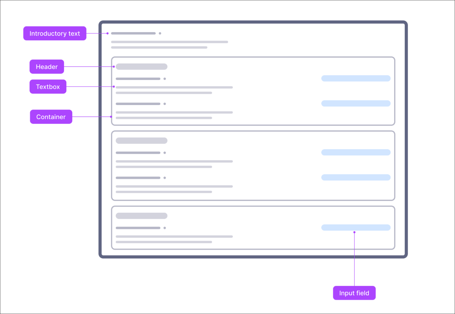 |
Introductory text
Using a text box, you can add usage instructions and links to useful resources (such as documentation and use case content) to give users a starting point for your app.
For example:
 |
Settings area
In the Settings area, you can include the parameters business users are able to customize. In this section you'll typically find the following content types:
SLAs (e.g. processing time, delivery time)
Activities definition (e.g. block activity, transmission activity, object creation activity)
Currency
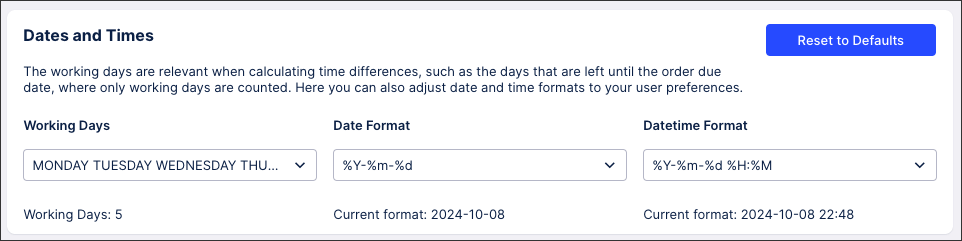
Working Days definition
Dates (e.g. start of value tracking date)
Date-Time Formatting
For example - this section allows users to set the working days, date format, and time formats used in the app:
 |
For each parameter that can be customized, we recommend building a singular section with two main parts:
Guiding text (using a text box component): This text should explain what parameter they are setting up and what this setting influences in the View. So for example, if you’re configuring an SAL section, include which field the SLA is for (e.g. invoice processing time, order delivery time..) and the selection made in the text.
The parameter to input (using the input component): The input component should allow you to easily set up the parameter. For that, feel free to choose the most fitting to your requirements. For instance, if you have a benchmark/threshold, we recommend the input box, whereas if it is a value you can pick from a specific selection - such as an event name, an object type, currency - please use the input dropdown component.
For more information about input components, see: Input dropdown.
In case multiple parameters are required to build the same setting, we recommend grouping multiple input components in the same section, and have a general guiding text on the different inputs required. To do this, we recommend the containers component.
When creating a Settings, we recommend including a maximum of five inputs for users to configure. For more than five, we suggest creating further tabs or using containers to group settings together.
Tip
Optionally, we recommend adding supporting charts or tables in this area to guide the user setting the correct input. For instance, include a table with all available activities to help a user to select a specific activity for a parameter.
Your data validation View should also be customized based on the specific requirements and user needs. In general, we recommend including at least two components:
 |
Initial description (text box component)
The initial description should tell the user what they are validating and explaining the use case definition. If specific KPIs or definitions are required, reference them in the description and guide the users in potential customizations. For instance, if you are describing a definition that has its PQL saved as KPI in the knowledge model, reference the exact KPI ID and the Knowledge Model Name, so the analytical user is guided to the right definition.
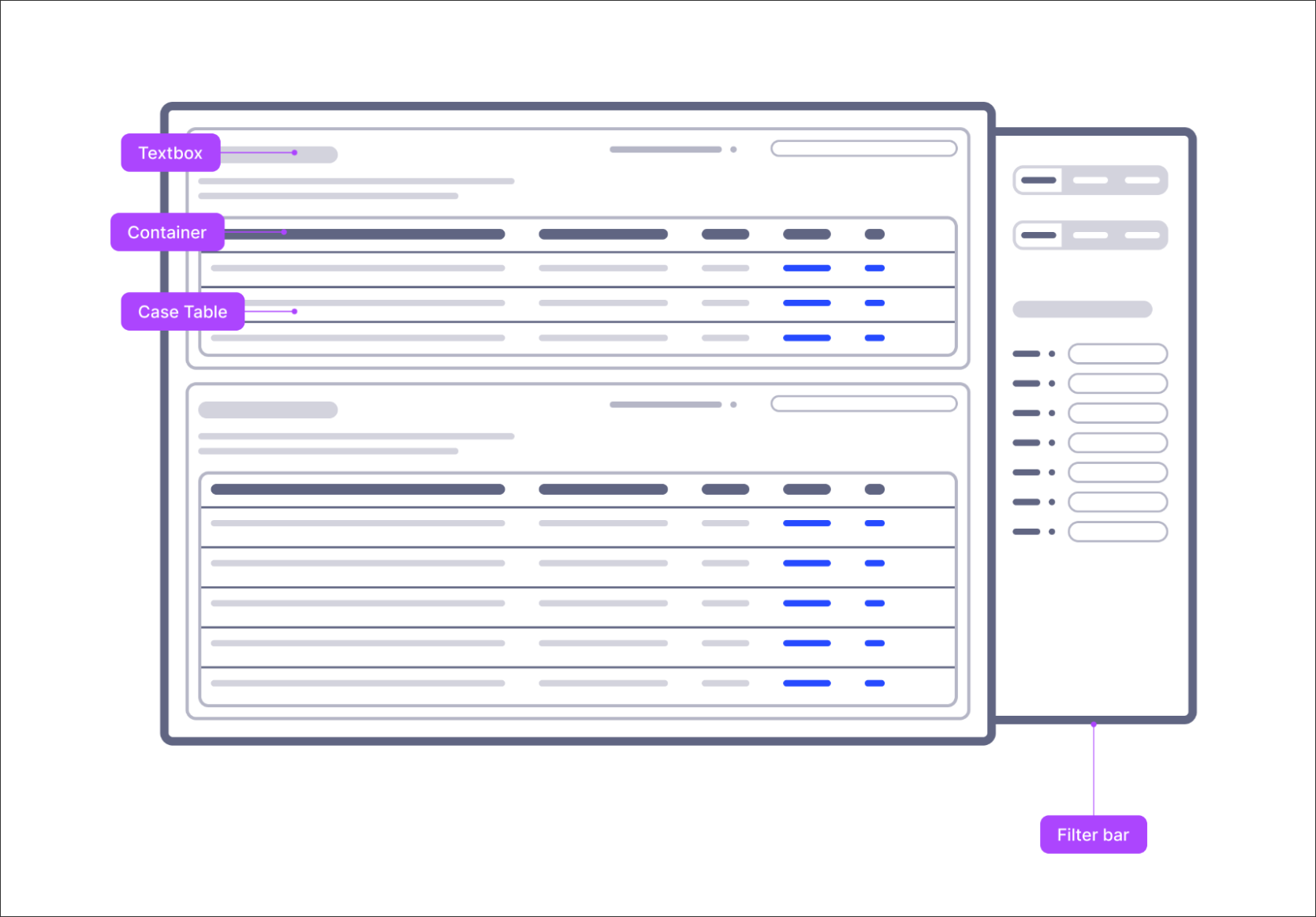
Case table (table component)
The case table should include the relevant cases, and the metrics / attributes related to the use case to be validated. So for example, if you are validating the status of a specific order, you may want to include the order ID, the status (the result of the specific definition), and all the attributes you took into account in the status definition - such as the system processing status, deletion indicators, creation date, goods receipt date. Other than these attributes, users may be interested in other fields to have more context, such as plant, location, organization.
Tip
Based on the specific use case, you can include more components, such as process explorer or specific filters. Try to create a simple and intuitive view though, ihelping the user to easily navigate through it.
When creating your initial set up and validating data Views, we recommend:
Referencing KPI definitions if they exist in the Knowledge Model.
Adding additional components if they help the user in validating the Use Case. For instance, you could add additional charts to help visualize the distribution of the cases with the use case.
Configuring and enabling a filter bar. See: Configuring a filter bar for your View.
We'd then discourage the following:
Including more than five sections in your Settings area.
Including more than five sections in your Validating data area.