Legacy view components
Legacy Views - Maintenance only
Effective August 1st 2025, Legacy View features can no longer be purchased as part of a Celonis Platform license. Celonis continues to maintain Legacy Views (by fixing bugs and ensuring that performance remains strong) but no further feature development will take place.
You can manually migrate your existing Legacy View components to our enhanced Studio Views, giving you access to our intuitive View creation capabilities. To learn how to migrate your existing Legacy Views to Views, head to: Migrating Legacy Views to Views.
And for an overview of our enhanced Studio features, see: Studio feature availability matrix.
Legacy view component
You're currently viewing a topic about a legacy view component in Studio. This component can still be used in legacy Studio views, however we recommend using the visual view editor in the new Studio experience. The updated interface includes drag and drop capabilities, allowing you to easily add components and configure your views.
For more information, see: Views.
You can customize your legacy studio views by adding and configuring View components. View components allow you to visualize your data in a number of ways, enable you to add interactive elements to your Views, and help you customize the look and feel of the View.
You can also add display rules to your knowledge model, allowing you to visually customize your Views with different styles and icons.
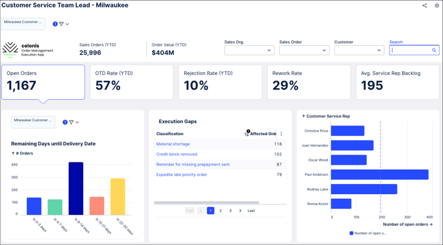
As an example, the following view including a customized image, dropdown filters, KPI lists, and three different charts:
Adding view components to studio Views
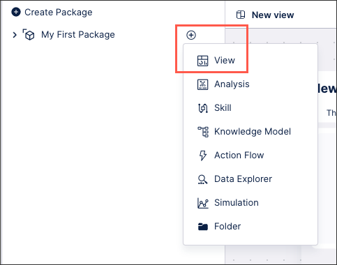
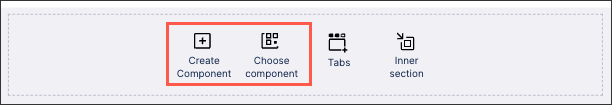
Components can be added while creating a new View.
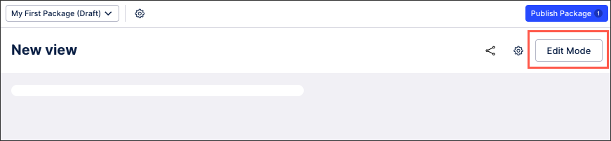
Alternatively, you can edit an existing view by clicking Edit Mode:
And then clicking Create or Choose Component:
Available view components
The following studio view components are available for your Celonis Platform:
Anomalies and root causes
Execution Gap List: View an automatically generated list of all anomalies detected in your system, including defined KPIs, occurrences, and the current impact. These anomalies can then be analyzed on a profile view level. See Configuring an execution gap list in legacy views.
Charts and tables
Charts: Visually display data using line, bar, point, text, and lollipop charts. See Configuring Charts in legacy views.
Histogram: View your data as a histogram, showing the frequency distribution of continuous variables. See Configuring a histogram chart in legacy views.
Sankey diagram: Display your data using a sankey diagram, a visualization used to depict a flow from one set of values to another. See Configuring a sankey diagram in legacy views.
Table: Display your data in a configurable table. See Configuring tables in legacy views.
Treemap: Display your data as a treemap, which shows hierarchical (tree-structured) data as a set of nested rectangles. See Configuring a treemap in legacy views.
Waterfall chart: Display your data using a waterfall chart, which visualize positive and negative changes to a value. See Configuring a waterfall chart in legacy views.
World maps: Display your data based on geographical locations. See Configuring a world map chart in legacy views.
Embedded components
iframe: Embed external content, such as websites or documents, using iframes. See Configuring an iframe in legacy views.
Embedded views: Display views or filtered versions of views within an existing view, such as embedding a regional or process specific view. See Embedding views in legacy views.
Execution and actions
Buttons: Insert a clickable button that directs users to specified websites or to trigger skills. See Configuring buttons in legacy views.
Comments: Add text comments to objects. See Comments (legacy).
Task list: Add an interactive task list to your view, allowing you to track progress made. See Configuring a task list in legacy views.
Explorers
Case explorer: Displays the connected data tables and provides a tool for examining cases and their respective activities. See Case Explorer.
Network and signal link explorer: Visualize your data using a custom graph. See Network Explorer.
Process explorer: View a visual process diagram, showing the number of items that have reached each stage of that progress over the reporting period. See Process Explorer.
Filters
Dropdowns: Add filters to views based on attributes or changing input variables. See Configuring dropdowns in legacy views.
Global search: Add a search box to your view, enabling users to search by relevant attributes. See Configuring a global search in legacy views.
Quick filters: Add a quick filter to your view. See Configuring quick filters in legacy views.
Time filter: Enable your users to filter the view by a selected date. See Time filter.
Form components
Input box: Add an input box to your view, allowing users to enter a date, number, text string, or time to the view. See Configuring an input box for legacy views.
Input checkbox: Add a labeled checkbox to your view, enabling users to click a box to activate or deactivate a feature. See Configuring an input checkbox for legacy views.
KPIs and Attributes
Attribute List: View an overview of key performance indicators and attributes. See Configuring an attribute list in legacy views.
KPI card: Display a detailed KPI card for a single KPI. See Configuring a KPI card in legacy views.
KPI list: Display a list of relevant KPIs for the view, with both display only and interactive KPI lists available. See Configuring a KPI list in legacy view.
View components
Activity history: View an overview of all activities for a specific object, such as comments, case updates, and executed tasks. See Configuring an activity history in legacy views.
Images: Add externally hosted images, such as company logos, to the view. See Adding images to legacy views.
Info text: Add an information icon and supporting text for users, giving them added context when viewing your data. See Adding infotext to legacy view components.
Text: Add customizable text to your view, using both text and HTML formatting. See Configuring a textbox in legacy views.