Available Studio View components
The following component categories and related components are available in the new Studio experience.
The following chart types are available:
Display your data using highly-customizable and interactive category based charts.
You can select from the following category chart types:
Bar
Grouped bar
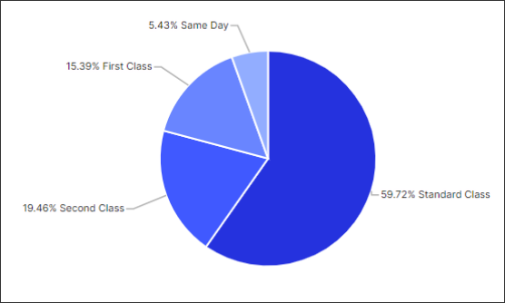
Pie / donut
Stacked bar
For more information, see Charts.
 |
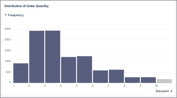
View your data as a histogram, showing the frequency distribution of continuous variables. To show this distribution, your data is divided into groups (known as buckets') on the x-axis, while the y-axis shows the frequency (count) based on the data that falls in each bucket.
For more information, see Charts.
 |
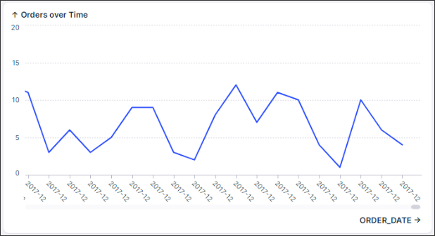
Display your data using a time series chart, helping you to compare and analyze data over a defined time period.
You can select from the following category chart types:
Columns
Grouped columns
Stacked columns
Columns & lines
Lines
For more information, see Charts.
 |
For all other chart types, including:
Sankey chart - see Sankey chart.
Waterfall chart - see Waterfall chart
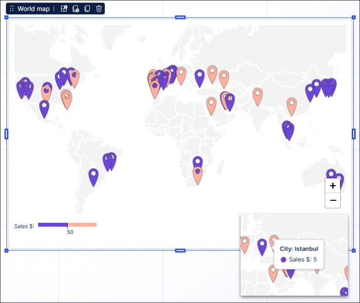
World map - see World map.
Container Containers allow you to visually combine new and existing components in your View, either on a white or transparent background.
In the following example, a white container has been used to visually combine related column chart and pie chart:
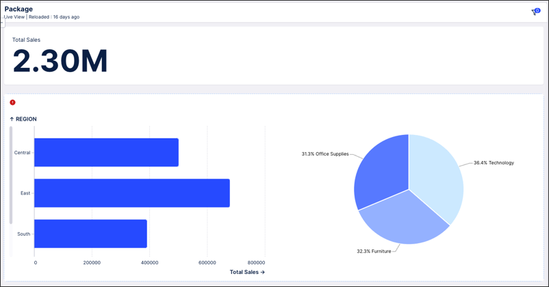
To learn more about containers, see Containers / Conditional layouts.
Dividers (Private preview only): Add a horizontal or vertical dividing line to your View, allowing you to visually separate sections and improve your content hierarchy within your View.
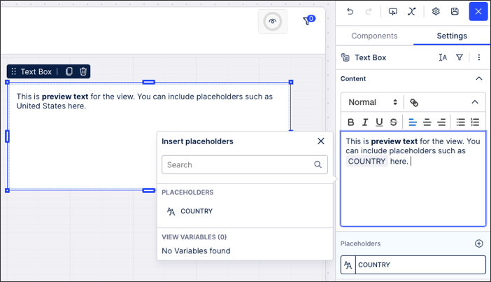
Text box: Here you can add a text box to your View, with text formatting, placeholders, and variables included.
With text boxes, you can also choose additional settings:
Background: Choose if the box is transparent or filled with a selectable color.
Text formatting: Choose if the text wraps onto additional lines or should all be kept on one line.
These components allow app viewers to filter the data displayed in the View.
You can select from the following filter components:
Date range: Allow app viewers to show data based on their selected date range.
Filter dropdown: Use the filter dropdown to filter your View by a value(s) from your data model tables.
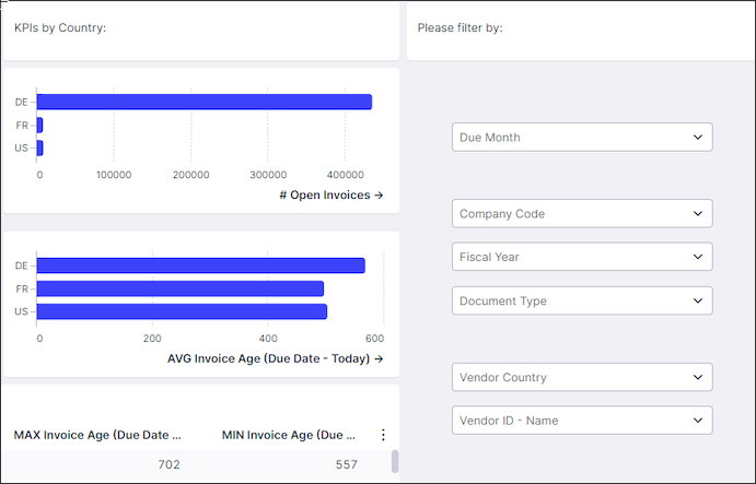
For example, the following View uses a number of dropdown filters:
Quick filter: Use the quick filter component to quickly generate buttons that filter your View by a value from one of your data model tables.
Search box (limited availability only): You can configure a free text search box for your Studio View, allowing your App users to search across all components within that View. Search boxes can be customized to focus results on selected search parameters, to allow wildcards to be used, and to guide users with placeholder text.
For more information about filter components, see Filter components.
You can add the following KPI-focused components to your Views:
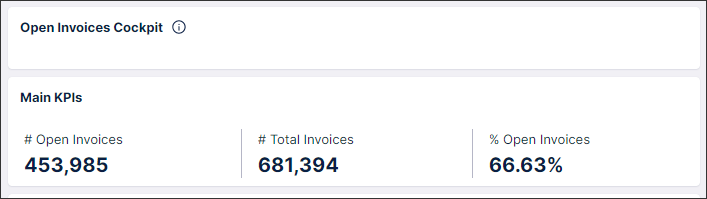
KPI card: Displays a detailed KPI card for a single KPI within your View.
KPI list: Displays a list of relevant KPIs for the View, with both display only and interactive KPI lists available.
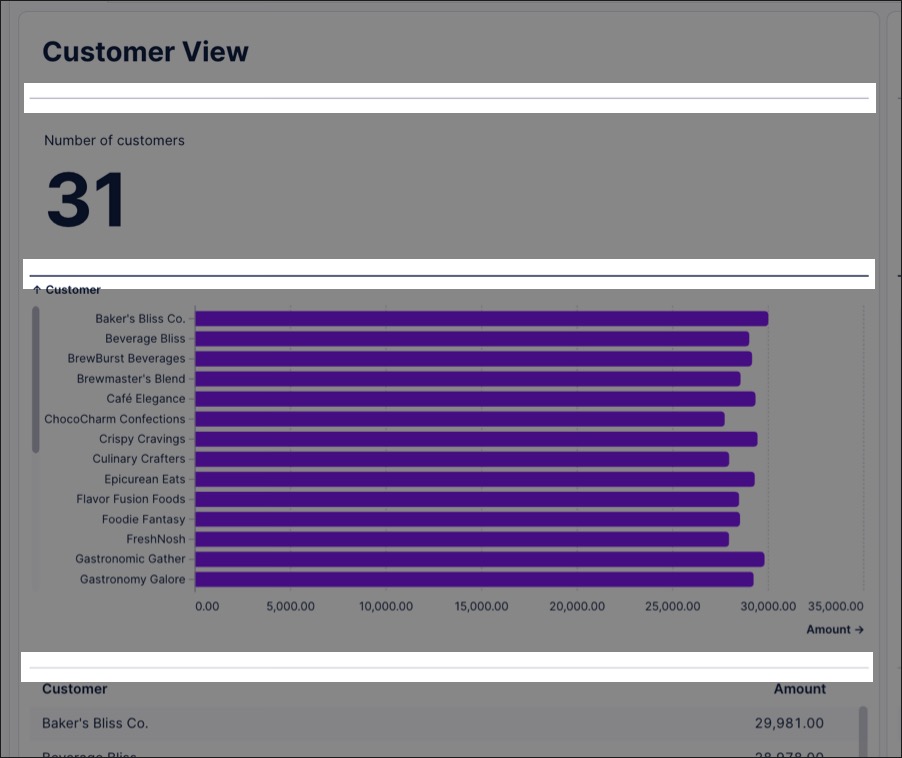
In this example, a KPI list has been added to the View:
KPI meter: Displays the current value of an individual KPI metric from your Knowledge Model on a bullet graph.
For more information, see KPI components.
These components allow you to add information linked to objects in your knowledge model.
You can select from the following object specific details:
Note
You can use visual mapping rules for colors and icons in the Attribute list component. For more information, see Color themes and Icon mapping.
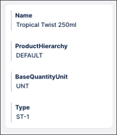
Attribute list: This components allows you to display multiple attributes in your View.
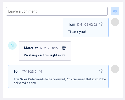
Comments: The comment component allows app viewers to add text-based comments within a View. These comments are associated with individual rows in a Data Model table, so you must provide an identifier definition for the respective table in the Data Model before configuring your comments component.
To learn how you configure your comments component, see Comments.
You can use the following components to visually display your processes:
Case explorer: The case explorer component allows you to show detailed information about the cases listed in your Data Model within your Studio View. You can then click individual cases to View their time stamped activity history (mapped from the activity table in your Data Model). For more information about case explorer component, see Case Explorer.
Instance explorer: Instance Explorer is a Studio view component for object-centric data models that lets you explore individual object instances—such as orders or invoices—and their associated events within the digital twin. It provides a visual, end-to-end view of each object’s life cycle and relationships, enabling you to trace issues, understand dependencies, and investigate root causes without creating custom queries or tables. For more information, see: Instance Explorer
Network explorer: The network explorer (formerly Object Link) component allows you to examine how objects are related across your business. By choosing different dimensions, you can explorer your object-to-object relationships by country, plant, material, or distribution and the KPI to display for each object. For more information about configuring the network explorer component, see Network Explorer.
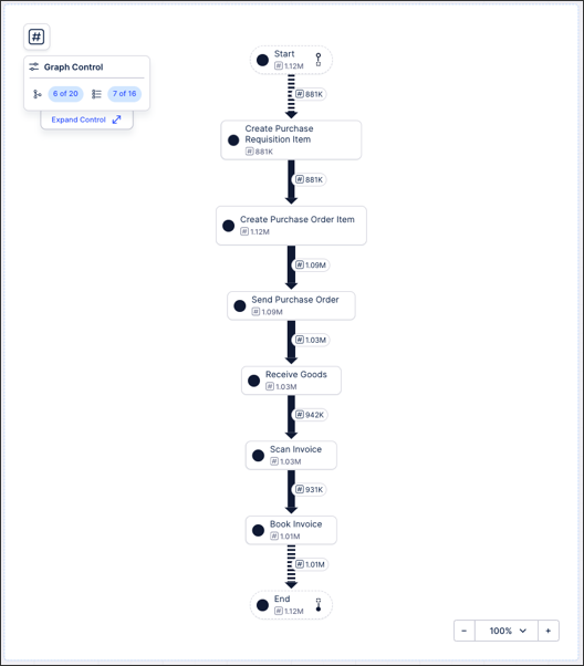
Process explorer: This components enables you to visually display the key stages involved in a process and the data associated with each stage (such as number of cases). For more information about the process explorer component, see Process Explorer.
Below is an example of a process explorer component:
Variant explorer: This components allows you to view variants of your standard process and see how they are impacting your process flow. For more information about the variant explorer component, see Variant Explorer.
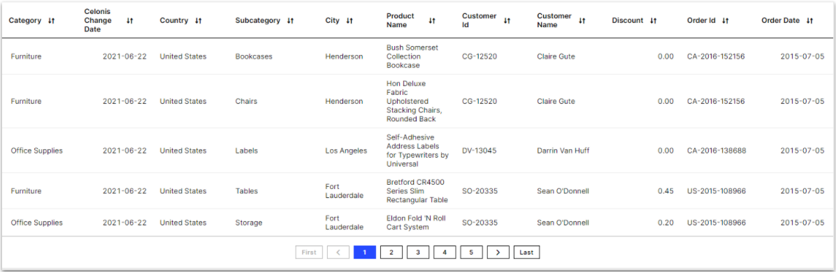
Display your data using highly customizable and interactive tables. You can also use tables within the new Studio experience to overlay a linked View within your View. This allows you to reference data from an existing View within your package.
For more information about configuring your tables, see Tables.
For more information about displaying an overlaid View within your View, see Linked Views.
 |
These components allow you to add interactive elements to your View, such as buttons to click and dropdowns to select data from.
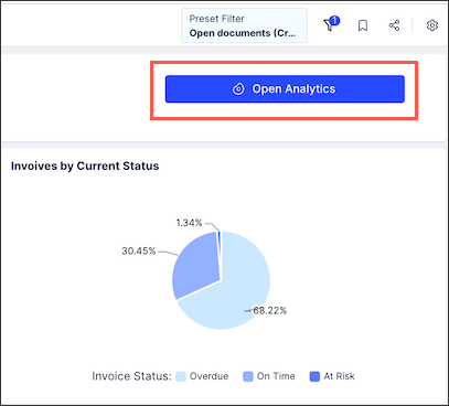
Button: Use buttons to trigger interactions within your Views, such as routing users to other Views or updating variables.
For example, the following View includes a button for the user to open further analytics:
To learn more about buttons, see Buttons
Buttons can also be used to display overlays of existing Views within the current View. For more information, see Linked Views.
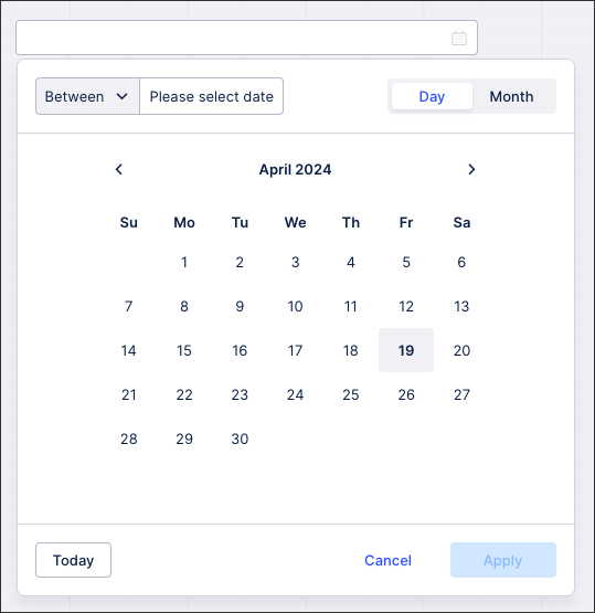
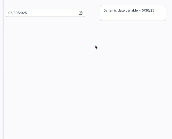
Date picker: The date picker component enables you to display a calendar that saves the users input as a variable. This variable can then be combined with other Studio components, such as text boxes, to dynamically update your View.
For example - a single date picker is used to update the variable in the text box:
To learn more about the date picker component, see Date Picker.
Input box: Store free text user inputs inside string and number variables using the input box.
Use the input box to allow your users to freely define the values for the parameters that impact your App. This without needing to choose from an option previously defined in the application.
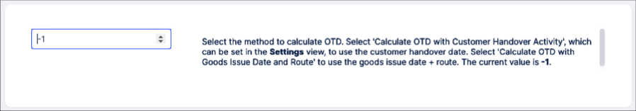
To learn more about the input box component, see Input box.
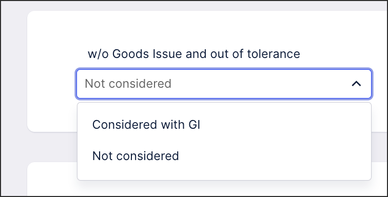
Input dropdown: Use the input dropdown to store a value or query object inside a variable based on a user selection from a list.
For example, enable app viewers to modify the behavior of their app based on what they select from within the dropdown:
To learn more about the input dropdown component, see Input dropdown.