Creating and configuring tables
You can display your data in a View using highly customizable and interactive tables. Once added to your View, you can configure which data is displayed in your table and how that is presented to your app users.
Using a table component to display information offers several key benefits, especially when presenting process or performance data interactively. Some of the benefits include:
Provide clarity and structure: Tables organize complex data into rows and columns, making it easy for users to read, compare, and interpret values. They're ideal for detailed, record-level insights (e.g., order IDs, timestamps, process variants).
Complementary to charts: Tables can complement charts (like bar, line, or pie charts) by showing the exact numerical values behind visual trends. This helps you balance summary and detail views in the same dashboard.
Dynamic filtering and interactivity: Tables in are interactive, meaning that clicking a row or applying filters can update the rest of the view dynamically. This enables contextual analysis, where users can explore how selecting certain data points affects KPIs elsewhere in the view.
Highly customizable: Using the Table configuration options, you can customize table components to your exact needs. This includes the column behavior, colors, and exporting the data.
Performance-friendly aggregation: Tables can efficiently handle aggregated data (e.g., sum, average, count) using PQL (Process Query Language). This makes the component a good choice when you want to summarize performance metrics by dimensions like region, customer, or process step.
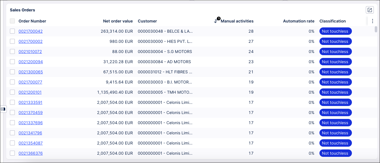
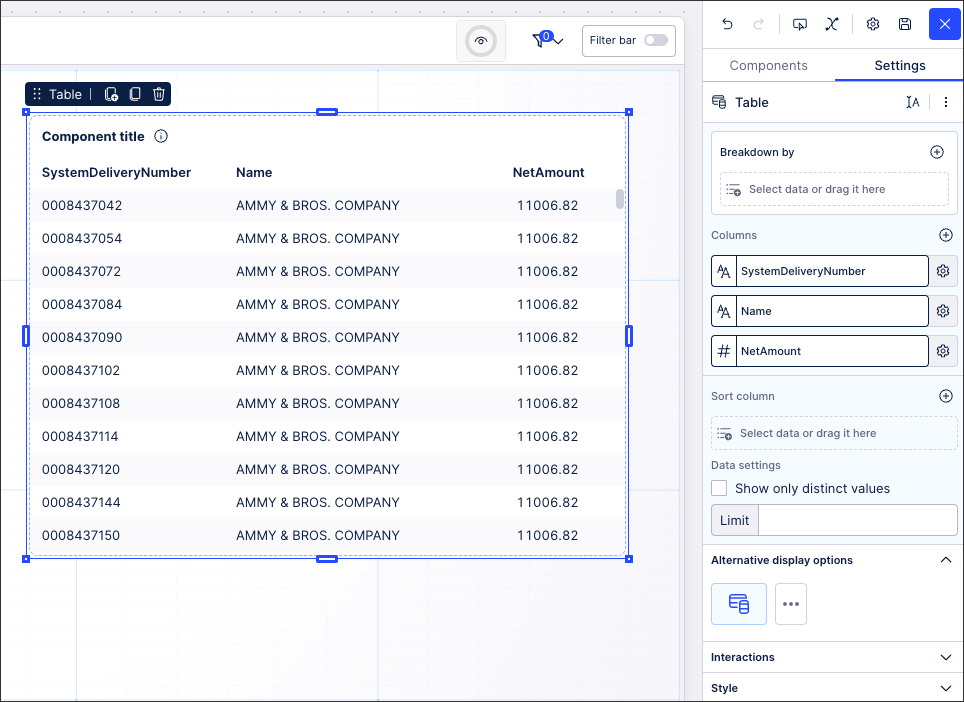
The following is an example of a basic Sales Order table, configured to include a linked View (accessible by clicking the order number column), color coded values, and manual filtering options:
 |
Interacting with published tables
While this topic explains how to configure tables, you'll find information about interacting with publishing tables in our 'Viewing Apps' guide:
To configure a table for your Studio View:
In View Edit Mode, drag and drop the table component into your View.
Open the component settings menu and customize your configuration using the following options: Table configuration options.
Click Interactive Mode and preview your search configuration.
Optional: To see the latest version of your View, deploy the package.
When configuring a table within a Studio View, you have the following configuration options available:
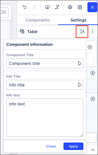
You can edit the table display name, tooltip title, and tooltip description by clicking Component Information:
 |
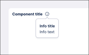
The text you enter here then appears on the published table:
 |
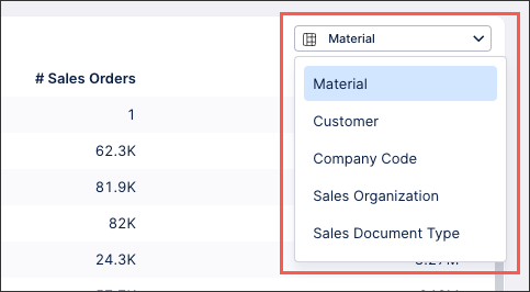
Use the PQL editor to select the data fields you want to base your table display on. The viewer of the published app can then switch between them using the dropdown:
 |
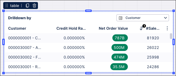
This is configured in the Breakdown by section of the table settings menu. If a column is hidden (configured in the column settings menu), then this can't be used as a breakdown option.
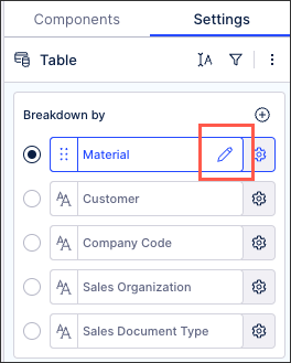 |
You can select multiple data fields here, with the highlighted one being the default.
Here you can configure the number and details of the columns in your table, including choosing which data fields are displayed in your table. This uses the PQL editor, with more information about the editor provided here: PQL editor.
Adding columns to your table
To add a column, click + and then configure the PQL statement for this column:
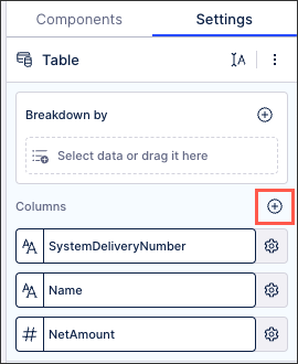
Table column settings
You can edit the individual column settings by hovering over the Settings icon:
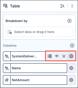
The following column settings are available:
Pin to left / right / unpin: Clicking once pins the column to the left of the table, clicking again pins the column to the right of the table, and clicking for a third time unpins the column in the table.
Hide / Show: This hides the column from the table but keeps the column configuration, enabling you to show the column again when required.
Delete: This deletes the column and its configuration, requiring you to manually add it back if required.
Column behavior: These settings control whether the user can copy values from the table, and if the columns should be pinned or sorted by default.
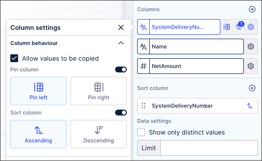
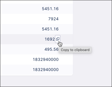
When allowing a value to be copied, the user has a Copy to clipboard button when hovering over that column value:
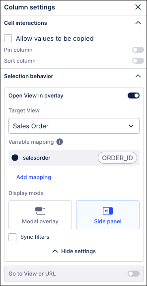
Column interactions: These settings control what happens when a user clicks the value in the column.
Open view in overlay: You can configure a linked View to open as an overlay within another View, triggered by a user clicking data in a table or a button. This overlaid View can then be displayed as a modal overlay or a side-panel. For more information, see: Linked Views
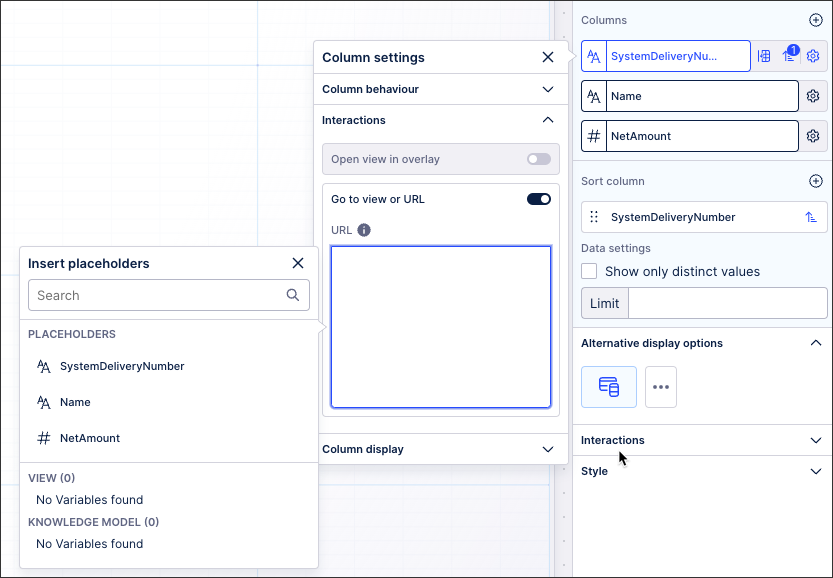
Go to view or URL: You can either enter a URL (formatted with http:// or https://) or click into the field to configure placeholders, such as linking to view variables or Knowledge Model variables.
Column display: You can add colors to the data displayed in your table columns using gradients, thresholds, or categorical colors. These coloring options allow you to configure which color is used for specific values or a range of values. To learn more about adding colors to your table columns, see: Column colors.
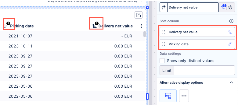
Choose how the columns in your table can be sorted by selecting the data fields and then choosing the order of sorting between columns. Any sorting applied in the column settings menu are automatically added to this section.
When multiple columns are sorted, the order of the columns is reflected by the number indicator on the table:
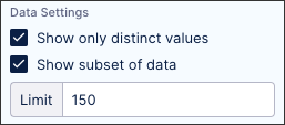
Select to show only distinct values in your table and control how many table line items are displayed.
In this example, 150 line items will be displayed in the table:
 |
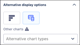
Based on the data you've selected, you may be prompted here to try visualizing this data using an alternative component.
If you select an alternative component, you may then need to make additional configurations.
In many cases, the alternative options for tables are charts. You can learn more about configuring charts here: Charts.
These settings allow you to configure what type of interactions a user can have with your table.
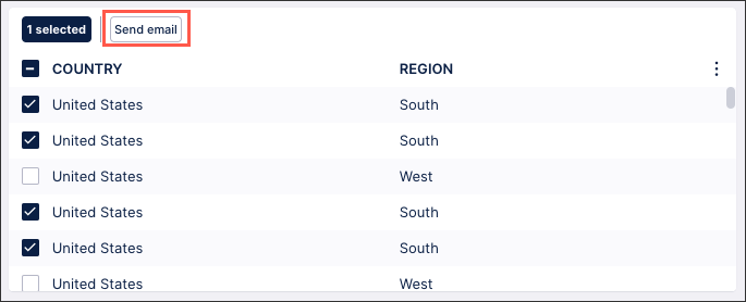
Actions: You can configure and use View actions such as sending emails, running action flows from within a View, and updating augmented attributes. These allow app users to select cells and then either send an email using that data or click to start an action flow / automated process running based on it.
In the following example, a user can send an email containing the information selected in this table:
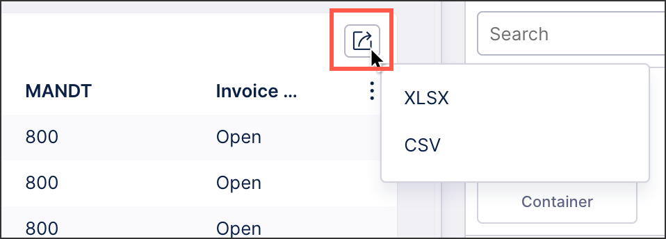
Allow exporting from table: When enabled, this allows app users to export the table as an XLSX or CSV file.
Exclude from pre-defined filters: When enabled, this removes the component from any filters that are set on a View and tab level.
Exclude from user filtering: When enabled, this prevents the app user from filtering the data within the table.
Can't be used to set filters: When enabled, this prevents the app user from using the table to set filters for the whole View.
Configure how your table is displayed using line breaks, column spacing, cell spacing, and display options.
Line breaks: To use line breaks in your View, you must enable the pagination display option. You can also only use line breaks in tables where you have 100 rows or fewer displayed per page. These options are highlighted in the screenshot below.
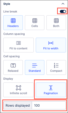
Column spacing: Choose whether your columns automatically resize to fit the data in them or are spaced based on the width of the table component in your View.
Cell spacing: Choose the height of your rows.
Display and rows displayed: Choose between infinite scroll or to have your table display a maximum number of rows per page.