Studio App Building Guidelines - Use case overview
A use case overview provides insights into how processes run, allows comparisons between processes, and helps identify trends in data. As the first tab in an analytical app, this view can also act as a landing page for views and can guide users into which use case deep dive to view next.
Overview tabs work best when analyzing multiple use case, particularly if these use cases can be grouped into categories.
When configuring a use case overview in Studio, consider the following:
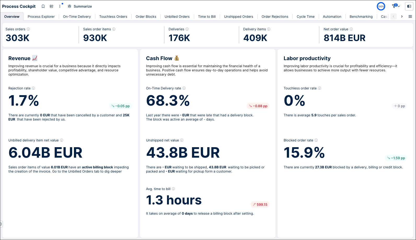
Examples of use case overviews can be found in any Starter Kit in the Celonis Marketplace. This screenshot is from the Process Cockpit view in the Order Management Starter Kit (object-centric):
 |
A use case overview is divided into four areas:
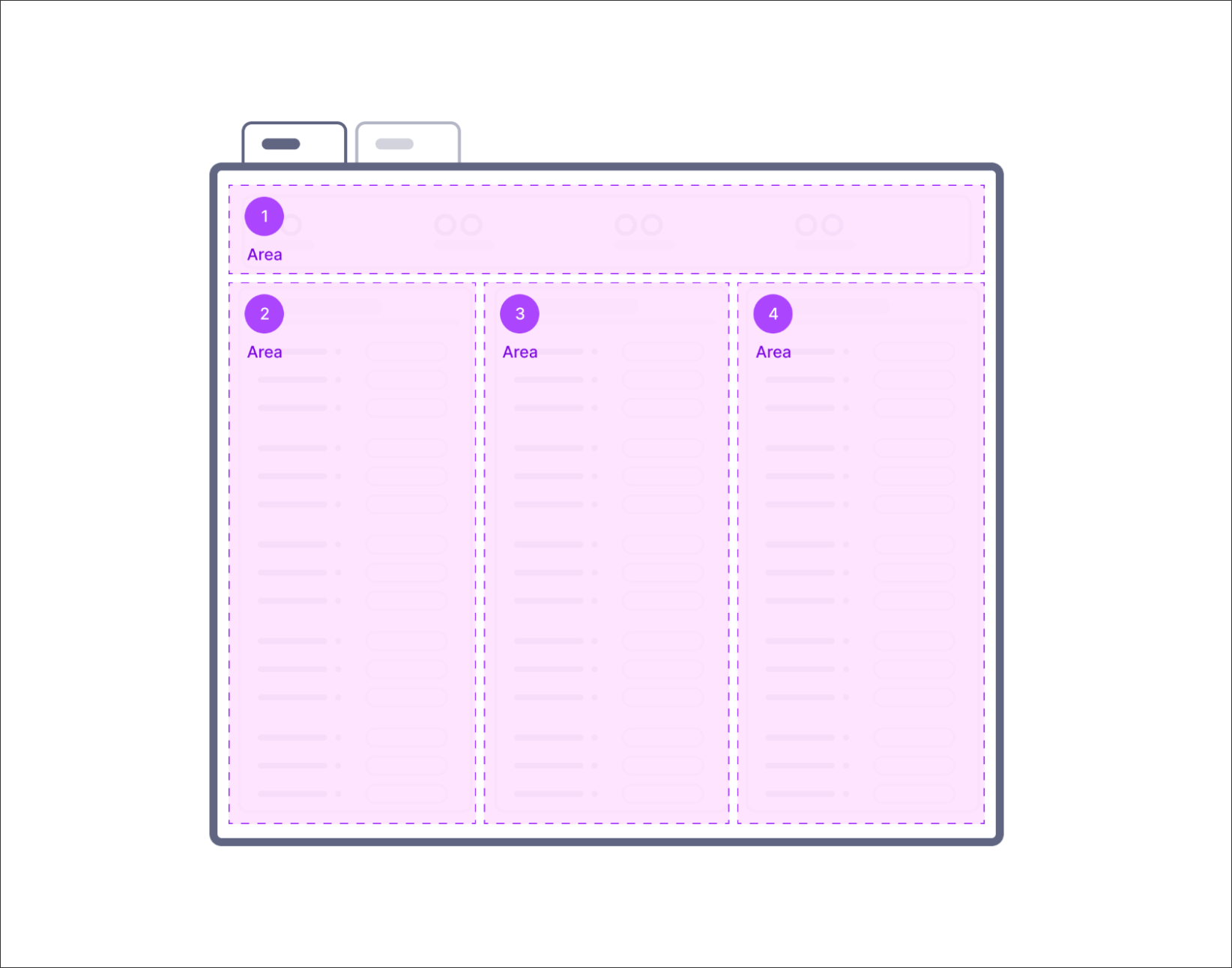 |
This view can then be created using a combination of Studio components:
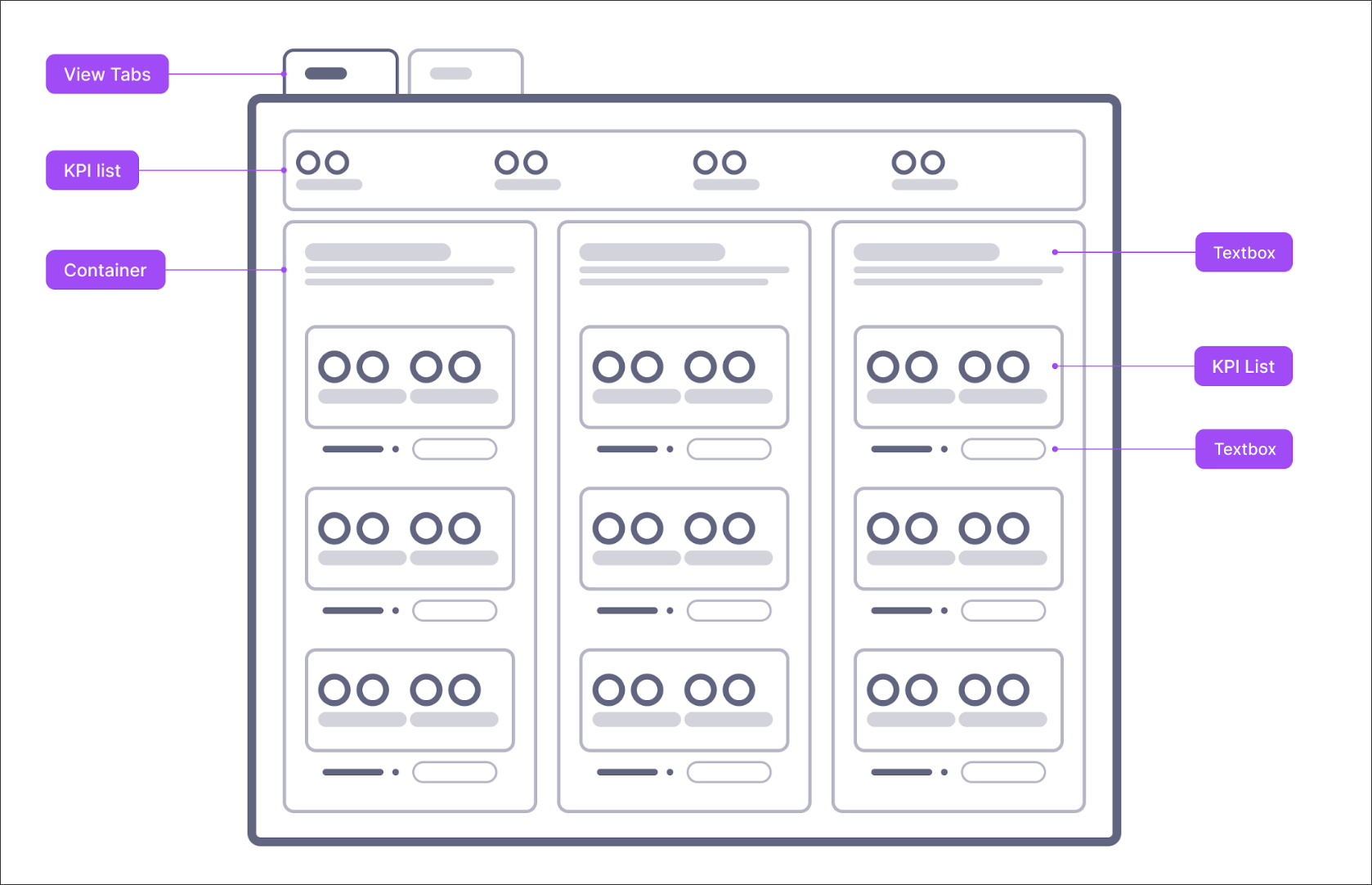 |
At the top of the view, the user can check the current scope being analyzed and apply filters where needed.
This area is composed of a KPI list containing the following:
A count for every base object from the use cases in this application (e.g. Sales order items).
A total sum of the value (e.g. Sales order item value).
In this example, the data scope area displays five KPIs:
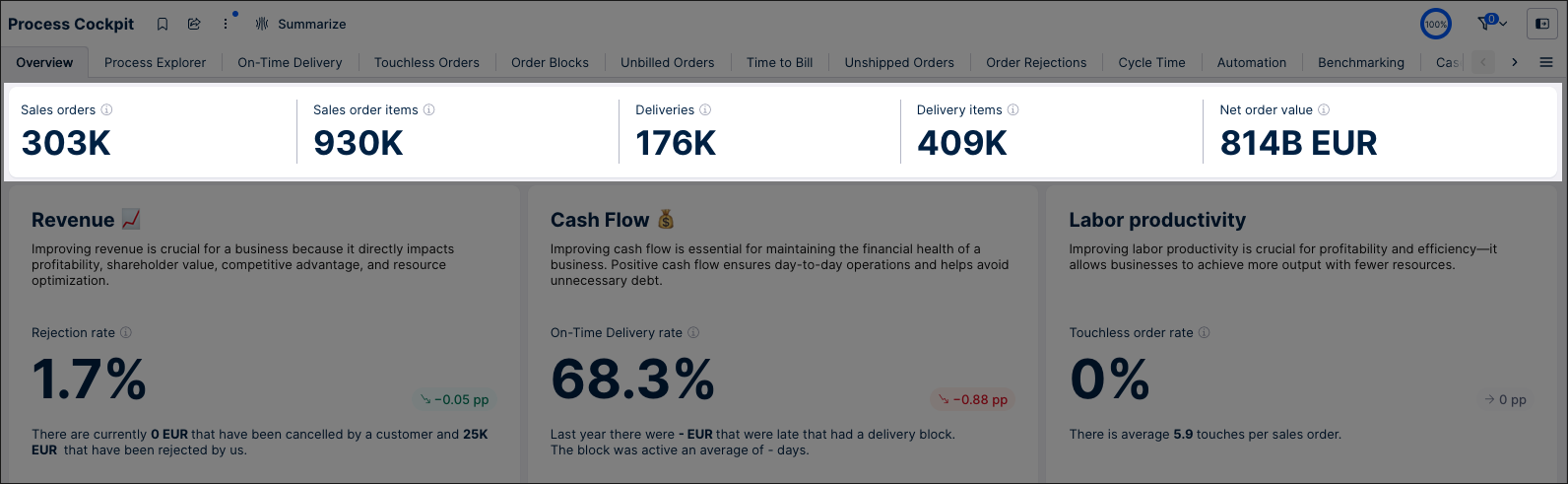 |
Tip
We recommend that the number of KPIs does not exceed five in the KPI list to maintain legibility in all screen sizes.
With the categories area, you display groups of use case related widgets (a KPI component and supporting text). These categories could be based on business objectives (such as labor productivity), a group of use cases (such as Open Invoices), or based on other common characteristics.
Each category could be comprised of:
Title: Use a text box component with Heading 2 text formatting to create a title.
Description: Use a text box component with normal text formatting to add a short description.
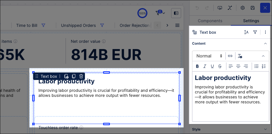
Widget: Configure a KPI list and then add a text box component with normal text formatting.
Tip
If you have 4 or more categories, we recommend arranging them vertically and configuring the view as “custom height" and making it scrollable. In every other case, we recommend the setting scale-to-fit as this will improve compatibility with various screen sizes.
Widget - KPI list
Display the main KPI of the use case here. We recommend adding a target and trend in every use case wherever possible, this allows the user to understand the urgency of improvements needed based on that information.
Every KPI should always have these components:
An info icon with information on how the KPI was calculated and what it represents.
A human-readable text. Never include technical table names, and avoid using abbreviations.
A rounded number format (e.g. 13 instead of 12.5678).
A unit of measurement. (e.g. 12 days instead of 12).
Trend (if possible).
Target (if possible).
The KPIs displayed in the overview should be the same as those chosen for the use case deep dive tab. The number should also be the same, so make sure that if you apply a filter in the tab, you also apply the filter in the overview.
Make sure you allocate the same space for each KPI. Therefore, the KPI value will most often be displayed in the same size. The size of the KPI might give it more importance, which might be unintentional in its design.
Tip
Don't use color in the KPI value. Colors should only be used in the trends and targets.
Widget - Text box
A text box below the main KPI containing additional information about the KPI, like related KPIs, possible root causes, or inefficiencies. This gives the user more context about this KPI. This text should not repeat the KPI or its definition but provide additional context information. KPI descriptions should be displayed only in the info icon of the KPI list and not in this textbox.
The text style should be “Normal”, and the related KPIs should be displayed as placeholders inside the textbox component. We recommend changing the style to bold to better distinguish them from the rest of the text.
When creating your use case overview, we recommend the following:
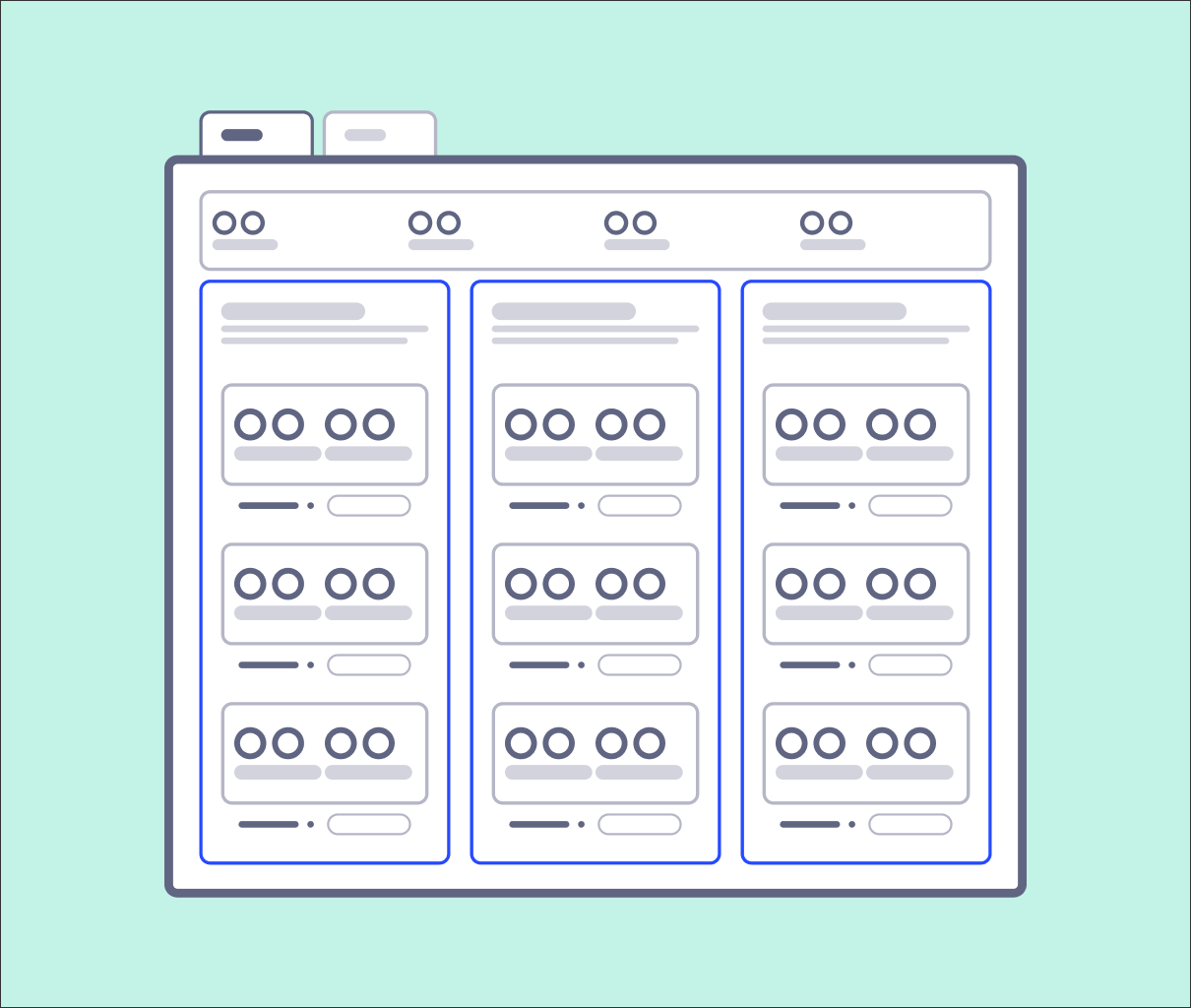
When creating your categories, group them together using containers.
Creating categories of equal size, ensuring consistency across the overview. If you have three categories, these should occupy a third of the view each.
Sort the categories according to their importance, the most important category should be placed on the left. Inside each category, sort the use cases vertically by importance. The most important use case in each category should be placed on top.
 |
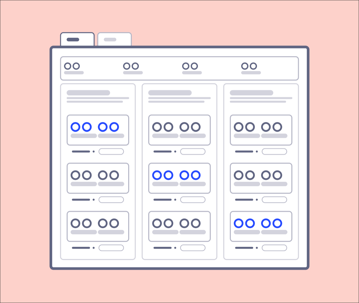
We'd also discourage the following:
Excessive use of colors - use black, preferably, for the KPI list colors. Leave color for the trend or target information. Don't use green or red colors if there is no target indication.
 |