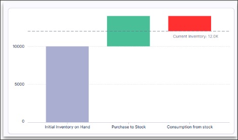
Waterfall chart component
You can configure a vertical or horizontal waterfall chart for your Studio Views, helping to visually display how an initial value is affected by a series of positive or negative changes, leading to a final value. The waterfall chart component support a flexible data tree structure, allowing you to efficiently define the hierarchy of your component by dragging and dropping your metrics into the desired order.
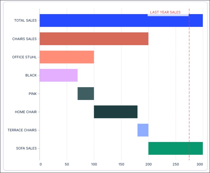
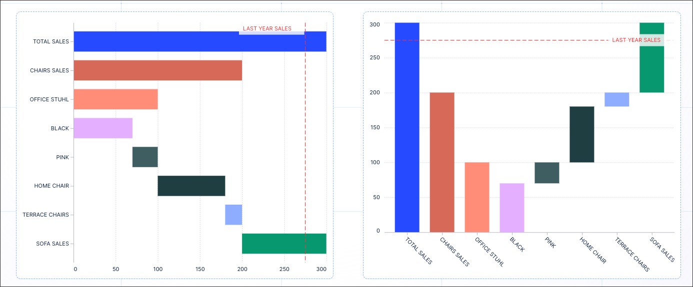
In this example, a waterfall chart is used to display the total sales of office furniture (blue bar). You then have seven individual items, displayed as their own bars of varying lengths (depending on their contribution to the total sales). These individual items are “stacked” to show how the value builds up or diminishes over time or categories.
You can see other use case examples for waterfall charts here: Waterfall chart use case examples.
To configure a waterfall chart for your Studio View:
In View Edit Mode, drag and drop the waterfall chart component into your View.
Open the component settings menu and customize your configuration using the following options:
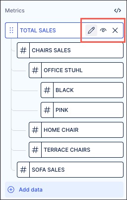
Metrics: Use the PQL editor to add the metrics you want to display in your waterfall chart. You can then reorder the metrics by dragging and dropping them into place, plus use the PQL editor, display / hide, and delete options where needed.
In our office furniture example, our main metric is TOTAL SALES and then our individual items are nested below.
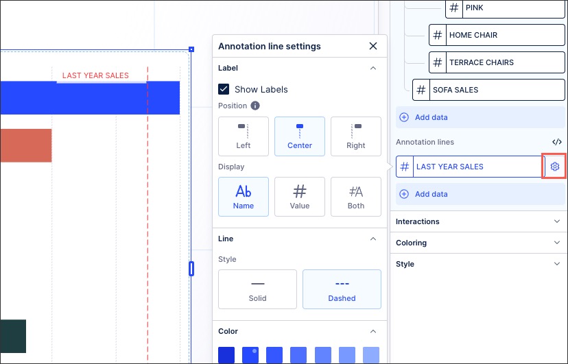
Annotation lines: Add a data object to use as an annotation line on your waterfall chart. This can be used to show comparisons between years, for example 'Last Year Sales' compared to the data displayed.
You can configure your annotation lines by clicking the Settings icon, giving the following options:
Show labels
Positions: Left, center right
Display: Name, value, both
Line type: Solid or dashed
Color: Choose the color for the line. We recommend using a color that complements the colors you use for the bars in the chart.
Interactions: Select if you want to exclude this waterfall chart from user filtering. If selected, the user can't click on the individual bars within the chart to use them as a filter for the whole View. For more, see: Temporary filters for Apps.
Coloring: Select the colors for each of your metrics. For recommendations on effective colors, see: Studio coloring best practice.
Style: Choose from horizontal (metrics displayed on the Y axis) and vertical (metrics displayed on the X axis).
In the following example, the horizontal version of the office furniture chart is on the left, the vertical version of the same chart is on the right:
Click Interactive Mode and preview your chart configuration.
Optional: To see the latest version of your View, deploy the package.
You can use a waterfall chart for the following use cases:
Build-up/Part of a whole chart: Used to show the build-up to a total. It provides an intuitive representation of how the total can be broken down by category.
For example, our office furniture waterfall chart used in this topic.
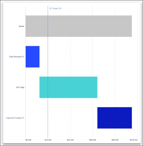
Gap chart: Used to highlight the gap to the target value.
For example:
Movement or variance chart (showing increases and decreases): This is often used with financial processes.
For example: