Choosing View layouts
Studio View layouts can be configured as either scale-to-fit or custom height Views, depending on your use case and display preferences.
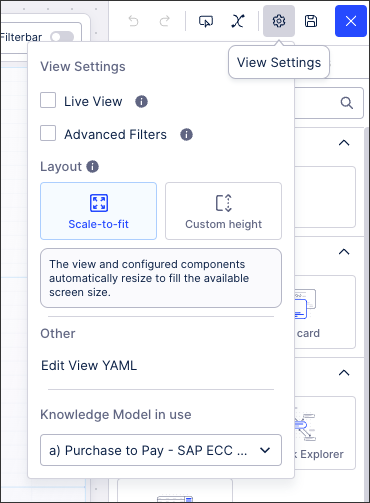
When creating or editing Studio Views, you can choose the layout type for that View by clicking View Settings or by right-clicking on the canvas:
You can also choose different layouts per tabbed View using the tab setting menu:
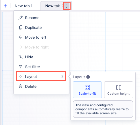 |
You can then select between scale-to-fit and custom height:
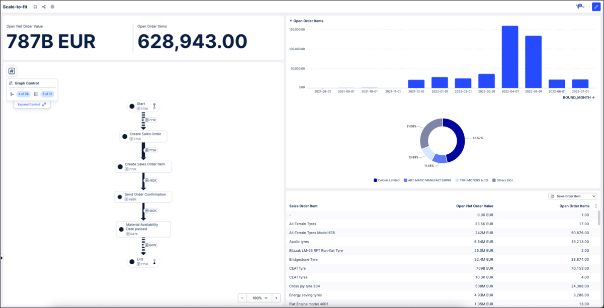
With scale-to-fit Views, the View and configured components automatically resize to fill the available screen size. Scale-to-fit Views have a fixed height and the View can't be vertically scrolled, meaning that you must configure your components based on the View space displayed. Scale-to-fit Views ensure that the View responds to the monitor displaying it, regardless of screen resolution and monitor sizes.
As an example, this is a scale-to-fit View on a large external monitor:
 |
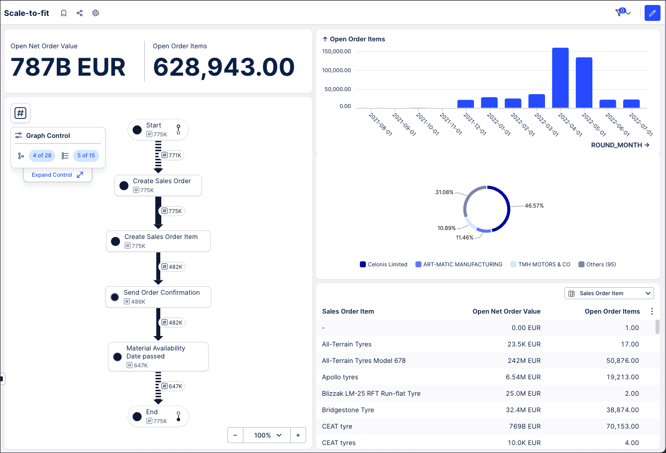
And this is an example of a scale-to-fit View on a laptop monitor:
 |
Tip
While the maximum height for custom Views is 10,000 pixels, we recommend designing your apps to focus on key themes, patterns, and focus areas. By taking advantage of features such as View tabs and containers, you can publish apps that are easier for your users to view.
For more app building guidance and guidelines, see: App building guidelines.
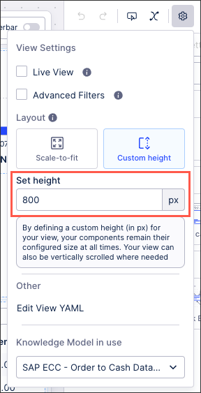
By defining a custom height (in px) for your View (maximum 10,000), your components remain their configured size at all times. Your View can also be vertically scrolled where needed.
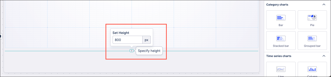
When editing a custom height View, your View height can be configured in two places:
From the View settings menu:
At the bottom of the View editing area:
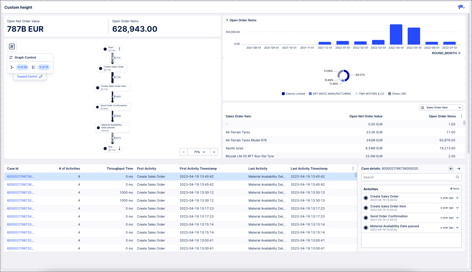
As an example, this View (an edited version of the one used in the scale-to-fit examples) has a custom height of 1920 pixels and is being displayed on a large external monitor. As you can see, the custom height allows for a case explorer component to be added to the View:
 |
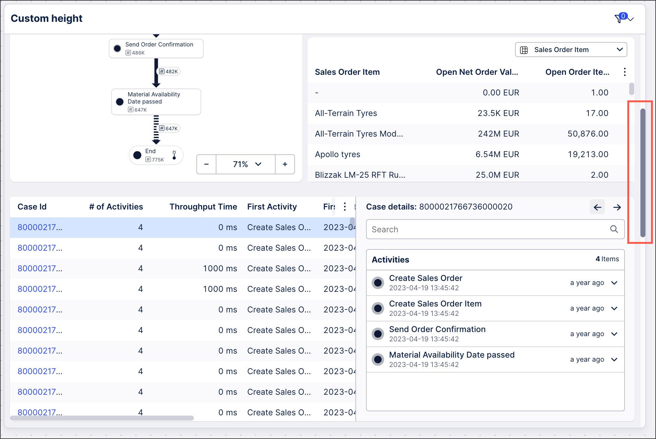
The same View can then be displayed on a laptop monitor, where the additional case explorer component is visible after vertically scrolling:
 |