View components
You can customize your Studio Views by adding and configuring View components. View components allow you to visualize your data in a number of ways, enable you to add interactive elements to your Views, and help you customize the look and feel of the View.
For an overview of available View components, see: Available components.
And for some commonly used component features:
When in View edit mode, you can add components to your View by dragging and dropping them into the View layout:
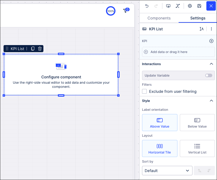 |
Once added to the layout, you can then resize, move, and remove the component as required.
You also can view the component Settings menu on the right-side, giving you the ability to add data and control the component's behavior within your View.
 |
Each component has its own settings, however, you will also find buttons for component information, PQL, and component controls for each component here:
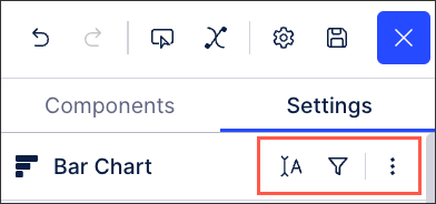 |
Component information: This allows you to change the name of the component, the info title that's visible to viewers, and the info text that's displayed.
PQL editor: This opens the PQL editor for the component, giving you enhanced editing options for the component's data. For more information about the PQL editor, see: PQL editor.
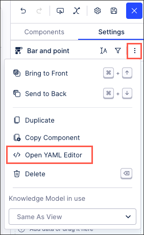
Component controls: These allow you to reorder, duplicate, and delete the component from your layout.
You can also change the associated Knowledge Model for your component using the component Settings menu. This allows you to show data from several data models on one dashboard (as Knowledge Models are linked to data models).
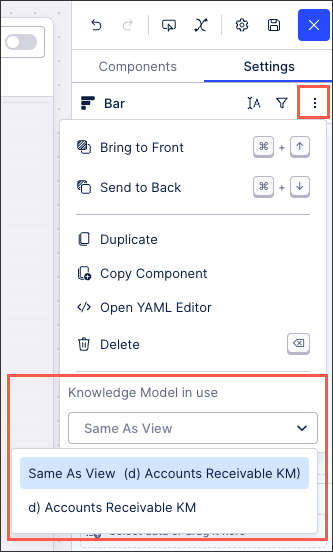 |
When creating your View and changing your Knowledge Model, the following rules apply:
Views are linked to one Knowledge Model (defined when the View is create and can be change using the View settings menu).
Every component added to the View will use the same Knowledge Model as the View by default.
When changing Knowledge Models, the filters set on the original Knowledge Model are not carried forward. You must set these again if you want to continue to filter your content.
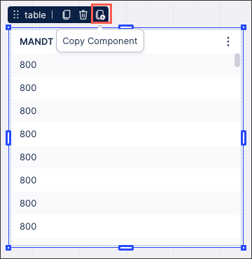
Once added to your View, you can copy and paste a component within your View, across tabs, and also across other Views within the same package.
To copy a component, either click Copy Component or select the component and use your keyboard shortcuts (CMD + C / CNTL + C):
 |
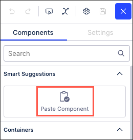
You can then paste this component using the keyboard shortcuts (CMD + V / CNTL + V) or take advantage of the Smart Suggestions option in new tabs:
 |
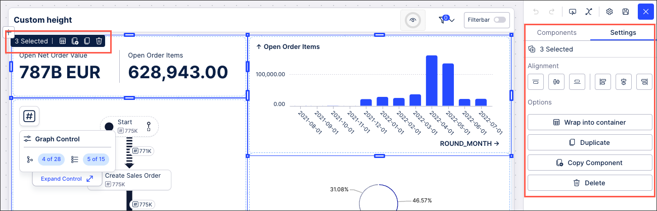
In addition to selecting individual components, you can also select and manage multiple components simultaneously using keyboard shortcuts (SHIFT+CNTL+CLICK for Windows, SHIFT+CMD+CLICK for mac). This groups the components and allows you manage them in the following ways:
Wrap into container: All selected components are visually combined into one container component (with either a white or transparent background).
Duplicate: All selected components (and their configurations) are duplicated within the same View.
Copy component: All selected components (and their configurations) are added to the clipboard / copy memory and can be pasted into other Studio Views.
Delete: All selected components (and their configurations) are deleted from the View.
 |
You can edit the YAML for your Studio components by clicking Options - Open YAML editor. This automatically takes you to the relevant section of the YAML for that component, allowing you to efficiently edit the component.