Activities
Analysis - Maintenance only
Effective August 1st 2025, Analysis features can no longer be purchased as part of a Celonis Platform license. Celonis continues to maintain Analysis (by fixing bugs and ensuring that performance remains strong) but no further feature development will take place.
You can migrate your existing Analysis assets to our enhanced Studio Views, giving you access to our intuitive View creation capabilities. To learn how to migrate your existing Analysis to Studio Views, head to: Migrating Analysis to Views.
And for an overview of our enhanced Studio features, see: Studio feature availability matrix.
Overview
 |
If an Activity Circle (see 1) is clicked
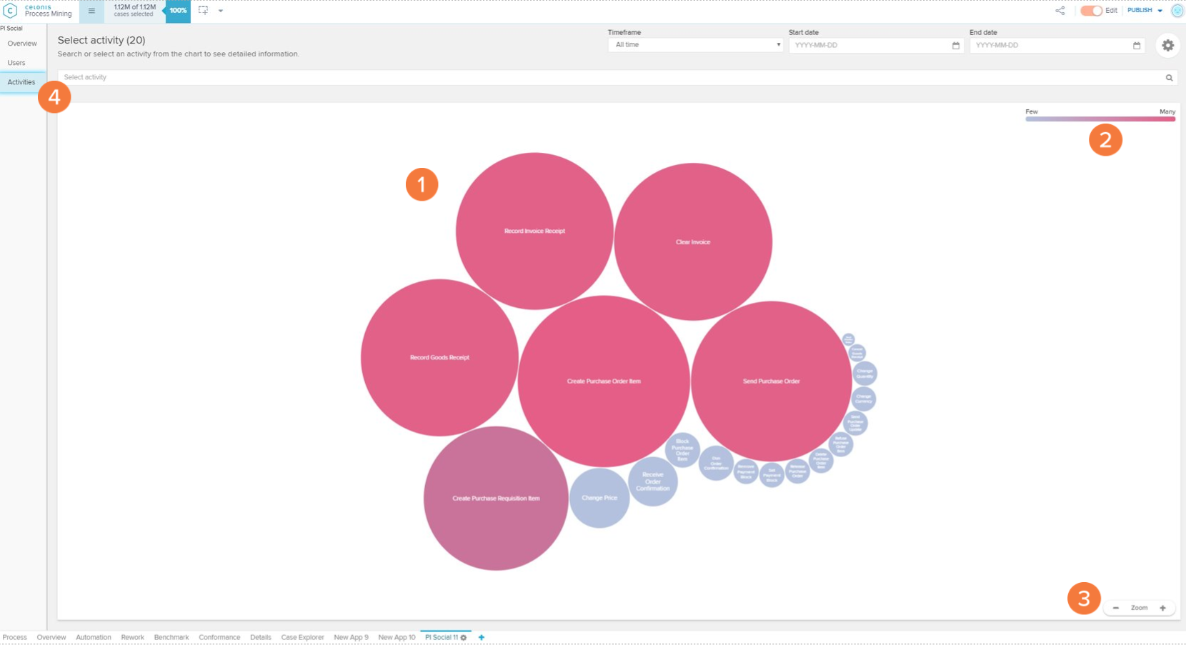
The Activities screen shows the most frequent activities in the current case selection.
Activities chart: each circle on the activities chart represents a certain activity that occurs in the analysed process. The size and tone of the circle are associated with the frequency of events per day in which this activity occurs (the bigger and darker the bubble, the higher the frequency). By clicking on an Activity Circle, you are able to see metrics or filter your analysis to this activity (see 5 to 8).
Activity circle color scale: the scale explains the color gradient of the activity circles. The lighter the tones, the fewer events per day are associated to an activity.
Zoom: allows the user to zoom out (' - '), zoom in (' + ') or reset the zoom (hover the mouse over the 'Zoom' keyword to visualise the 'Reset' button) of the Activities chart.
Activity selector: dropdown selector for searching and selecting an activity in order to open its activity profile (see 'Activity Profile' section).
Go to activity profile: opens the activity profile of the selected activity circle (see 'Activity Profile' section).
View cases in: view the selected activity circle activity on other tabs of your analysis.
Event count: daily average number of events with the selected activity.
Number of users: displays the number of users who execute this activity per day.
Cases come from: contains the activity that most commonly precedes the selected activity, and the relative frequency (in percent) this happens.
Cases go to: contains the activity that most commonly proceeds the selected activity, and the relative frequency (in percent) this happens.
Activity Profile
 |
 |
 |
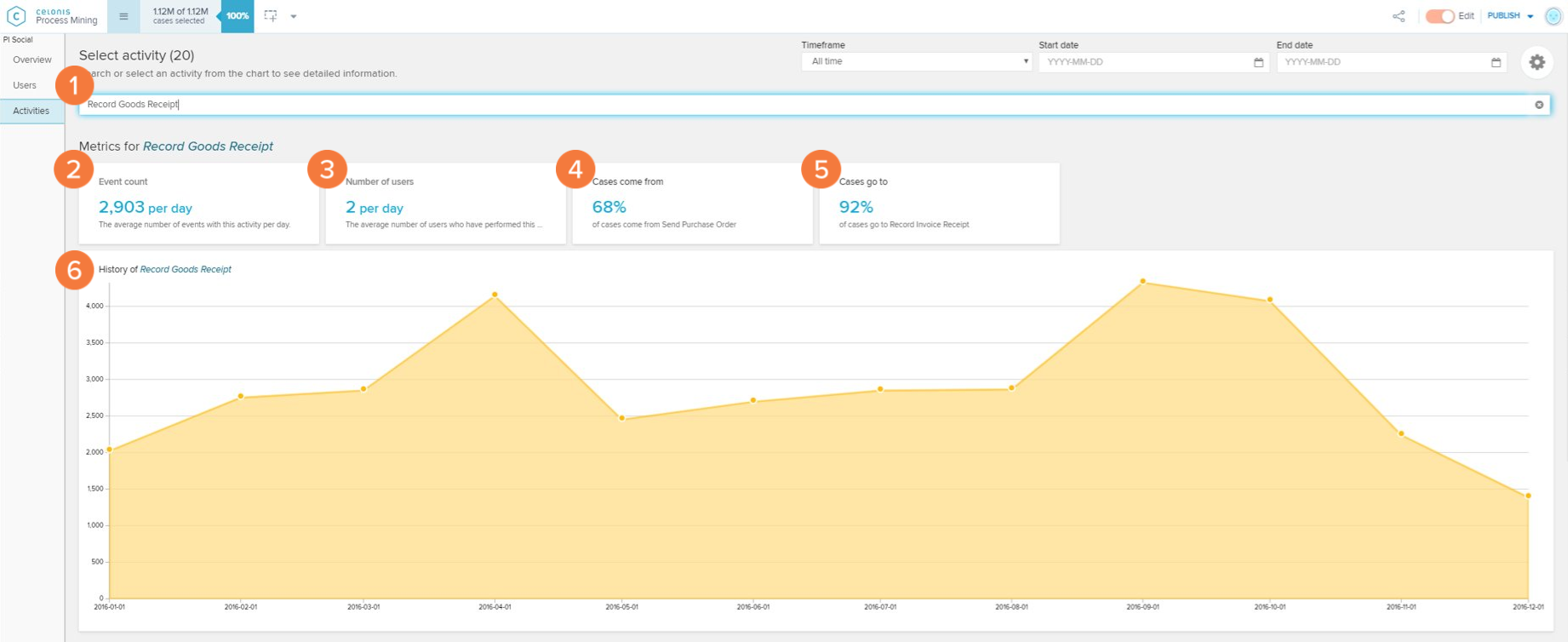
The Activity Profile screen shows metrics and graphs on a selected activity.
Activity selector: change current activity whose profile is being visualised or cancel the selection.
Event count: daily average number of events with the selected activity.
Number of users: displays the number of users who execute this activity per day.
Cases come from: contains the activity that most commonly precedes the selected activity, and the relative frequency (in percent) this happens.
Cases go to: contains the activity that most commonly proceeds the selected activity, and the relative frequency (in percent) this happens.
History chart: the chart displays the trend for the average event count per day for this activity through different months.
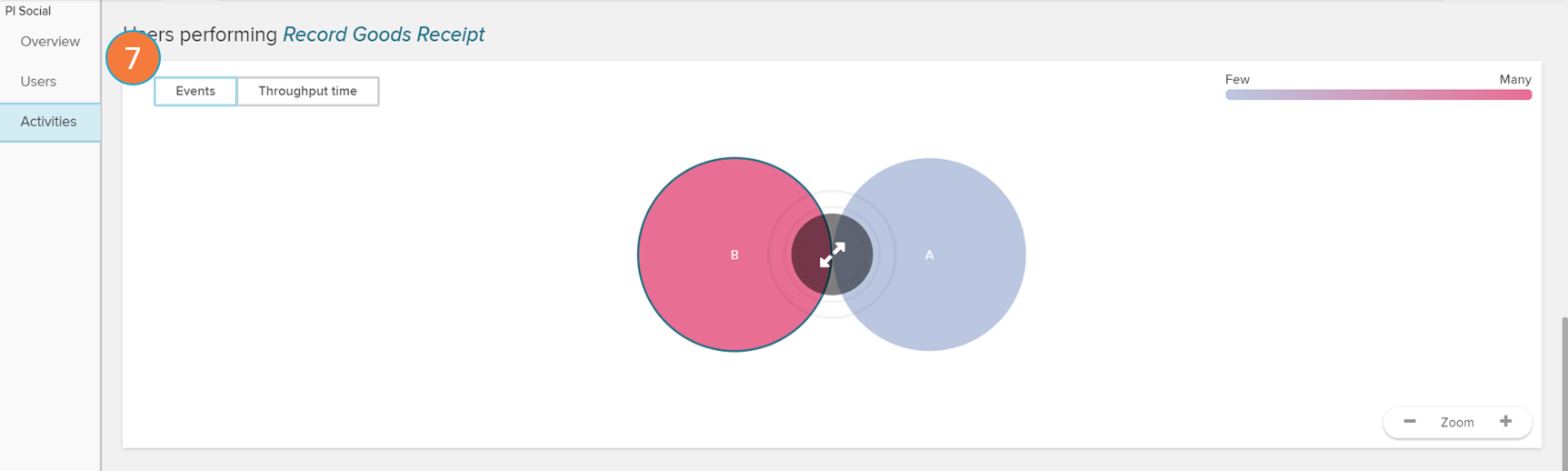
Users performing: opens up the user panel (see 'Users' section) filtering only the users that perform the selected activity.
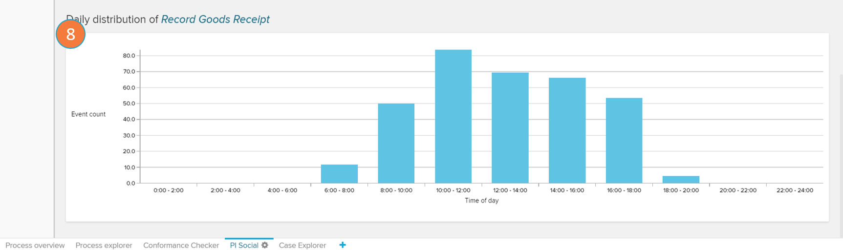
Daily distribution chart: displays a histogram with the average event count of the selected activity according to the part of the day in which they occur.