Creating overview pages
You can create overview pages for your Process Designer instance, providing landing pages for users when they sign into their accounts or click Home. Overview pages can be customized to show the information most relevant to you and your organization, with common use cases including:
Navigation: Create entry points or dashboards that allow users to drill down into more detailed process models or sub-processes.
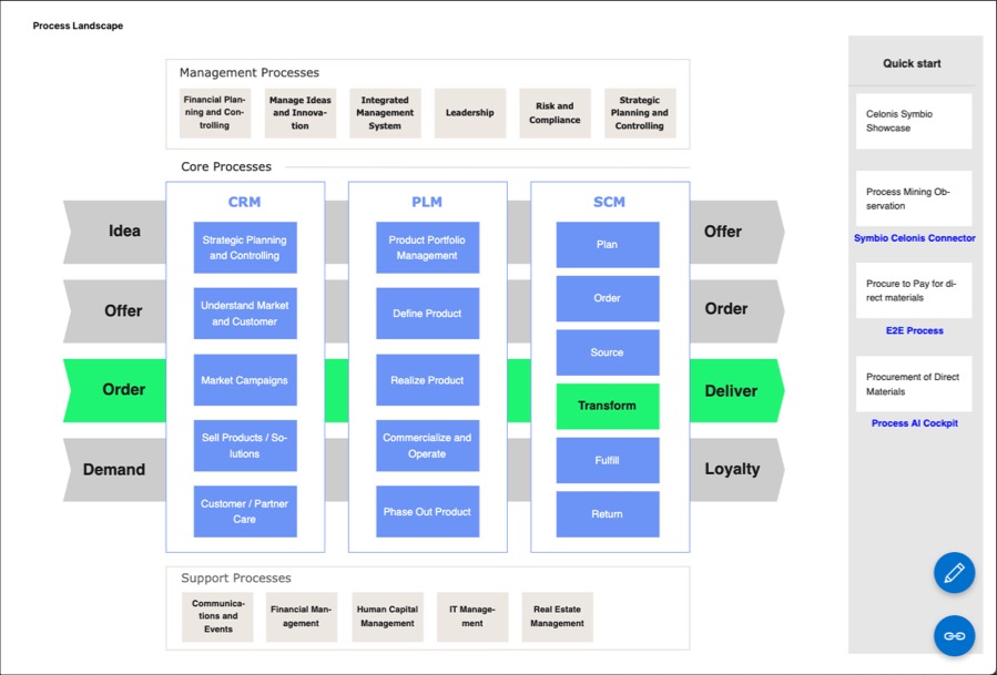
High-level visualization: Help your users visually view and understand the structure and flow of your processes without getting into technical details.
Context: Show how individual processes fit into the broader business or departmental context, showing how various objects (like departments, IT systems, or sub processes) are connected and interact with each other.
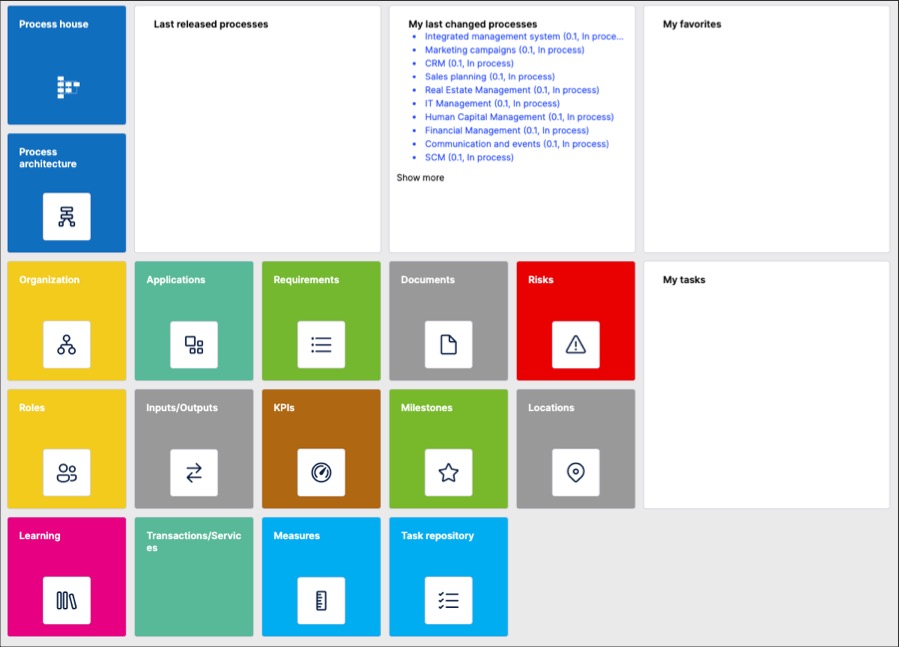
Two examples of overview pages in Process Designer:
Creating and managing overview pages
As an architect, to create overview pages in Process Designer editor mode:
Click Home - Configuration.
Add an overview page name and click New.
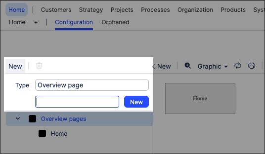
The overview page is created and ready for editing,
Select the newly created overview page and use the canvas to edit the page.
You can add widgets to the page, with further details here: Overview page widgets
Click Save.
Overview page widgets
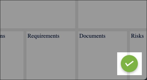
When editing your overview pages, you can add widgets by clicking New:
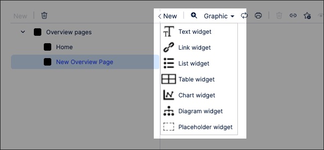
The following widgets available:
Widget | Information | ||||||||||||||||
|---|---|---|---|---|---|---|---|---|---|---|---|---|---|---|---|---|---|
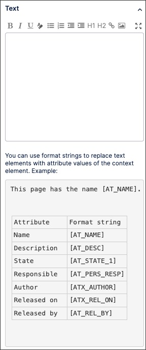
Text | Create a dynamic text box using the rich text editor. This widget includes the following options:
 | ||||||||||||||||
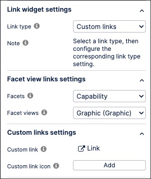
Link | Create a link to a Process Designer view or an external site. This widget includes the following settings:
 | ||||||||||||||||
List | Create an interactive list. This widget includes the following settings:
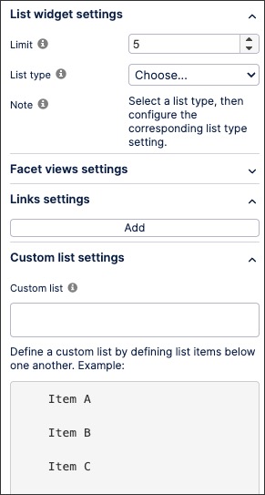 | ||||||||||||||||
Table | Add and configure an interactive table. This widget includes the following settings:
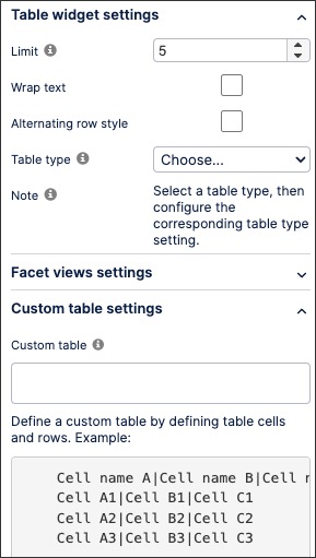 | ||||||||||||||||
Chart | Add and configure an interactive chart. This widget includes the following settings:
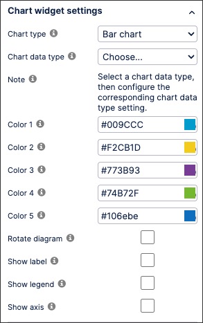 | ||||||||||||||||
Diagram | Add a process graphic from a repository object. This widget includes the following settings:
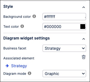 | ||||||||||||||||
Placeholder | Add a holding tile to your overview page, allowing you to come back and edit it when needed. |