Knowledge Model - Custom Objects and Custom Attributes (legacy Views only)
Note
Custom objects and custom attributes can only be used with legacy Views in Studio and aren't supported in the new Studio experience. We recommend migrating away from Legacy Views and taking advantage of the enhanced features offered by our Studio Views experience.
For more information about legacy Views, see: Studio feature availability matrix.
You can define custom objects and custom attributes in your KM using YAML to extend your legacy View components. These can only be used in legacy Views within Studio when the complementing View components know how to read them, with anything else limited to the KM.
Custom Objects make use of Custom Attributes (customAttributes) which can hold arbitrary information.
Display content rules are visual customizations of Studio components based on boolean conditions.
Display content rules apply a specific visual style to an object based on a specific logic. This logic is defined by users and contains a condition usually applied to a value. If the condition described in the logic is met, the style of the object can be changed. This means adding an icon or an avatar, adding borders or background colors, or changing the style of the object’s font.
Display content rules can be applied to the KPI Lists, Attribute Lists, Tables and in some cases, to Histogram components within Views. Display content rules must be first created in the Knowledge Model in order to be accessible from inside the View Components. In order to apply a display content rule to an object, the display rule must be added in the Styling rule dropdown for the object.
Display Content Rules are composed of three parts:
Naming: Shows what the display content rule is called and what its ID is:

Logic: Contains the boolean statement that must be true for the display content rule to be implemented. This logic has two components:
Comparator: Condition that will be tested against the value for the Display Content Rule to be activated. Some comparators can be used together to create more complex logical rules.
Value: Value against which the condition must be fulfilled for the Display Content Rule to be activated. The format the value must be in depends on the selected comparator.

The following comparators can be used in Display Content Rules:
Comparator
Evaluates to TRUE if…
Data Type
“IS_EMPTY”
The object the rule is applied to is empty. Does not need to be compared to a value.
Int | float | date | string
“IS_NOT_EMPTY’
The object the rule is applied to is not empty. Does not need to be compared to a value.
Int | float | date | string
“TEXT_CONTAINS”
The text of the object the rule is applied to contains the text in the value operator.
string
“TEST_DOES_NOT_CONTAIN”
The text of the object the rule is applied to does not contain the text in the value operator.
string
“TEXT_STARTS_WITH”
The text of the object the rule is applied to starts with the character(s) specified in the value operator.
string
“TEXT_ENDS_WITH”
The text of the object the rule is applied to ends with the character(s) specified in the value operator.
string
“TEXT_IS_EXACTLY”
The text of the object the rule is applied to is exactly the same as the one specified in the value operator. This operator is case sensitive.
string
“DATE_IS”
The date of the object the rule is applied to is exactly the same as the one specified in the value operator.
date
“DATE_IS_BEFORE”
The date of the object the rule is applied to is before the one specified in the value operator.
date
“DATE_IS_AFTER”
The date of the object the rule is applied to is after the one specified in the value operator.
date
“GREATER_THAN”
The value stated in the rule is greater than the the object the style is applied to.
Int | float | date
“GRATER_THAN_OR_EQUAL”
The value stated in the rule is greater than or equal to the the object the style is applied to.
Int | float | date
“LESS_THAN”
The value stated in the rule is less than the the object the style is applied to.
Int | float | date
“LESS_THAN_OR_EQUAL”
The value stated in the rule is less than or equal to the the object the style is applied to.
Int | float | date
“EQUAL”
The value stated in the rule is equal to the the object the style is applied to.
Int | float | date | string
“NOT_EQUAL”
The value stated in the rule is not equal to the the object the style is applied to.
Int | float | date | string
“BETWEEN”
The value of the object the styling rule is applied to is between the values stated in the rule. These values can be stated as [value1, value2].
Int | float | date
“NOT_BETWEEN”
The value of the object the styling rule is applied to is not between the values stated in the rule. These values can be stated as [value1, value2].
Int | float | date
Tip
When building a rule with more than one comparator, make sure that your conditions are mutually exclusive so that your desired style is applied to the correct value.
Tip
Conditions are evaluated in the same order they are listed within the rule.
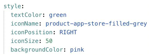
Style: Visual changes executed to the object once the logic in the display content rule is applied. There are four types of style changes:
Icon: Adds an icon next to the object’s content.
Avatar: Adds an icon with the first character of the value the style is applied on.
Font: Changes the format of the object’s font.
Background/Borders: Changes the look of the object background or adds borders to the object.
The following styling options are available in combination with the following components:
YAML operator
Description
Options
KPI List
Attribute List
Table
Histogram
iconName
Specifies the icon that should be added to the rule.
Yes
Yes
Yes
No
iconSize
Defines the size of the icon.
px size
Note
Max size varies based on component.
Yes
Yes
Yes
No
iconFont
Defines if icon specified under iconName should show its iconFont version.
TRUE|FALSE
Yes
Yes
Yes
No
avatar
Adds an avatar to the cell the value is expressed in.
true | false
Yes
Yes
Yes
No
avatarSize
Defines the size of the avatar.
xs | sm | md | lg | xl
Note
Max size varies based on component.
Yes
Yes
Yes
No
avatarURL
Indicates the direct web address of the image file being used as the profile picture or avatar.
Valid URL
Note
Must be used with an attribute that contains the UserName value.
Yes
Yes
Yes
No
avatarColor
Defines the color of the avatar.
Hex of CSS color
Yes
Yes
Yes
No
iconPosition
Defines where the icon will be located in regards to the value.
LEFT | RIGHT | ONLY_ICON
Yes
Yes
Yes
No
label
Applies style only to the value of object instead of the cell the object is in.
true | false
Yes
Yes
Yes
No
backgroundColor
Defines the background color of the cell the value is in.
This must be configured in the following format (replacing the HEX value for the color of your choice):
"#FE4854"
Hex of CSS color
Yes
Yes
Yes
Yes
textColor
Defines the text color of the value.
Hex of CSS color
Yes
Yes
Yes
No
border
Defines the border width, style and color properties.
Yes
Yes
Yes
No
borderRadius
Defines the width of the radius applied to the border corners to make them rounded.
px size
Yes
Yes
Yes
No
fontSize
Defines the size of the font the value is expressed in.
px size
Yes
Yes
Yes
No
fontItalic
Applies italics to the font the value is expressed in.
TRUE | FALSE
Yes
Yes
Yes
No
fontWeight
Applies bolding to the font the value is expressed in.
Yes
Yes
Yes
No
YAML examples of display rules
One comparator example:
customObjects:
  - id: DISPLAY_RULE_1
    displayName: Display rule 1
    customAttributes:
      - comparator: GREATER_THAN_OR_EQUAL     # comparator is used to compare value from ``DISPLAY_RULE.customAttributes.value`` to the value from PQL
        value: 1000       # value to compare. In case you use the comparator BETWEEN, you would define the value as such: '[8,15]'
        style: #styles to change the cell's appearance
          textColor: green #CCS collar or HEX code
          backgroundColor: "#FE4854"
          fontSize: 16px
          fontItalic: false
          fontWeight: bold
Two comparator example:
customObjects:
 - id: DISPLAY_RULE_4
    displayName: Display rule 2
    customAttributes:
      - comparator: LESS_THAN
        value: 1000
        style:
          textColor: red
          backgroundColor:"#FE4854"
          fontSize: 16px
          fontItalic: true
          fontWeight: bold
      - comparator: GREATER_THAN_OR_EQUAL
        value: 1000
        style:
          textColor: green
          backgroundColor: "#FE4854"
          fontSize: 16px
          fontItalic: false
          fontWeight: bold
Dropdown item components can be used to define breakdown items for your dropdown.
YAML example
customObjects:
  - id: TIME_DROPDOWN
    displayName: Time Dropdown
    customAttributes:
      list:
        - name: DAY
        - name: WEEK
        - name: MONTH
The priority switcher allows you to set a Priority KPI as a company or department goal and pass it over as input for other components, e.g. to sort tasks and actions. As an example, task lists can be sorted according to the main objective to optimize towards. This objective is defined in form of a KPI that should change over time to a certain direction.
If the Priority Switcher is implemented in a View, it is displayed next to the title of the View.
In the priorities section of your record, add one or arbitrary priorities. Make sure that you are connecting the priority to an existing KPI. This link makes sure that the priority icon is displayed on a KPI. In case you don't want this link, you can enter a dummy KPI.
Priority switcher YAML example
records:
  - id: INVOICE
    displayName: Invoice
    priorities:
    - id: CASH_DISCOUNT_PRIORITIZATION
      displayName: Cash Discount
      pql: CASE WHEN "BSEG"."BELNR" IN ('0120205969', '9330002454', '5110056998',
            '5110055916', '5110055917', '5110052424', '5110056999', '5110052423')
            THEN 'Urgent' WHEN DAYS_BETWEEN(TO_TIMESTAMP(  '10012020'
            ,'MMDDYYYY'), ADD_MONTHS(PU_MIN("BSEG",
            "_CEL_AP_ACTIVITIES"."EVENTTIME", "_CEL_AP_ACTIVITIES"."ACTIVITY_EN" =
            'Cash Discount Due Date passed'),6)) < 0 THEN 'Low' WHEN
            DAYS_BETWEEN(TO_TIMESTAMP(  '10012020' ,'MMDDYYYY'),
            ADD_MONTHS(PU_MIN("BSEG", "_CEL_AP_ACTIVITIES"."EVENTTIME",
            "_CEL_AP_ACTIVITIES"."ACTIVITY_EN" = 'Cash Discount Due Date
            passed'),6)) < 5 AND DAYS_BETWEEN(TO_TIMESTAMP(  '10012020'
            ,'MMDDYYYY'), ADD_MONTHS(PU_MIN("BSEG",
            "_CEL_AP_ACTIVITIES"."EVENTTIME", "_CEL_AP_ACTIVITIES"."ACTIVITY_EN" =
            'Cash Discount Due Date passed'),6)) >= 0 THEN 'Low' ELSE 'Medium' END
      kpi: LOST_CASH_DISCOUNT
KPIs need to be activated to be displayed in the Priority Switcher. To do this, add the customAttribute "active: true". This will make the KPI selectable in the priority switcher.
YAML example
kpis:
  - id: LOST_CASH_DISCOUNT
    displayName: Lost Cash Discount
    customAttributes:
        absoluteCalculation: true
        active: true #required Defines if the KPI should be considered by the Priority Switcher
    pql: ( SUM(CASE WHEN MONTH("BKPF"."CPUDT") = 4 THEN "BSEG"."SKFBT_CONVERTED" *
        "BSEG"."ZBD1P"*1.1 * 0.01 ELSE "BSEG"."SKFBT_CONVERTED" *
        "BSEG"."ZBD1P"*0.01 END) - SUM(CASE WHEN "BSEG"."ZBD1P" > 0 AND
        "BSEG"."SKFBT_CONVERTED" > 0 THEN  "BSEG"."SKNTO_CONVERTED" ELSE NULL END)
        ) * 2
    filterIds: []
    format: $.3s
    breakdowns: []
    aggregations: []
    parameters: []
    desiredDirection: DECREASE
    priority: false
type: KPIUse the Recommendation component on Views to list out different recommendations on how to improve a KPI. Details about the recommended improvement measures can be provided in Profile Views.
Recommendation List Components are defined in the customAttribute section in KPIs.
YAML example
kpis:
  - id: TOTAL_REVENUE
        displayName: Total Revenue
        customAttributes:
        recommendations:
          - id: RECOMMANDATION_REVENUE
                displayName: High volume of outstanding order shipments
                filter: CASE
                firstKpi: null
                secondKpi: null
                process: RM
          - id: RECOMMANDATION_REVENUE_2
                displayName: High inventory for low-demand products
                filter: CASE
                firstKpi: null
                secondKpi: null
                process: RM
|