Configuring a button
Adding and configuring a button component to a View is one of the most effective ways to transform a static dashboard into a fully interactive and actionable application. Buttons can be used for a number of use cases, including displaying linked Views and opening another View or a URL.
The benefits of adding buttons to your View include:
Enhanced navigation and user flows: Buttons help guide the user through the application and manage data views efficiently
View-to-View navigation: A button can be configured to redirect the user to a specific, related View, either within the same app or in a different one. This is crucial for designing a clear, logical user journey.
Open external links: Buttons can open external URLs (like a transactional record in an ERP system) and dynamically pass filtered data or variables to the external system, providing a seamless "jump" from Celonis to the system of record.
Tab navigation/overlays: You can use a button to open another section of the View, such as a different tab, or display another View as an overlay (modal or side-panel) to show supplementary information without leaving the current screen.
Dynamic filtering and display control: Buttons can be used to control the state of the data and components within the current View, making the dashboard dynamic.
Set variables: A button can be used to set the value of a View Variable. This single action can then instantly change the data displayed across multiple components on the View (charts, KPIs, tables) that reference that variable.
Toggle components: By using buttons to set variables, you can effectively show or hide components based on the variable's value, helping to save screen space and keep the interface clean (e.g., toggling between a bar chart and a table view).
Improved user experience: Buttons are highly configurable with custom labels, icons, sizes, and colors (variants like primary or danger), allowing designers to apply visual cues that align with the action being performed.
Clear Call-to-Action: A button provides a clear, unmistakable visual cue for the next logical step the user should take.
To configure a button in your Studio Views:
In View Edit Mode, drag and drop the button component into your View.
Open the component settings menu and customize your configuration using the following options:
Button label: This is the text displayed on the button. You can enter static text (e.g., "Apply Filters") or use ${ } to input PQL expressions or Variables, allowing the label to change dynamically based on your data.
Interactions: This section defines what happens when a user clicks the button. You can layer multiple actions:
Add Action: Click this to define custom triggers.
Switch container tabs: If your view has a "Tabs" component, toggling this allows the button to jump to a specific tab automatically.
Open linked view: Links this button to another View within the same package.
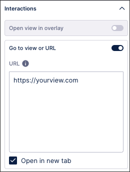
Go to view or URL: Redirects the user to a different Celonis View or an external website.
Update variable: A powerful feature used to change the value of a Knowledge Model variable or View variable when the button is pressed (often used for custom filtering or "Reset" buttons).
Open message: Lets you create a message that displays in the View when the user clicks the button.
Button style: See: Button styles.
Icon: You can add a visual cue (like a checkmark or arrow) from the dropdown library to sit next to your text.
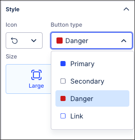
Button type: Choose between primary, secondary, danger, and link.
Size: You can toggle between Large and Small to adjust the button's footprint on the canvas.
Click Interactive Mode and preview your button configuration.
Optional: To see the latest version of your View, deploy the package
In this Order Management Starter Kit, two buttons have been configured that display linked Views as overlays when clicked:
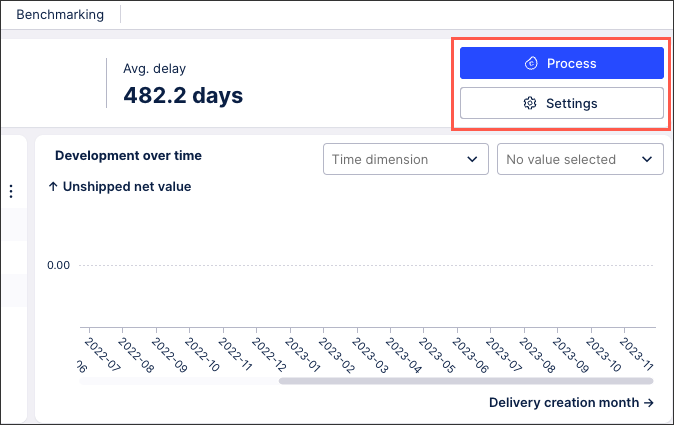 |
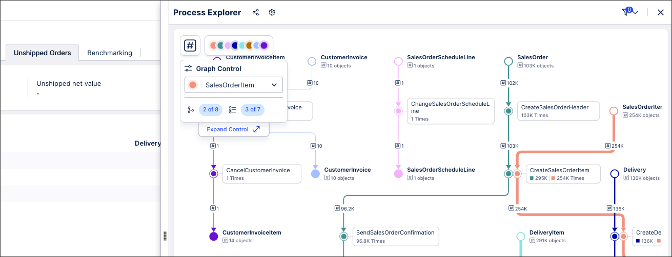
For example, by clicking Process, the user can see the Process Explorer for this metric:
 |
For more information about configuring linked Views, see: Linked Views.
You can also configure buttons to open another View or an external URL:
When configuring your buttons, you can select a button icon, button type, and button size (which can also be manually resized within edit mode).
The following icons are available: Add, arrow up, attach, Celonis logo, chevron up, chevon down, chevron left, chevron right, download, edit, filter, hide, idea, info, link, notification, open in new tab, reset, resolve, send email, settings, and show.
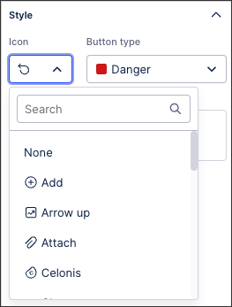
The following button types are available: Primary (blue), secondary (white), danger (red), link (white with blue outline).
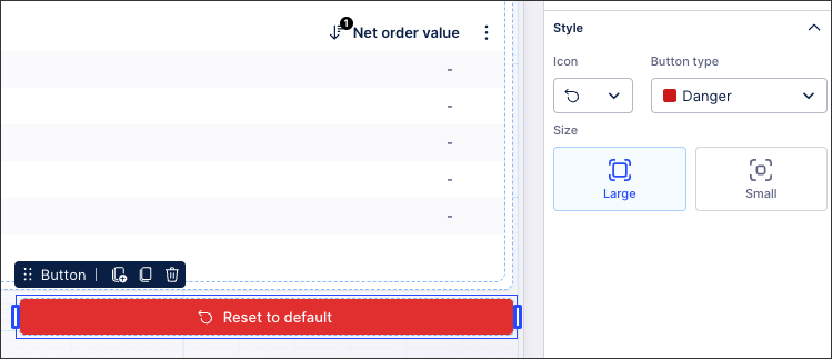
In this example, the 'Danger' button has been used to allow users to reset their View to default values:
 |