Area chart
An area chart visualizes quantitative data across a continuous dimension, such as time, by filling the area beneath a line to emphasize the size of the values. It works like a line chart but highlights the data through shading, making trends and cumulative changes easier to see.
In Studio Views, area charts are configured using a minimum of one dimension and one metric.
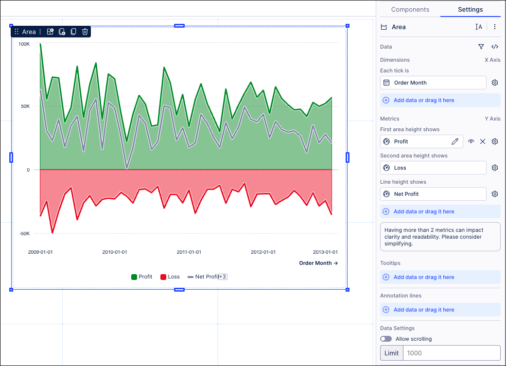
In this example, an area chart is used to display the profit (metric), net profit (metric), and loss (metric) levels per month (dimension). The chart shows:
Green area (profit): The total profit earned in each month.
Red area (loss): The total loss in each month.
Gray line (net profit): Represents net profit (profit minus loss).
X axis / Y axis: Order month (dimension), profit / loss (metrics)
From this chart, you can see that the net profit generally stays positive, since the green (profit) is consistently larger than the red (loss). There are repeating peaks and dips, suggesting possible seasonal patterns.
You should consider using an area chart for you data when you're looking to:
Emphasizes magnitude: The shaded area highlights the volume of data, making it easier to see how much of something (profit, loss, revenue, etc.) is being measured, not just the trend.
Show cumulative trends: Ideal for showing how values add up over time (e.g., profit vs. loss), making it clear which portion contributes more to the total.
Compare data: By stacking or overlaying multiple series (like profit and loss), you can directly compare how different components contribute to the whole.
However, you should avoid using an area chart if you have too many overlapping series, making a very cluttered chart that's hard to see exact values for.
To configure an area chart for your Studio view:
In View Edit Mode, drag and drop the area chart component into your View.
Open the component settings menu and customize your configuration using the following options:
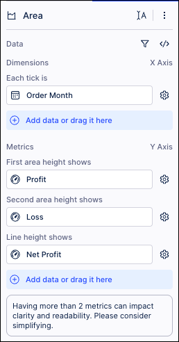
Data: Use the PQL editor to select the data to display in your area chart.
Dimension - each tick is: Use the PQL editor to add the metric displayed on the X-axis. In our example, we've selected Order Month.
Metrics - first / second height area shows: Use the PQL editor to add the metrics you want to display in the chart. In our example, we've selected profit and loss.
Metrics - Line height show: Use the PQL editor to add the metrics you want to display as a line within the area chart. In our example, we've configured Net Profit (calculated as profit minus loss).
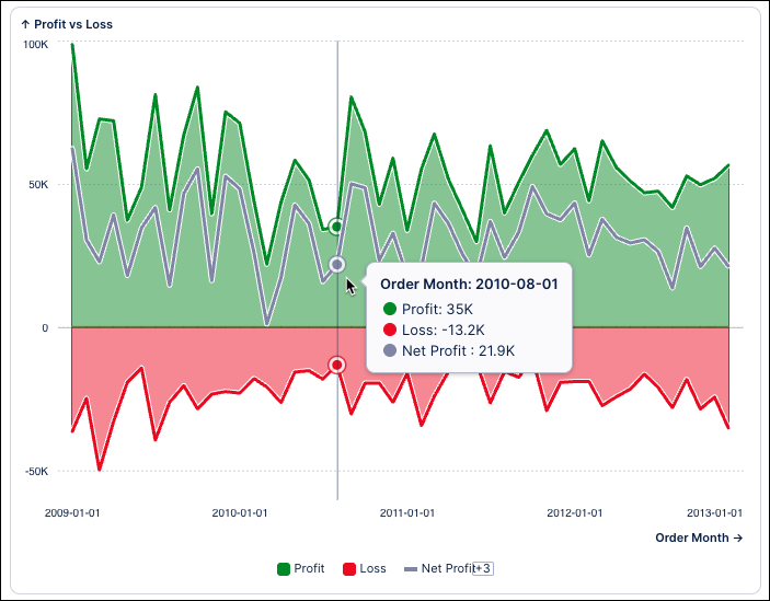
Tooltips: Decide if you want your chart to display information when you hover over it. In our example, when you hover over a point, the tooltip displays the exact data (e.g., profit = 35K, loss = –13.2K).
Annotation lines: Used to draw lines on the chart area. This can be useful for highlighting information such as a threshold. You can also choose to display your lines by name, value, or using both.
Allow scrolling: When allowing scrolling, you can select where the scrolling start position is by selecting between default, scroll from top, and scroll from bottom.
Alternative display options: Based on your configuration, you may be prompted to try displaying your data using other Studio component types. If you select an alternative type, any configurations made to your chart component will be reset to default.
Interactions: Enable and disable whether users can set temporary filters when interacting with that component. For more information, see: Temporary filters for Apps.
Exclude from predefined filters: When enabled, this removes the component from any filters that are set on a View and tab level.
Exclude from user filtering: When enabled, this prevents the app user from apply a temporary filter to the data within the component.
Can't be used to set filters: When enabled, this prevents the app user from using the component to set temporary filters for the whole View.
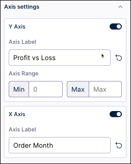
Axis settings: Enter custom distribution and dimension axis labels.
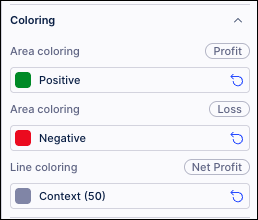
Coloring: Select the colors for your area. In our example, we've used green (positive), red (negative), and gray (net profit line)
For recommendations on effective colors, see: Studio coloring best practice.
Click Interactive Mode and preview your chart configuration.
Optional: To see the latest version of your View, deploy the package.