Date Picker
The Date Picker is an interactive input component that allows you to embed a calendar directly into your View. Its primary purpose is to capture a user's date selection and store it as a variable, which then acts as a dynamic trigger to update other components—like tables, charts, or text boxes—based on that specific time frame.
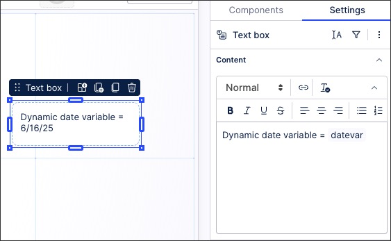
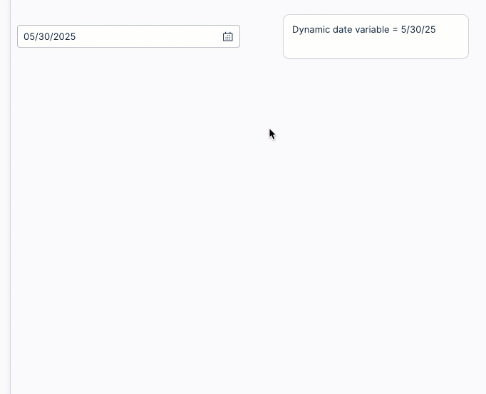
For example, a single date picker is used to update the variable in the text box:
To configure a date picker component for your Studio View:
In View Edit Mode, drag and drop the date picker component into your View.
Open the component settings menu and customize your configuration using the following options:
Date range or single date: Allow the user to select a date range (with start and end dates) or a single date.
Save input to variables: Choose which View or Knowledge Model variables to save the user input to.
For more information about variables, see: Enhanced variables
Data settings: Choose whether the apply selection limits, with the following options available:
None
Do not allow dates in the past
Do not allow dates in the future
Style: Enable quick selections for the user.
Click Interactive Mode and preview your date picker configuration.
Optional: To see the latest version of your View, deploy the package.
To configure the example, the date picker component settings are:
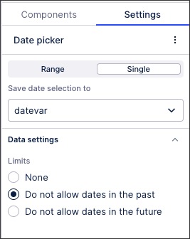
Single selection
Save date selection to 'datevar' View variable
Do not allow dates in the past
The text box configuration then includes the 'datevar' View variable as a dynamic field: