Input dropdown
Input dropdowns are a Studio component that let app users choose a value from a predefined list, then use that selection to dynamically update what’s displayed in the app. Input dropdowns work well for self-service apps, especially when you want users to view data from different time periods (e.g., “Last 30 Days”, “Quarter 1”), business entities (e.g., company code, plant, customer), and categories (e.g., product type, process variant).
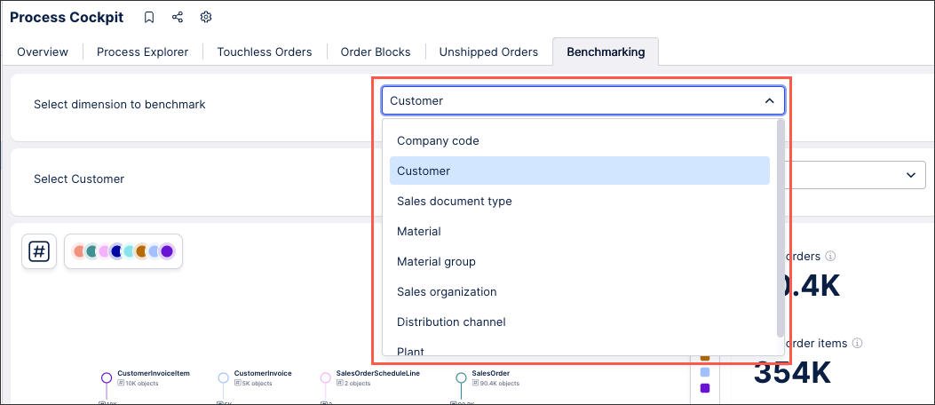
In this benchmarking app example, an input dropdown with manual inputs has been configured to allow the user to select the dimension to benchmark:
To configure an input dropdown for your Studio Views:
In View Edit Mode, drag and drop the input dropdown component into your View.
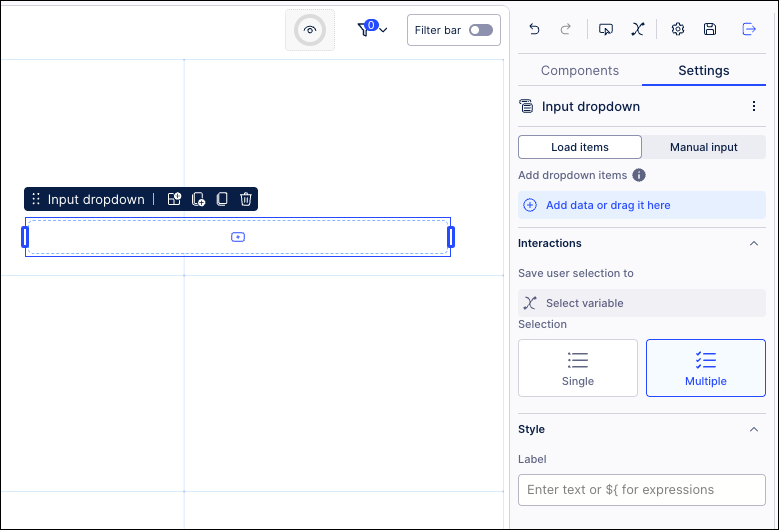
Open the component settings menu and customize your configuration using the following options:
Input type: Choose how the values are generated in your input dropdown, selecting from loading items or manual input:
Load items: Dropdown items are added based on your selection in the PQL editor. From the editor, you can select the column to create the dropdown items. See: Example - Input dropdowns with loaded inputs.
Manual input: Dropdown items are selected from existing attributes and metrics or entered as free form text. See: Example - Input dropdowns with manual input.
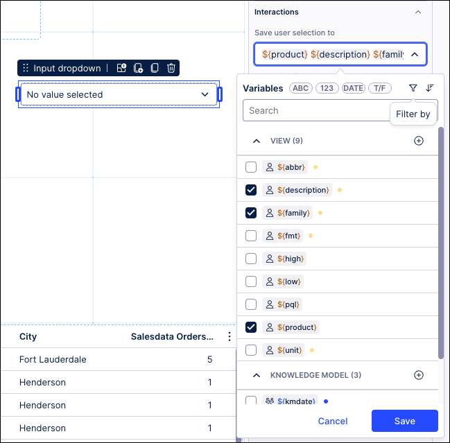
Interactions - Save user selection to variables: Choose one or multiple View and Knowledge Model variables to save input dropdown selections to. By saving the selection to variables, you can reuse this selection across Views and View components. See: Enhanced variables.
Note
The input dropdown will always display the current value of a variable. If the value of the variable is updated elsewhere in the app, it will also be updated in the input dropdown.
Interactions - Selection: Allow single or multiple selections from this input dropdown.
Style - Label: Add a default label for the dropdown by entering plain text or using smart inputs. See: Smart inputs.
For example, you can add free text and a variable to the dropdown using this expression:
Result: ${view_variable}
Click Interactive Mode and preview your button configuration.
Optional: To see the latest version of your View, deploy the package.
In the same benchmarking example, an input dropdown with manual inputs has been configured to allow the user to select the dimension to benchmark:
|
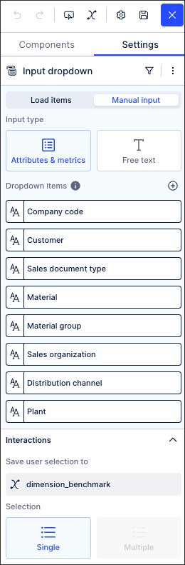
This input dropdown has been configured by manually adding each dropdown item and labelling them with 'Free text'. We've then also added a variable to save the user selection to:
In this example, the PQL statement for the 'Customer' dropdown item is:
"o_celonis_Customer"."CustomerNumberAndName"
You can also write values into multiple variables from a single selection in the input dropdown component. This works for string, number, date and boolean variables, but isn't supported for object variables.
For example, this app provides an input dropdown for users to switch between Consumer and Corporate views:
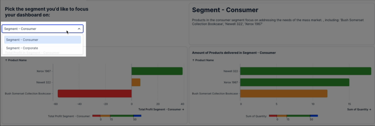
And for each selection, the input dropdown saves their choice to three variables:
And for a video showing this feature in use:
Object variables allow you to store the metadata of a particular metric or attribute in one single variable. This object variable can then be reference in View components such as input dropdowns, text boxes, and component fields.
In this example, we've configured an input dropdown with an object variable allow the app users to switch dimensions in a chart component:
This example can be configured using these steps:
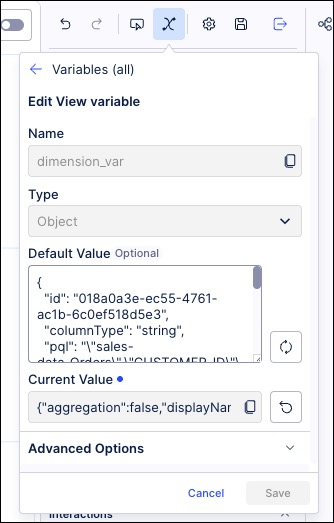
Create an Object variable in the same package as the View.
In our example, this is 'dimension_var'
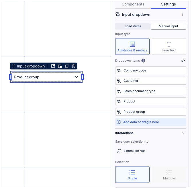
Configure an input dropdown that saves manual input to the object variable:
Configure a chart using the object variable as the dimension.
In our example, this shows as 'Product group'
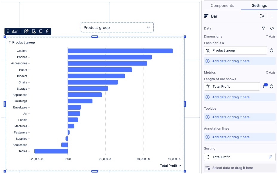
The PQL statement to configure this is:
${dimension_var.pql}And the PQL editor displays the same:
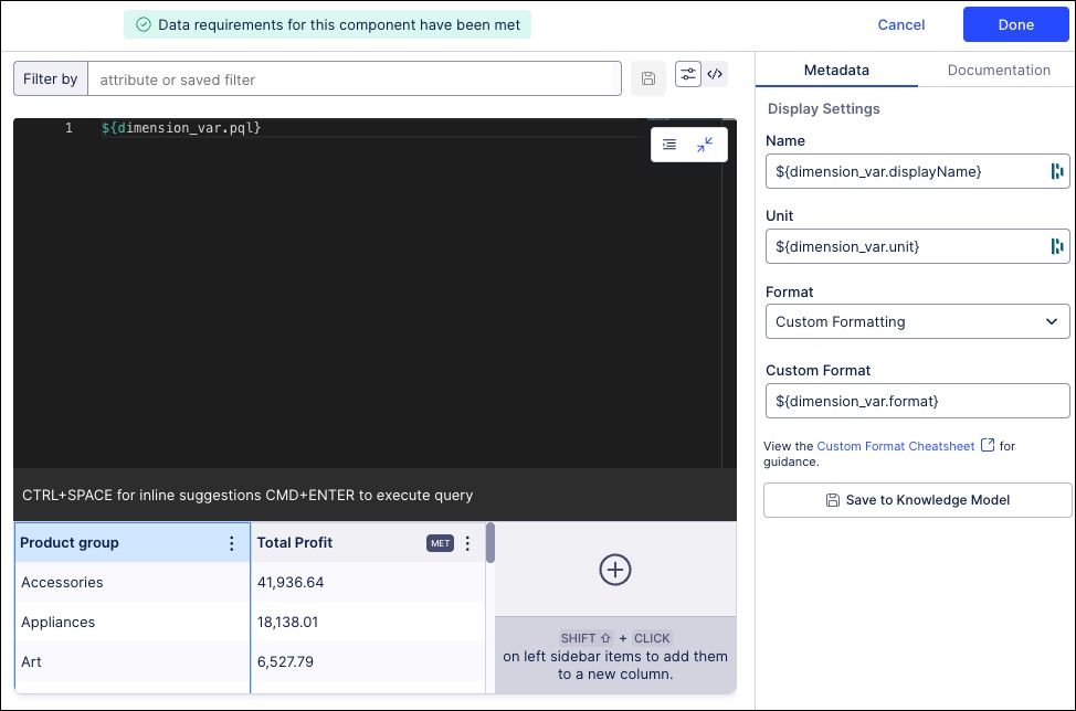
Configure the object variable display settings.
In our example, these are:
Name: ${dimension_var.displayName}
Unit: ${dimension_var.unit}
Format: Custom format
Custom format: ${dimension_var.format}
Click Preview and test the chart by switching dimensions.
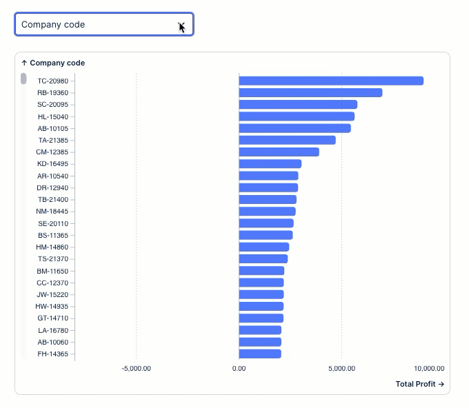
In the following benchmarking example, an input dropdown has been configured using entries loaded from the Knowledge Model:
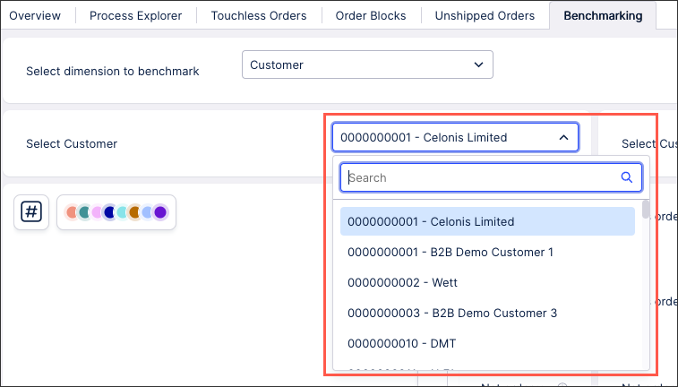 |
This input dropdown has been configured by creating a PQL statement and saving the user selection to a variable:
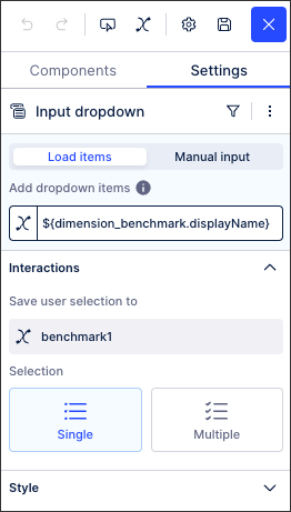
In this example, the PQL statement is:
${dimension_benchmark.displayName}You can search in input dropdowns using the following special (wildcard) characters:
_matches exactly one character.%matches zero or more characters.
For example, for these items Delivery Truck, Express Air and Standard Air, entering:
Express Ai_
returns Express Air only.
Entering:
%Air
returns both Express Air and Standard Air.
Important
If you're searching for a specific value, you must either enter that value exactly or use the special (wildcard) characters in your search. If your search term includes one of the special characters, you must use \ to escape it. For example, to search for TEAM_123_ABC, you could enter:
TEAM\_\123\_\ABC(exact value); or%123(values containing123); orTEAM\_\123%(values containingTEAM_123).