KPI-based coloring in Process Explorer and Variant Explorer
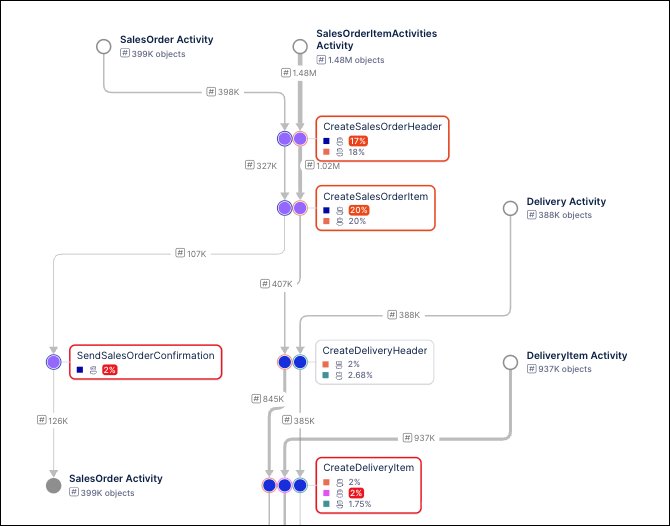
Process Explorer and Variant Explorer both offer the functionality to color code events and connections in your process graph based on the type of event or based on meeting a specified KPI threshold. For example, you can assign custom colors to specific events in order to identify inefficiencies or bottlenecks in your process.
You can also use colors to indicate the performance of an event or connection KPI using custom thresholds, so that events or connections with KPIs that have failed to reach a specified value will display in a different color than those that have exceeded it. For example, assigning colors based on these thresholds makes it easier to identify poorly performing activities that may be causing delays.
Color values can be specified for any KPI that is part of a custom KPI group. When the KPI group is saved, the coloring is updated in all components that are configured to include this KPI group.
To create a color mapping for your KPIs:
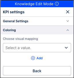
Go to your Studio View and enter the Edit Mode.
Select the explorer in which you want to add color mapping.
On the Settings tab, go to the KPI Groups section and click on the custom KPI group to which you want to add a color mapping.
On the KPI Settings, go to the Coloring section and then click the Add link.
In the Add Visual mapping window, enter a name for this color rule.
Choose the type of color mapping you want to use from the Add Visual mapping window and then assign values based on the sections below for the Gradient, Thresholds, or Categorical options.
When finished, click Save.
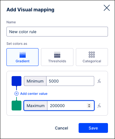
By using gradient coloring, you can choose how your values are colored based on their relation to the minimum, center, and maximum values assigned.
In the Add Visual mapping window, enter a name for this color rule and click the “Gradient” option.
Enter the lowest and highest values you want to display. Click the color swatch to assign a different color to either value, or leave these fields blank to include all data.
Click the Add center value link and repeat these steps to assign a central value if needed.
Click Save when finished.
By using threshold coloring, you can define the point at which your values change colors. Values above and below your specified threshold values will display in the assigned colors. You can further configure this mapping by adding more threshold levels above or below the initial value. Values in your View will change color when they exceed or drop below any of the assigned threshold.
In the Add Visual mapping window, enter a name for this color rule and click the “Thresholds” option.
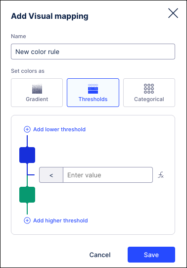
Enter the threshold value in the field provided.
Click the color swatches to choose a different color for values higher and lower than the threshold value.
Click the Add lower threshold or Add higher threshold links to assign additional threshold values and assign colors.
Click Save when finished.
In the Add Visual mapping window, enter a name for this color rule and click the “Categorical” option.
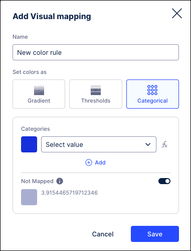
In the Categories section, select a value from the dropdown.
Click the color swatch to assign a different color.
Click the Add link.
Repeat these steps to assign additional values to this color mapping.
Click Save when finished.
Go to your Studio View and enter the Edit Mode.
Select the explorer component in which you want to assign the color mapping.
On the Settings tab, go to the KPI Groups section and click on the custom KPI group to which you want to assign a color mapping.
On the KPI Settings, go to the Coloring section and then use the dropdown to select the color mapping you want to apply to the selected explorer.
To remove the color mapping and return to the default colors, go to the Coloring section again and click the Reset to default link. The selected explorer is refreshed and the default color mapping is applied.
The Legend will display at the bottom of the process graph next to the Zoom controls, even if there are no color mappings applied. The Legend will show what events have been mapped to each color for the event coloring assigned to the explorer component. For color mappings that utilize threshold or gradient values, the Legend will show the values assigned as a range of colors. The color swatches to the right of the assigned KPI colors will indicate the event log where the mapping has been assigned.
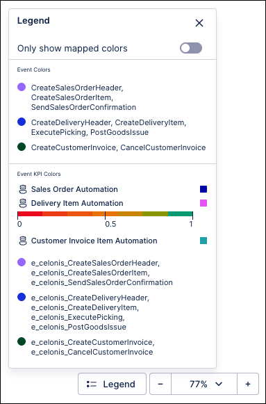 |
The Only show mapped colors toggle can be used to gray out the events using the default colors to make it easier to identify the mapped elements within the process graph. When this setting is enabled, only the events or activities that have colors assigned will be colored, while all elements of the process graph using default colors will be displayed in gray.
 |