Input box
Input boxes allow you to record a manually entered value from users and then use that value throughout your View. This saves the input as either a View variable or a Knowledge Model variable. This variable can then be used in other components to adjust the View based on the manual value entered by the user.
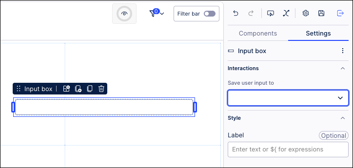
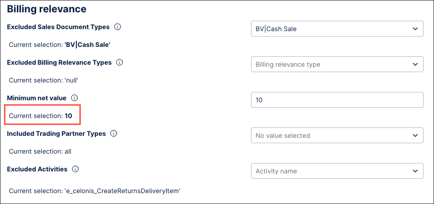
In this example, the input box allows users to enter the minimum net value:
 |
Adding input boxes to your Views offers a number of benefits, including:
Flexible user-driven filtering: Users can type in exact values (e.g., customer ID, order number, material code) rather than scrolling through long lists of filter options. Input boxes are particualarly useful when dealing with large datasets where dropdowns would be impractical.
Dynamically updating other components: When connected to charts, KPIs, and tables, the input box acts as a dynamic filter. This means that all linked components automatically update as the user types or submits a value.
Consistency across Views: A single input box can be tied to multiple KPIs, charts, and tables, ensuring all visualizations stay aligned with the same filter value.
To configure an input box for your Studio View:
In View Edit Mode, drag and drop the input box component into your View.
Open the component settings menu and customize your configuration using the following options:
Interactions - Save user input to: Choose one or multiple View and Knowledge Model variables to save input dropdown selections to. By saving the selection to variables, you can reuse this selection across Views and View components.
Style - Label: Add a default label for the dropdown by entering plain text or using smart inputs. See: Smart inputs.
Click Interactive Mode and preview your button configuration.
Optional: To see the latest version of your View, deploy the package.
In this example, the input box allows users to enter the minimum net value:
|
This input box example is configured by saving the user input as a Knowledge Model variable. In this case, the variable is a number type:
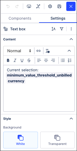
${minimum_value_threshold_unbilledcurrency)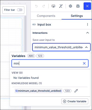 |
This variable can then be used in other components, such as a text box:
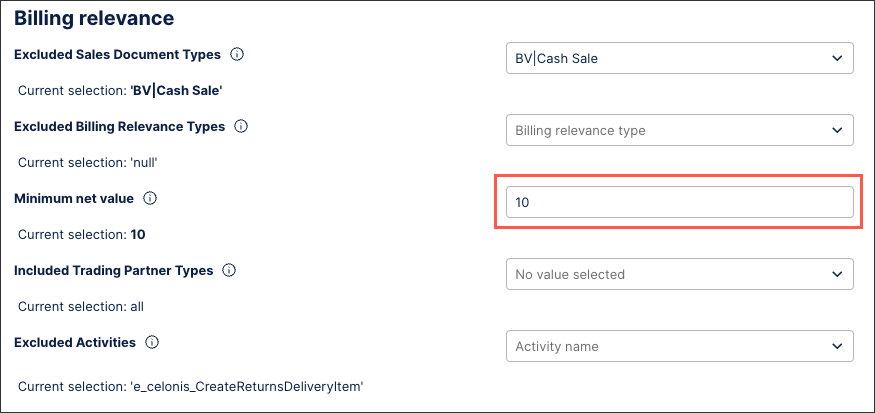
With the published version of the app showing the value entered (10):
 |