infoText
infoText is used to add an information icon with a title and description next to the title of another component, providing hints to your users. InfoText allow both plain text and HTML content, giivng you the ability to add images to your views.
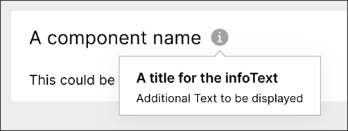
Basic infoText configuration
A basic infoText configuration includes a title and description, with an example displayed below:
The example YAML to configure a basic infoText component:
- id: "info"
  type: "text-box"
  settings:
    name: "A component name"
    content: "This could be your component"
    infoText:
      title: "A title for the infoText"
      content: "Additional Text to be displayed"
Advanced infoText configuration
An advanced infoText configuration includes a title and HTML based description, with an example displayed below:
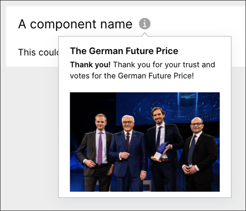
The example YAML for an advanced infoText configuration:
- id: "info"
  type: "text-box"
  settings:
    name: "A component name"
    content: "This could be your component"
    infoText:
      title: "The German Future Price"
      content: "<b>Thank you!</b> Thank you for your trust and votes for the German\
        \ Future Price! <br><br><img src=\"https://pbs.twimg.com/media/EKZ0c3gWsAAmRax?format=jpg&name=small\"\
        >"