Views Layout
Note
You're currently viewing a topic describing a Studio feature using the general availability feature set. This feature is also available in the new Studio experience, however both the design and the way it works may be different to what you see described here.
For more information about the new Studio experience, see: Studio (new experience)
Layout overview
Views are displayed as a (responsive) grid of components. Layout objects are rows, columns and tabs. They can be nested.
The components and the layout are linked through the componentId (defined in the layout element) that needs to match the id in the components section.
Layout configuration | Component configuration |
|---|---|
layout:
  rows:
    -id: row1
     order: 100
     columns:
     - id: row1-column1
       size: 1
       order: 100
componentId: Intro | components:
- id: Intro
type: text-box
settings:
title: My Intro Text
content: Some content |
Visual Layout Editing
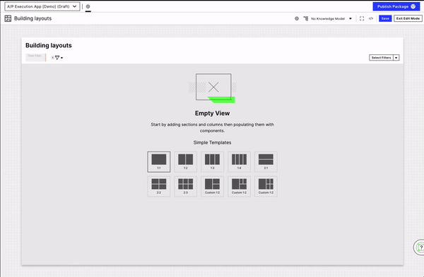
Instead of defining your view layout with YAML, you can also use the point-and-click visual editing capabilities.
You can:
Add new sections.
Create columns within sections.
Create subsections,
Create tabs.
Create new components.
Choose existing components.
Adjust the width and height of a section or column.
Adjust the styling of a section (background color, spacing).
Configuring rows
Rows need to contain at least one column. Even though the row should stretch over the whole width of the view, a column (in this case of size: 1) needs to be defined for the row.
Every row has an id and an order. The id can be configured explicitly (e.g. id: row1) or is otherwise auto-generated.
The key “order” defines the place of the row in the grid. A row withorder: 100will appear before a row withorder: 200no matter which one is configured “first” in the YAML file.
Row configuration options:
removePadding: truewill remove the initial padding of the rowscrollHorizontally: truewill show horizontal scroll if elements don't fitheight: 600defines a fixed height (in this case 600 pixels) for the whole row and the columns inside, can be string ("600") or number (600)growHeight: truewill grow the row to the rest of the available space automatically (often helpful for e.g. a Table as the last row). If there are multiple rows with growHeight, the space is distributed evenly (2 rows: each having 50% of the rest available space)
The width of a row cannot be configured per se. However, multiple columns could be added to a single row of which not all contain content.
Tip
There is no functionality yet to freeze a row (“sticky header"). However, this can be achieved through embedded views where the content that should be frozen is in the main view and the content that is scrollable is configured in the Embedded View.
Configuring columns
Columns must contain one of the following properties:
componentId:Will visualize the component defined on this view by a certain ID and needs to match the “id” of the component (please note case sensitivity).tabs:can nest tabs inside a column.layout:can nest layouts inside. This way, more rows within one column can be defined.
Columns can be of different sizes
size: 1/2defines the size of the appearance (in this case half of the row).height: 600defines a fixed height for the column. Not applicable if column height is larger than row height.
Columns can be of different types defining the visual appearance through type
none as the default option (does not need to be configured explicitly).
type: panelwraps the column with a bordered, rounded panel.type: panel-contentwraps the column with the bordered rounded panel with padding around the content.
Example configuration: 1 row with 4 columns
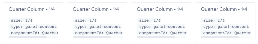
layout:
  rows:
        - id: row1
      columns:
        - size: 1/4
          type: panel-content
          componentId: QuarterColumn
          order: 100
          id: row1-column1
        - size: 1/4
          type: panel-content
          componentId: QuarterColumn
          order: 200
          id: row1-column2
        - size: 1/4
          type: panel-content
          componentId: QuarterColumn
          order: 300
          id: row1-column3
        - size: 1/4
          type: panel-content
          componentId: QuarterColumn
          order: 400
          id: row1-column4
Example configuration: Nested grid with 1 row with 2 columns, 1 of these columns having 2 rows
layout:
  rows:
        - id: row1
      columns:
        - size: 1/2
          layout:
            rows:
              - id: row1-column1-row1
                columns:
                  - size: "1"
                    type: panel-content
                    componentId: AdvancedNestedGrid
                    order: 100
                    id: row1-column1-row1-column1
                order: 100
              - id: row1-column1-row2
                columns:
                  - size: "1"
                    type: panel-content
                    componentId: AdvancedNestedGrid
                    order: 100
                    id: row1-column1-row2-column1
                order: 200
          order: 100
          id: row1-column1
        - size: 1/2
          type: panel-content
          componentId: AdvancedNestedGrid2
          order: 200
          id: row1-column2
Configuring tabs
Columns can contain tabs to structure content.
The following attributes can be configured: (*required)
label:represents the text displayed on the tab*.order:order of the tab (from left to right).id:the id would be auto-generated if not set explicitly. However, your YAML configuration gets easier to read when ID’s of layout elements are set explicitly.
one of the following is required:
componentId:links to the component that should be displayed within the tab.layout:a full layout can be used within a tab.
Example configuration: tabs
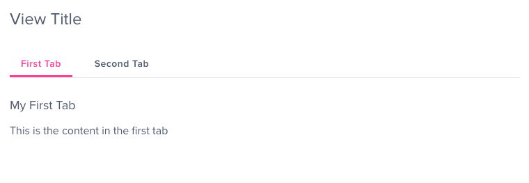
layout:
  rows:
    - id: row1
      columns:
        - size: 1/2
          tabs:
            - label: First Tab
              componentId: firstTabComponent
              order: 100
              id: row1-column1-tab1
            - label: Second Tab
              layout:
                            rows:
                  - columns:
                      - componentId: secondTabComponent_1
                        size: 1/2
                      - componentId: secondTabComponent_2
                        size: 1/2
              order: 200
              id: row1-column1-tab2
          order: 100
          id: row1-column1
However, only the content of one tab is accessible at a point in time so ask yourself “How important is the content?
Should it really be hidden behind a tab or is it too crucial for the user to make decisions?”.
Adding content vertically - which might create the need for scrolling - can be an alternative to using tabs.
Tip
Right now, using breakdowns to change table columns as might be known from Process Analytics requires defining inputs and custom attributes in the Knowledge Model. Using tabs can be a great alternative to achieve similar results. To do so you will simply put a similar table into each tab and adjust what you need to change.
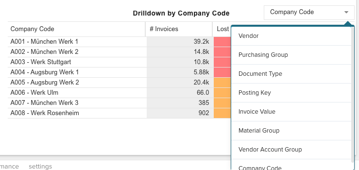
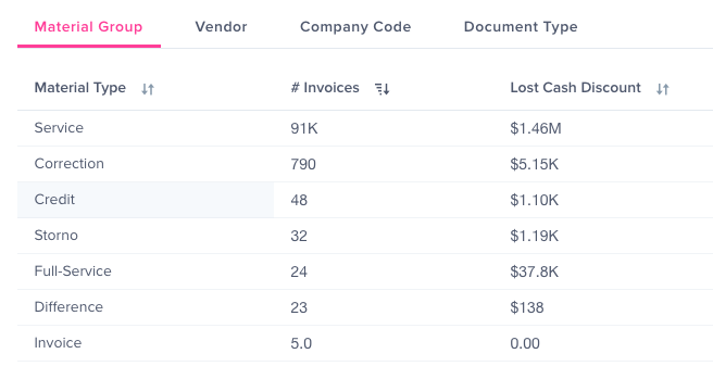
Drilldown in Process Analytics | Tabs in Studio | ||
|---|---|---|---|
|
|