Configuring chart colors
You can configure the color of your bars, columns, and slices in your charts, helping you to visually display and highlight your data in a range of colors.
When configuring your chart colors, there are six color types available:
Primary scale: A gradient of seven blues.
Highlight scale: A gradient of seven grays.
Context scale: A gradient of seven greens.
Semantic - negative: Red.
Semantic - warning: Orange.
Semantic - positive: Bright green.
 |
Configuring chart colors
Chart colors are currently configured at a component level when in View edit mode.
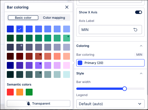
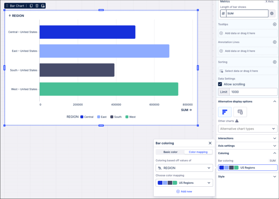
To configure your chart colors, click the chart component and then select Settings - Coloring:
 |
Note
If you can't see the Coloring section for your chart type, you need to configure your dimensions or metrics. Once these are configured, the coloring settings can then be applied to them.
Depending on your chart type, you can then choose between basic coloring and color mapping:
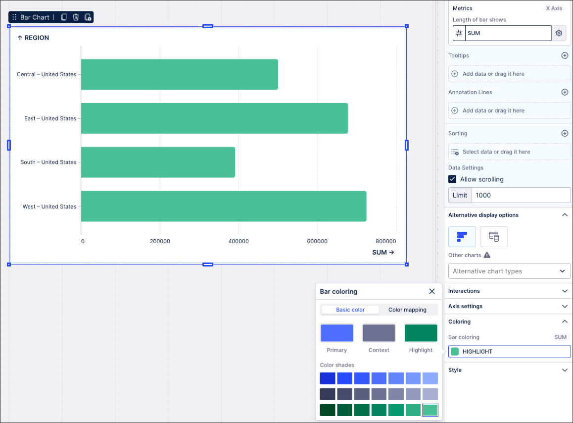
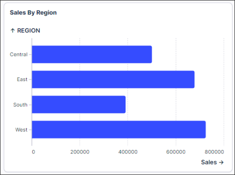
When selecting your basic chart coloring, this displays all bars and columns in the same color.
In this example, all bars in this chart are colored green:
 |
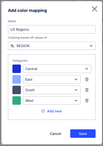
When choosing color mapping for your chart, you can configure a color for each bar, column, or slice that's displayed. This involves mapping colors to chart dimensions and metrics (taken from your knowledge model).
You can configure your color mapping based on categories (for dimensions), gradients (metrics), and thresholds (metrics):
In this example, the chart is configured to show each category (in this case US regions) in a different color:
 |
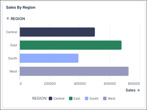
The chart then displays like this:
 |
When configuring your chart colors, we recommend the following best practice:
Consistency: Don’t change the meaning of colors across Views. Be consistent in the use of colors, ensuring that your viewers are able to quickly identify the meaning behind the colors you've used.
Use color to emphasize or de-emphasize points: While colors can be powerful, they are often overly utilized, making it even more challenging for users to identify insights. Use color to focus attention on what matters.
A good example of this:
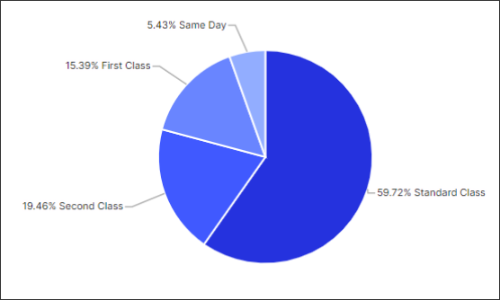
Unnecessary coloring: Avoid the over-use of colors for charts where there are no visual benefits to using them.
A good example of a chart where using one default color works best:
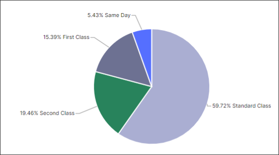
And the same chart but with unnecessary coloring:
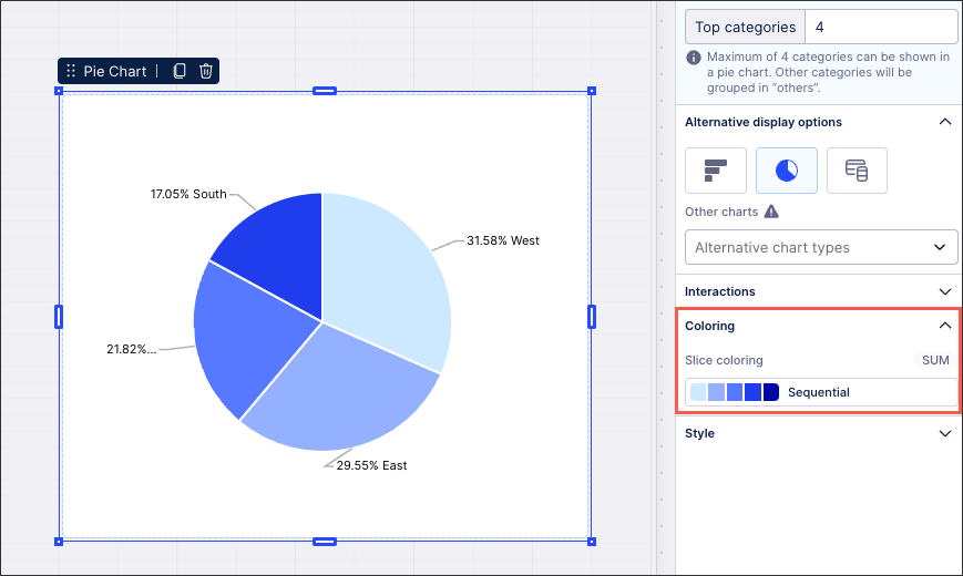
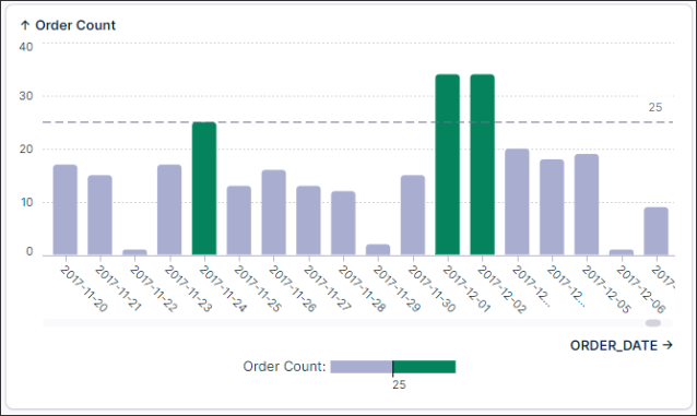
Sequential color scales often increase comprehension: When coloring continuous categories, gradient colors are often much easier to read than using multiple hues.
The gradient color clearly indicates more or less contribution:
In this example using hues for each category does not create any value for the user:
Mixing colors: Don’t mix high and low saturated colors unless you are trying to show the importance or ordering.