Charts and tables - Settings
General settings
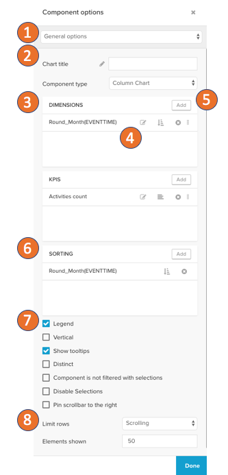
The general settings allow you to:
Switch between the settings sections.
Edit the title and switch the component type.
See which dimensions and KPIs are currently configured.
Jump to editing the dimension or KPI, apply to sort on it, remove it or resort by drag and drop.
Add new dimensions or KPIs.
Change the sorting of the component.
Apply advanced options:
Hide and show the legend.
Switch the layout to be vertical.
Activate or deactivate tooltips.
Display only distinct dimension entries.
Exclude the component from being filtered by selections of other components.
Disable selections on the component itself.
Only on charts: Pin the scrollbar to the right.
Limit how many data points are shown at once.
Diagram Area and Legend Options
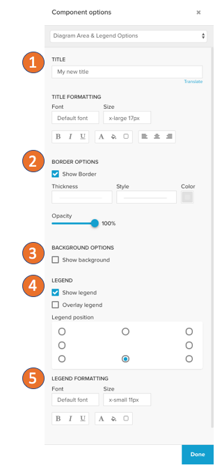
In the diagram area and legend options you can:
Set the title and the title's format options.
Define the border options of the component: Thickness, style, color, and opacity.
Activate a component background
Activate and define the legend on charts.
And set the legend format options.
Position line options (Charts only)
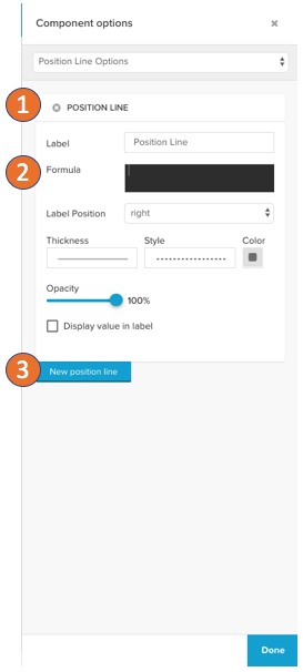
The position line will draw a line on the KPI axis after the definitions:
Set a name and delete the position lines at the top left.
Define a PQL statement set the label position, line thickness, line style, line color, opacity, and if the value is shown on the label.
Add a new position line.
Dimension axis (charts only)
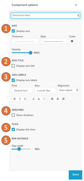
The dimension axis will define how the axis for your dimensions will be displayed:
Activate/deactivate the axis completely, set the line thickness, line style, color, and opacity.
Activate/deactivate the axis title.
Hide and show the axis labels and configure their text format.
Hide and show gridlines on the dimensions axis.
Hide and show the ticks on the dimension axis.
Column chart only: Set the distance between the single bars.
Primary / Secondary value axis
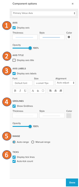
The primary and secondary value axis setting defines how the KPI axis is visualized:
Activate/deactivate the axis completely, set the line thickness, line style, color, and opacity.
Activate / deactivate the axis title.
Hide and show the axis labels and configure their text format.
Hide and show gridlines on the dimensions axis.
Set the boundaries of values that are shown on the axis to the automatic or manual range.
Configure how the tick lines are displayed. Activate/deactivate them and define how many ticks are drawn.
Data series settings (Tables)
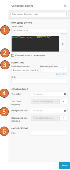
The data series settings include all options on how the data returned from the engine will be interpreted:
Give the data series a title which will be shown in the table header and define the PQL statement.
KPIs only: You can activate shares in percentage. This will allow you to input a second PQL statement that is not split by the dimensions and the original KPI input will be divided by the result of the share in percentage statement. Therefore the share of a KPI in percentage will be the result.
Set the format options on the KPI or dimension.
Define the text color with default color and an optional color mapping to set a color threshold.
Define the background color for the table cells with the default color and an optional color mapping to set a color threshold.
Set the width of the column. By default this is the relative width, if horizontal scrolling is activated in the general settings, this is the number of pixels.
Data series settings (Charts)
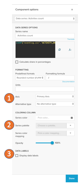
The data series options for charts follow the settings for the tables above with the following differences:
You can define on which axis the data series of a KPI is shown.
A color palette can be set, which colors the single data points with the palette's colors according to the dimension.
Data labels can be activated to be shown on top of the chart, where you can as well set the format, value, and exact positioning.
Scatter plot options
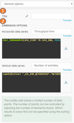
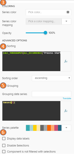
The general options on the scatterplot are specific for the scatterplot component. All other advanced settings are shared with the other table and chart components.
Set the title in the title input
The dimensions on the horizontal and vertical axis can be set individually.
The default series color with the default color picker or define a color mapping. The color mapping will be applied according to one of the dimensions.
If you activate sorting, you can write a KPI or dimension that is used to sort your data points. Only the max. first 5000 values can and will be displayed in the chart.
You can group the data points by a dimension or KPI. This grouping will be shown in the legend and the data points will be colored by the groups.
In the advanced options, you can choose to display the data labels, deactivate selections and deactivate that the component is filtered by selections.
Boxplot options
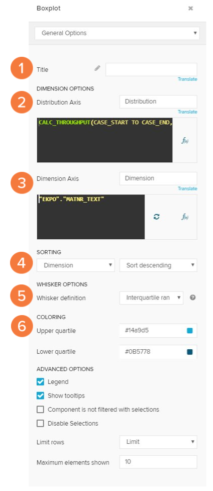
The general options for the boxplot are specific to the component:
Set the title.
Define your distribution axis.
Define your dimension axis.
Sort the boxplot by dimension or distribution.
Define the whiskers.
Define quartile colors.