Coloring table columns
You can add colors to the data displayed in your table columns using gradients, thresholds, or categorical colors. These coloring options allow you to configure which color is used for specific values or a range of values.
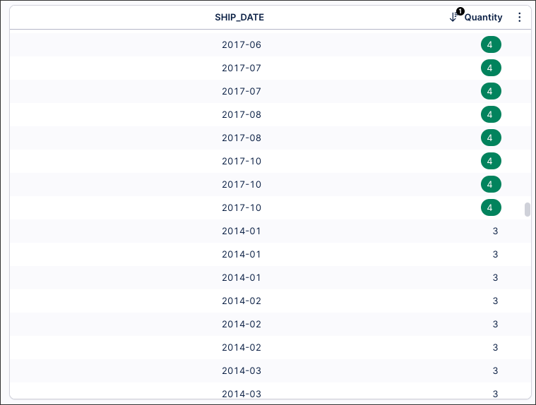
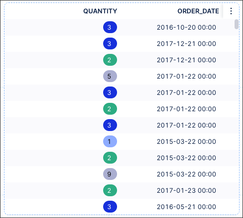
For example, this table is configured to highlight any quantities considered above the average quantity (4). As a result, the quantities 4 or above are colored green.
 |
To learn how this is configured within a View, see: Example of conditional table column coloring.
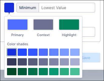
When configuring your table column colors, you can choose from three color schemes and related shades:
Primary: Shades of blue.
Context: Shades of gray.
Highlight: Shades of green.
You can choose between gradients, thresholds, and categorical colors for your table columns:
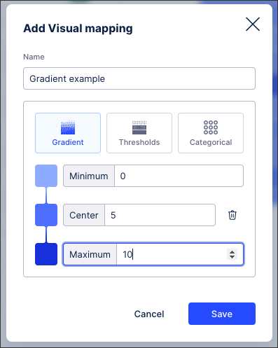
Gradient coloring
By using gradient coloring for your columns, you can choose how your values are colored based on their relation to the minimum, center, and maximum values in the range:
 |
With the example table looking like this (based on highlighted value coloring):
 |
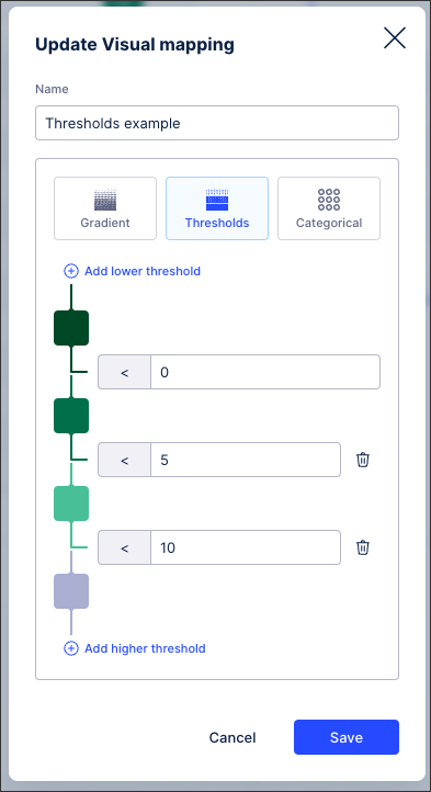
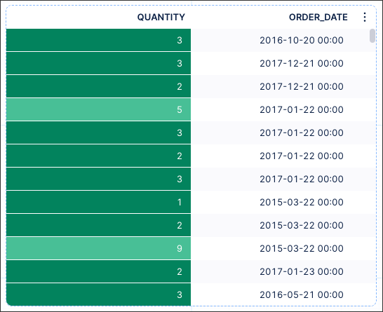
Threshold coloring
By using theshold column coloring, you can select the values at which your column values change colors. You configure this by adding threshold levels, with the value changing color once it is this value or higher:
 |
With the example table looking like this (based on background value coloring):
 |
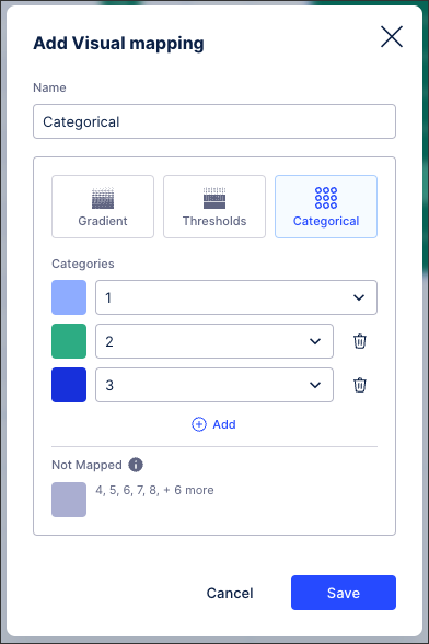
Categorical coloring
When using categorical column coloring, you can assign a color to each category or value in the table column. You can configure specific colors per category / value and choose the color for anything that isn't mapped:
 |
With the example table looking like this (based on highlighted value coloring):
 |
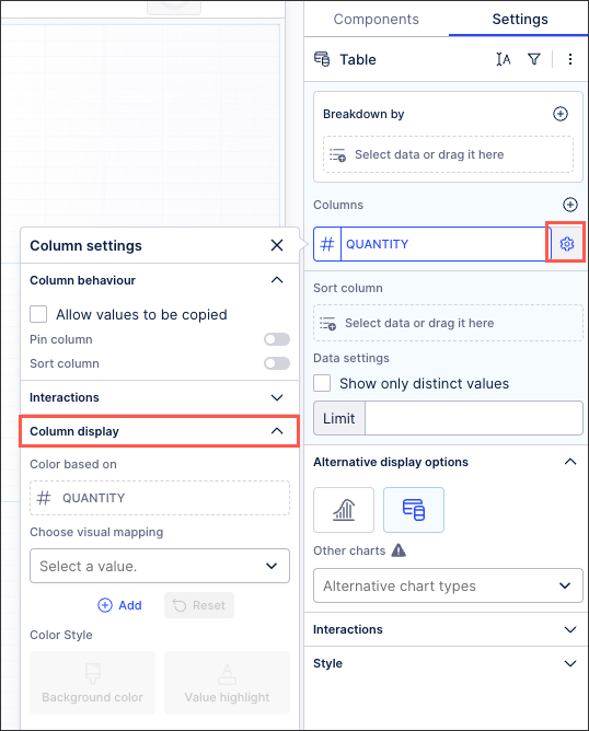
To add colors to your column:
From your table component settings, click the column settings icon and then expand the Column display section:
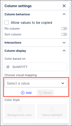
Choose between either selecting an existing value or creating a new color map:
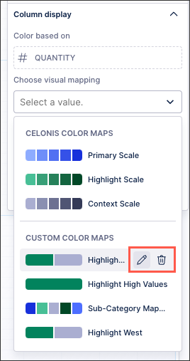
Select a value: Choose between either Celonis Color Maps or edit or use Custom Color Maps:
To edit or delete a Custom Color Map, hover over the row:
Add new color map: Choose your colors based on gradients, thresholds, or categorical. See: Gradients, thresholds, and categorical column colors
Select whether this color should be used to highlight the value inside the cell or be a background color for the cell.
Save your View.
In this example table, the coloring of the columns is based on the "Average Quantity" (which is 4 in this data set). The table is configured to highlight all values in the table that are higher than the global average. Anything value lower, such as when the quantity is 3, is left uncolored:
 |
This is achieved by adding the 'Average Quantity' column to the PQL statement:
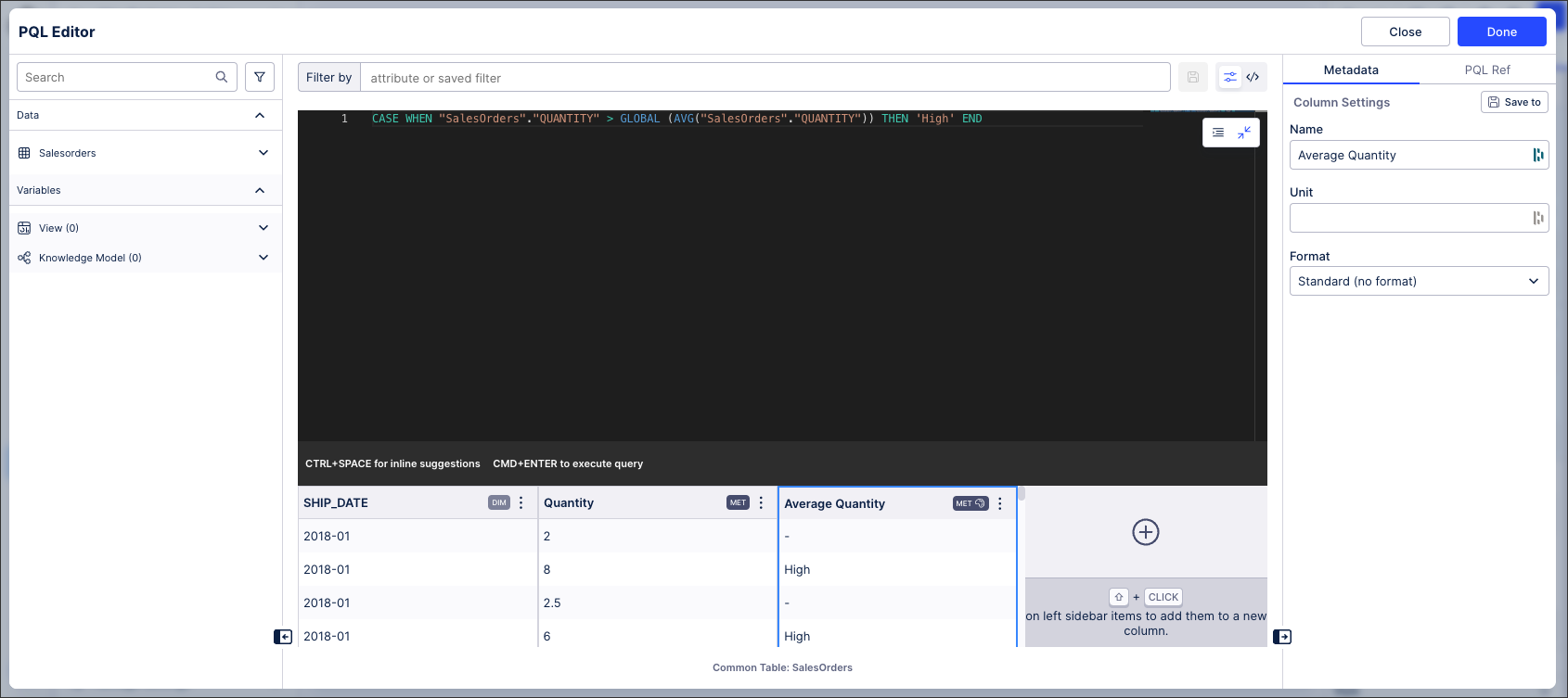 |
The PQL statement for this is:
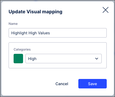
CASE WHEN "SalesOrders"."QUANTITY" > GLOBAL (AVG("SalesOrders"."QUANTITY")) THEN 'High' ENDThis column display is then configured as follows:
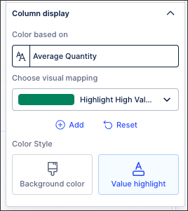
With the Highlight High Value custom color map being configured as: