Pie or donut chart
A pie or donut chart is a circular chart that displays categories as slices or a percentage of the whole, allowing you to visually identify the break down of categories.
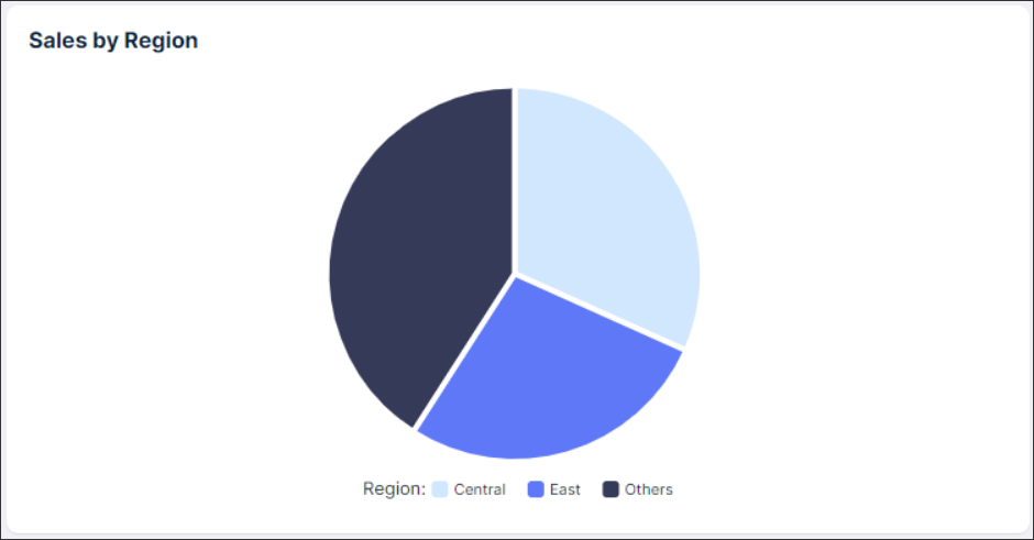
In the following example, the total sales by region is displayed. You can see from this pie chart that the central and east regions are the two highest performing regions.
 |
Basic pie or donut chart configuration
When configuring a basic pie or donut chart, you need to define at least the KPI you want to display and which categories you want to separate the data into. These should both be defined within your knowledge model. For more information about knowledge models, see: Knowledge Model.
For a basic pie chart configuration, the following attributes are available:
Attribute | Required | Type | Description |
|---|---|---|---|
category | Yes | Record attribute | References attributes defined in the knowledge model. |
KPI | Yes | KPI | References an individual KPI defined in the knowledge model. |
Name | No | String | Defines the pie chart name that will be displayed on the top left corner of the component. |
And the YAML example for a basic pie chart configuration:
id: pie-chart-3f3c89ac-2fb2-4912-9154-f3b75f121a79
type: pie-chart
settings:
  category: SUPERSTORE.PRODUCT_SUBCATEGORY
  kpi: total_sales
Advanced pie or donut chart configuration
When configuring an advanced pie or donut chart, you also need to define at least the KPI you want to display and which categories you want to separate the data into. These should both be defined within your knowledge model. For more information about knowledge models, see: Knowledge Model. From there, you have a number of optional attributes such as data limits, pie or donut chart legends, slice colors, and tooltips.
For an advance pie chart configuration, the following attributes are available:
Attribute | Required | Type | Possible values | Description | |
|---|---|---|---|---|---|
display | No | string |
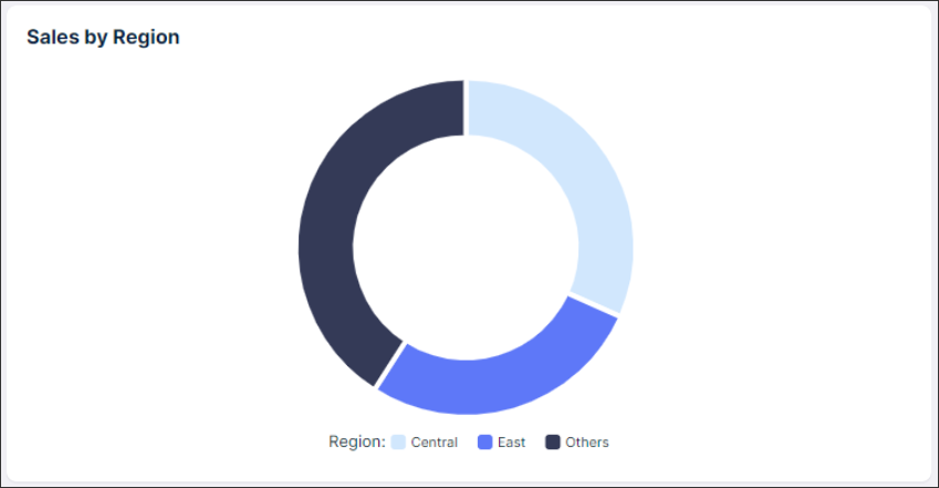
| Defines if the component should be displayed as a pie or donut. The donut chart is a variant of the pie chart, with a hole in its center, and it displays categories as arcs rather than slices. Both make part-to-whole relationships easier to see at a glance and should be only used to compare the differences between categories.
| |
categoryLimit | No | string |
| Defines the maximum number of categories to show in the chart. If there are more than 4 categories of data, then all remaining ones will be bucketed into an “others” slice. If more then 4 categories are needed, we recommended using a bar charts for easier to read visulization. | |
dataLabel | No | string |
| Defines if the data label is displayed and, if it is, whether it shows the percentage of the total value or the KPI value. | |
legend | No | string |
| Defines if and where the legend (category names) should be displayed in the component. | |
colors | No | string | Defines what color schema will be used to color each slice. | ||
additionalKPIs | No | KPI | Define additional KPIs to be displayed in the pie chart tooltip. | ||
interactions: tooltip | No | boolean |
| Defines whether tooltips will appear when hovering over a slice or not. | |
interactions: filters filterByUserFilters | No | boolean |
| Defines if the chart will be filtered by other view filters or not. | |
interactions: filters setFilters | No | boolean |
| Defines if the chart will be filterable via slice selections or not. |
And the YAML example for an advanced donut chart configuration:
id: pie-chart-3f3c89ac-2fb2-4912-9154-f3b75f121a79
type: pie-chart
settings:
  category: SUPERSTORE.PRODUCT_SUBCATEGORY
  kpi: total_sales
  display: donut
  categoryLimit: 2
        dataLabel: percentage
        legend: label
  colors: SEQUENTIAL_TEAL
  additionalKpis:
    - kpi: sales_furniture
  interactions:
    tooltip: true