Configuring quick filters in legacy views
Legacy view component
You're currently viewing a topic about a legacy view component in Studio. This component can still be used in legacy Studio views, however we recommend using the visual view editor in the new Studio experience. The updated interface includes drag and drop capabilities, allowing you to easily add components and configure your views.
For more information, see: Views.
Use the quick filter component on Views to allow users to quickly filter on relevant attributes with as few clicks as possible.
Basic quick filter configurations
When configuring a basic quick filter for your view, you can choose to filter by either knowledge model or attributes:
Filtering by Knowledge Model
You can use KM filter if you want to create complex and reusable filter queries. Before setting up the component you need to define KM filters first. When configuring this filter, the following attributes are available:
Attribute | Required | Type | Description |
|---|---|---|---|
filters | Yes | List of filter | Contains a list of filter. |
selected | Yes | Boolean | Defines a default selection state for the quick-filter |
And the YAML example for filtering by knowledge model:
id: qf1
type: quick-filters
settings:
  filters:
    - filter: JAN01
      selected: true
    - filter: FEB16
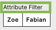
Filtering by attributes
You can also filter by attributes, with the following attributes available:
Attribute | Required | Type | Description |
|---|---|---|---|
attributeFilters | Yes | List of attribute filter | Contains a list of attributes. |
attribute | Yes | Record.Attribute | References the attribute from the Knowledge Model by which you want to filter. |
type | Yes | String | Defines the attribute type of the Attribute. |
values - name: Zoe value: Zoe | Yes | List of values consisting of name and value | Defines the values by which the attribute can should be filtered. |
And the YAML example for filtering by attributes:
id: qf2
type: quick-filters
settings:
  attributeFilters:
    - attribute: ACTIVITY.USERNAME
      type: string
      values:
        - name: Zoe
          value: Zoe
        - name: Fabian
          value: Fabian
Advanced quick filter configuration
To configure an advanced quick filter component, the following attributes are available:
Attribute | Required | Type | Possible values | Default Value | Description |
|---|---|---|---|---|---|
single | No | Boolean | true false | false | Defines if only one single filter or multiple filters can be applied. |
label | No | String | Defines a label should be displayed above the quick filter. Click here to see screenshot  | ||
styles | No | Enum | overflow styles | Contains different styling options such as overflow or styles. | |
overflow | No | Enum | full-width line-break scroll | full-width | Defines the orientation of a list of dropdowns when the width of the selected dropdowns exceeds the component size. |
styles | No | Enum | horizontal vertical | - | Contains different style options such as horizontal and vertical alignment. |
horizontal | No | Enum | full right center left | full | Defines the horizontal alignment of the component. |
vertical | No | Enum | top center bottom | bottom | Defines the vertical alignment of the component. |
And the YAML example for an advanced quick filter configuration:
id: qf1
type: quick-filters
settings:
  label: Custom label
  single: false
  filters:
    - filter: FILTER_FABIAN
    - filter: FILTER_ZOE
  styles:
    overflow: full-width
    position:
      horizontal: full
      vertical: bottom