Studio App Building Guidelines - Designing Apps with Data in Mind: Patterns and Key Focus Areas
Apps aim to provide information quickly and efficiently, empowering users to gain valuable insights and make informed decisions. The ultimate goal is to deliver fast value at scale by reaching as many users as possible and delivering value rapidly and effectively.
Key considerations when designing apps
These key considerations should serve as a guide through the design process, rather than strict instructions. Remember, any design process is iterative—requiring revisiting decisions, exploring alternatives, and critically evaluating current solutions.
Before you begin, it’s essential to clarify the context in which your View will be used. The clearer you define the tasks and decisions it needs to support, the more informed and effective your design choices will be throughout the process.
To create an effective View, review the following key considerations:
High-level concept: How would you describe the app in your own words?
Purpose: What user focused problems does your app solve? How do these users solve this problem currently?
Audience: Who is your main app user? What do they know about the data you're planning to use? Do they only want to look up values or do they want to compare and analyze them?
Task and information need: What tasks and decisions do your user want to complete with the data? What key information do they need to help them make decisions? Is all the data necessary or do they just need specific insights?
Usage context: How will users interact with your view? For example, a laptop, a larger monitor, or on a mobile device? Does the data need to be interactive? How much time will they spend using the app? How often will they use it?
These key considerations are also available as a PDF file - click here to access and download it.
Tip
Use your answers to define “How might We” questions. These are open-ended questions that encourage design explorations i.e. How might we use color coding effectively to highlight important trends without causing confusion?
 |
Researchers from the University of Edinburgh, University of Glasgow, University of Oxford, and King’s College London have developed a comprehensive framework known as Dashboard Design Patterns. This framework includes essential design trade-offs that we believe are equally applicable to the design of a View. We aim to leverage this valuable framework to provide you with informed recommendations for creating an optimal user experience.
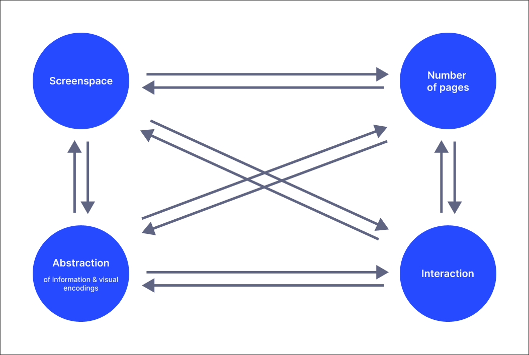
When designing a View, various parameters can be adjusted to optimize the user experience.
Screen space: This refers to the amount of display area available for the View. It can vary from large screens to compact displays.
Number of pages: This parameter involves how content is distributed across multiple Views (or View tabs) or consolidated into fewer pages.
Abstraction: This involves the level of detail presented. Higher abstraction means showing aggregated or derived data, while lower abstraction provides more detailed information.
Interactivity: This parameter defines the extent to which users can interact with the View, including navigation, filtering, and personalization options.
These parameters are interconnected and can influence each other. For instance, increasing screen space might allow for a reduction in the number of pages or a decrease in abstraction. Conversely, decreasing screen space might necessitate an increase in interactivity or abstraction to maintain usability.
Ideally, the goal is to minimize all these parameters. Minimizing screen space allows for better embedding or small screen display. Reducing abstraction ensures that more data and information are visible to the viewer. Minimizing the number of pages enables viewers to see all information at a glance, and reducing interaction allows viewers to engage with other tasks while observing the dashboard without missing any hidden information.
There are times when we have to display so much information that it is impossible to minimize all parameters and we need to make decisions on how to tune the parameters (that’s why we call them design trade offs).
Examples of design trade offs
Let’s check some examples of how these parameters can be influenced by you when creating your apps:
Screen space
Increasing screen space: Displaying the View on a large screen or using a custom-height layout with a high amount of pixels (page scroll).
Decreasing screen space: Displaying the View on a small device like a tablet or working with a higher browser zoom level.
Number of pages
Increasing the number of pages: Distributing content across more Views or View tabs (or even packages).
Decreasing the number of pages: Combining content into the same View. Try to not overcrowd your View with too many components, this may negatively affect performance.
Abstraction
Increasing the abstraction: Showing aggregated data e.g. showing a chart with a trend over time vs. a table with raw values for every day.
Decreasing the abstraction: Showing more detail about your data and information. Components allowing for a lot of details are tables, the case explorer and the attribute list. We recommend using View overlays for providing details on a specific case or object.
Interactivity
Increasing interactivity: Providing means for exploration, navigation, filtering and personalization. An example could include using the breakdown selector in a table to let the end user switch between primary columns. Tables also have a setting to let end users decide which columns to show or hide. Offering filter components is a great way to let your users interact with a View by slicing and dicing the data. We recommend using the in-built filter bar for that.
Decreasing interactivity: Reducing interactive means. Sometimes you are forced to provide low interactivity because your end users cannot manipulate the View, e.g. when the View is static on a monitor which cannot be manipulated via mouse, keyboard or touch.
App data and visual representation
 |
Identify the most relevant data needed for users to complete their tasks and choose the best way to visually present it.
Views can display raw data or various levels of abstraction to simplify and reduce the amount of information shown. With datasets that contain numerous elements (e.g., rows in a data table) and attributes (e.g., columns), Views should offer the right level of detail, ensuring users are not overwhelmed while still getting the insights they need.
Detail dataset: For instance, you might present a detailed dataset in a table format to show raw values across multiple attributes, allowing users to explore comprehensive information.
Aggregated data: If you want to reveal broader patterns, such as overall sales trends, you could use stacked column charts to represent aggregated sales data by product category over time.
Thresholds: To quickly identify performance issues, consider using color-coded thresholds in tables or visual indicators that highlight data points that fall outside acceptable ranges.
Derived values and filters: Provide meaningful summaries or analyses of raw data. For example, metrics like "Profit Margin" can be displayed in KPI lists to quickly communicate key insights. Filters narrow down data and calculate trends within specific subsets, focusing on the most relevant information e.g., the last 14 days
Individual values: Highlight key individual values of a larger data set using large, bold numbers on the View, such as the latest sales figure or the next delivery date, to draw immediate attention.
By carefully selecting the appropriate visual representations, such as tables for detailed data or line graphs for trends, you enhance the user's ability to grasp essential insights quickly and effectively.
Guiding questions when considering data and visual representation
What data is essential for users to complete their tasks?
How much information do you want to provide, and at what level of detail or abstraction?
What visual representations best convey the data and insights?
Should the visuals provide detailed information that takes up more screen space, or should they be more concise to fit a compact layout?
Design trade off
Abstraction vs. Detail: Higher abstraction reduces clutter but may hide important data; too much detail can overwhelm users.
App structure and layout
 |
Organize information across your Views to present data in a clear and intuitive way, ensuring users can easily find what they need. The structure should reflect the relationships between different Views or Tabs, influencing how users move through the content. This decision can be shaped by the Views’s purpose—for example, a hierarchical structure might allow users to "drill down" into details, while a flat structure might work better for providing a high-level overview across a few Views.
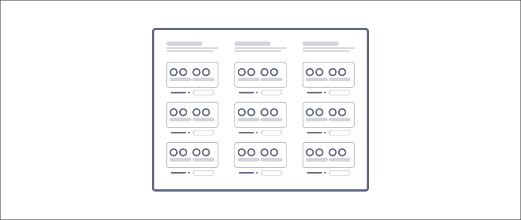
When designing the layout of your View, arrange components and visual representations to highlight their relationships and importance. Combining different layout patterns can enhance the effectiveness of your presentation. For example, if displaying multiple KPIs with similar data, consider a parallel (grid-like) layout. This emphasizes repetition and facilitates easy comparison across components.
Single page: For Views requiring a quick overview, consider using a single-page structure. This approach allows users to see key metrics and KPIs at a glance, making it easy to absorb information. However, be cautious of cluttering the View with too much detail, which can hinder user comprehension.
Hierarchical app structure: When working with complex datasets, a hierarchical structure can be beneficial. This allows users to start with a high-level overview and drill down into more detailed content. For example, a top-level View might display national sales data, while View tabs could provide insights into regional performance.
Parallel app structure: When users need to compare different aspects or dimensions of a dataset, a parallel structure is an effective choice. This structure organizes information across multiple Views at the same level, facilitating efficient comparisons through easy navigation. A parallel structure is also ideal for offering low-usage Views, such as settings or validation tools, which enhance the overall user experience.
 |
Tip
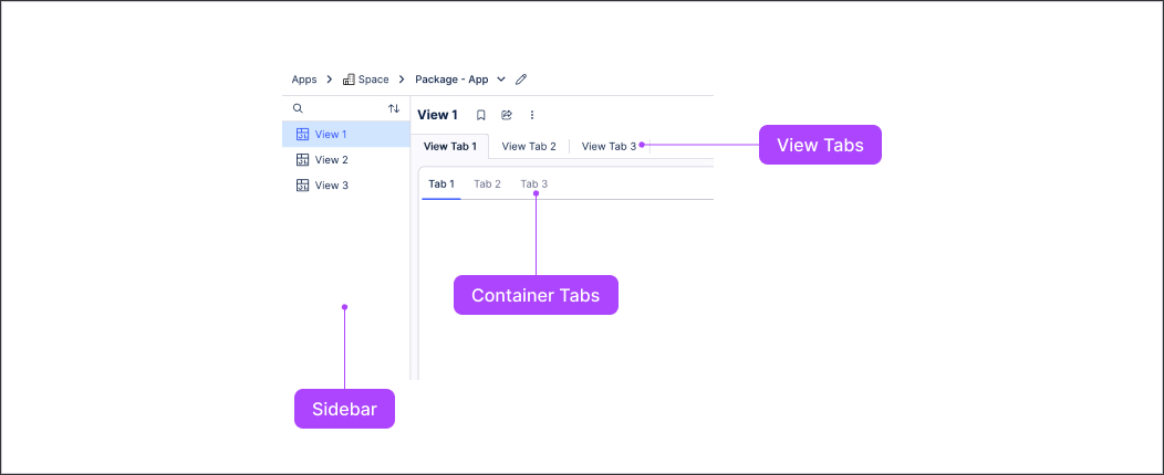
Use the sidebar panel, View tabs and container tabs to manage the structure and navigation of your app.
Grid layout: Use grid layouts when precise comparisons are necessary. Organizing components into rows and columns helps users quickly relate specific information in a multidimensional dataset.
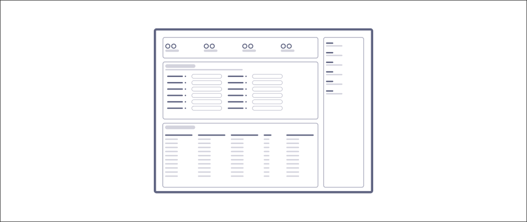
Group layout: To clarify relationships between related data points, employ a group layout. Visually grouping components using containers can enhance users' understanding of how the data is interconnected.
Guiding questions when considering app structure and layout
How should information be organized to enhance user understanding and navigation?
Are there specific user workflows that should influence the structure and layout of the Views?
How should the components and visuals be arranged to create a clear, intuitive structure?
How can the layout reflect the relationships between components and highlight their importance to the user?
Design trade off
Single vs. Multiple Views: Fitting everything into a single View reduces interaction but risks overcrowding, while using multiple Views improves clarity but increases navigation complexity.
App screen space and interactivity
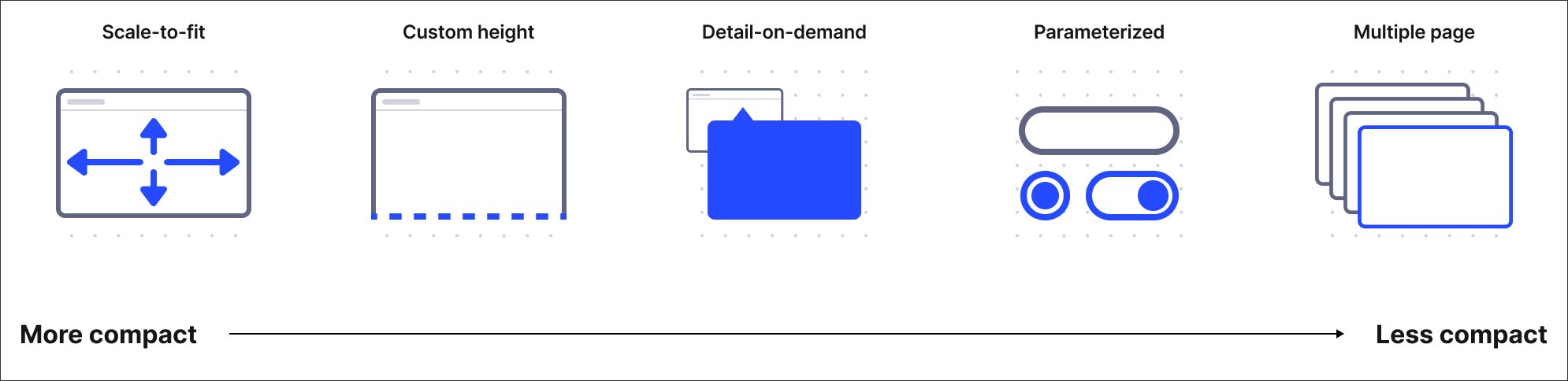 |
Effectively decide how to use your available screen space, by balancing how much information to display at once and the extent of user interaction required. Tradeoffs here often involve deciding whether to display more data on a single screen, which may require higher abstraction, or to allow users to interactively explore more data using filters or navigation. If space is tight, leveraging interactivity (e.g., scrolling, filtering) allows for displaying additional data without overwhelming users visually.
Scale-to-fit: This allows all information to be visible at once, providing a quick overview. This is ideal for users who need to grasp the context rapidly but may lack detail.
Custom height: This lets users scroll to access more content, making it useful for displaying extensive information while keeping the most important data readily available above the fold.
Detail On Demand: This interaction allows Views to reduce the amount of information shown on screen at once by revealing more details only when the user asks.
Techniques like tooltips or pop-ups can provide additional context without cluttering the interface.
Furthermore, exploration interactions enhance this interaction by enabling users to gradually uncover insights as needed while maintaining a clean and organized View. You can use Linked Views to provide larger details on demand.
Effective navigation elements can complement this by guiding users through the additional layers of detail, ensuring they can easily access the information they need.
Parameterization: This capability allows users to control what content is currently shown on screen through various filters and selectors, such as checkboxes and drop-down menus. This empowers users to customize their experience, focusing on the most relevant data.
Multiple Pages: These can be employed to distribute information across several Views, allowing users to navigate through distinct topics without losing focus. Navigation elements, such as tabs or buttons, can facilitate seamless transitions between these pages, enhancing the user's journey through the Views. This structure is beneficial for complex data sets, allowing users to drill down into specific areas of interest while still having a clear overview of the available content.
Guiding questions when considering app screen space and interactivity
How much data needs to be displayed at once?
Should all key information fit on a single screen, or would an interactive approach be more effective?
What key interactions are necessary for the user to explore, filter, or personalize their experience?
Can you minimize interactions where possible to simplify the user experience?
Design trade off
Screen space vs. interactivity: Maximizing screen space can reduce interaction but risks limiting data presentation. Increasing interactivity (such as zooming or filtering) can mitigate space constraints but adds complexity.
Simplify and organize information
Simplifying and organizing information transforms a View from a data dump into a valuable decision-making tool. This approach enables users to easily grasp complex data, identify key insights, and make informed decisions. Prioritize clarity, organization, and user-friendliness.
To do this:
Use clear hierarchies: Establish a clear visual hierarchy in the layout by using size, color, and placement to indicate the importance of different elements. This guides users’ attention to relevant data.
Group related information: Visually group related components or data points together using containers or white space. This aids comprehension and helps users see relationships within the data.
Embrace white space: Use white space strategically to separate different sections and elements, improving readability and creating a less crowded appearance.
Provide contextual information: Utilize tooltips or pop-ups to offer additional details when users hover over specific elements, allowing them to explore data without cluttering the main view.
Utilize clear labels and legends: Ensure that all charts and graphs have clear labels and legends to explain their data points, avoiding jargon or complex terminology that might confuse users.
Strategic use of color
Color is a powerful tool in View design that can significantly enhance user comprehension and engagement. Thoughtful color choices not only guide users’ attention to critical information but also foster a cohesive visual experience that aids in data interpretation.
To do this:
Meaningful color choice: Avoid arbitrary use of color; ensure each color serves a specific purpose related to your data, enhancing its meaning and context.
Color harmony: Maintain a cohesive color scheme throughout your View. Consider using complementary colors (opposites on the color wheel) for emphasis or analogous colors (neighbors on the color wheel) for a harmonious feel.
Accessibility: Ensure colors have sufficient contrast against their background to enhance readability and make the information easily distinguishable for all users.
Highlight important information: Use color strategically to draw attention to key data points or trends, making it easier for users to identify important insights at a glance.
Data representation: Color can effectively represent data within charts and graphs. Use color coding to differentiate categories, track changes over time, or visually encode values. Ensure the color coding is intuitive and consistent throughout the View.
For more guidance on using color, see: Studio coloring best practice.
Meaningful and concise headlines
In information-dense environments like Views, concise headlines enable users to scan effectively, helping them identify relevant sections without being overwhelmed by lengthy text. Concise headlines enhance comprehension by allowing users to quickly grasp the key takeaway of a data section at a glance, which is crucial for efficiently scanning for specific information.
To do this:
Evaluate necessity: Before writing a headline, ask yourself if it is essential or if the context provides sufficient understanding.
Be precise and concise: Craft shorter headlines that take up less space, improving the presentation of data visualizations and other elements.
Employ consistent formatting: Maintain a consistent style for all headlines (e.g., font size, weight) to create a cohesive look and feel across the View.
Note
Design patterns inspired by content found at https://dashboarddesignpatterns.github.io