Table
Note
You're currently viewing a topic describing a Studio feature using the general availability feature set. This feature is also available in the new Studio experience, however both the design and the way it works may be different to what you see described here.
For more information about the new Studio experience, see: Studio (new experience)
Use tables in views to give your users a list of items with an overview of all relevant attributes.
Basic table configuration
To configure a basic table component, the following attributes are available:
Attribute | Required | Type | Description |
|---|---|---|---|
field | Yes | KPI, or | References objects defined in the Knowledge Model. In many use cases the record must have an identifier defined to use it properly. |
id | Yes | String | Defines a unique identifier for the field. The identifier is auto-generated if you don't define it. |
order | Yes | Integer | Defines the order of the table column. The order is auto-generated if you don't define it. |
And the YAML example for a basic input box configuration:
id: table-basic
type: table
settings:
  data:
     columns:
        - field: RECORD.ATTRIBUTE
                  id: 100
                  order: 100
        - field: KPI
                  id: 200
                  order: 200
Advanced table configuration
When configuring advanced tables, there are three configuration options:
General: These are general settings that apply to the whole table.
Column specific: These control how your table's columns are displayed and filtered.
Others: These are settings to limit and sort the table.
General advanced table configuration
To configure the general settings for an advanced table the following attributes are available:
Attribute | Required | Type | Possible values | Description | |||
|---|---|---|---|---|---|---|---|
resizeMode | Yes | Boolean | fit expand (default) | Defines how table columns are spaced, and how they behave as users resize them. The two options are:
| |||
allowContentLineBreak | Yes | Boolean | true false (default) | Defines if long text should appear in multiple lines in column cells.
| |||
allowHeaderLineBreak | Yes | Boolean | true false (default) | Defines if long text should appear in multiple lines in column headers.
| |||
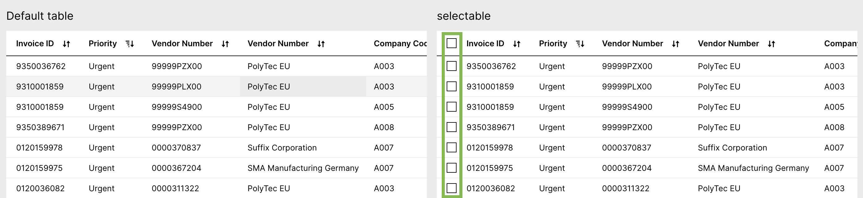
selectable | No | Boolean | true false (default) | Defines that checkboxes are displayed in the first column. This is required for displaying default actions above the table.
| |||
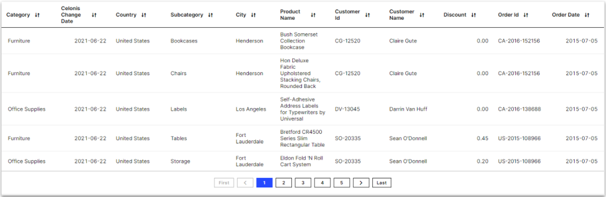
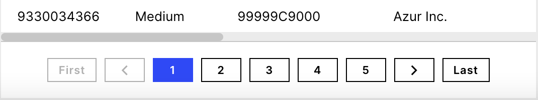
showPagination | No | Boolean | true (default) false | Defines if paginations at the bottom of the table should be displayed. Infinite scrolling will be used if pagination is not defined or set to "false".
| |||
allowDataExport | No | Boolean | true false (default) | Lets end users export the table as a comma-separated file (.csv) or an Excel file (.xlsx). Keep in mind that the download might take some time depending on how much data gets exported. The export button is grayed out while the export is running. When using this configuration also use the "name" attribute. Otherwise the layout won't look good. | |||
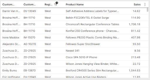
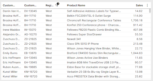
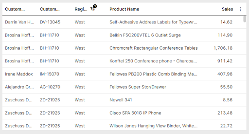
density | No | Boolean | standard (default) compact relaxed | Defines if the table should be shown with a standard, relaxed, or compact view by changing the row height. Standard
Compact
Relaxed
|
And the YAML example for configuring general settings in an advanced table:
id: table-basic
type: table
settings:
  name: <String>
  options: #Options:
         selectable: true
         showPagination: true
     allowDataExport: true
     resizeMode: fit
     allowContentLineBreak:true
     allowHeaderLineBreak:true
  data:
     columns: #Basic configuration
        - field: RECORD.ATTRIBUTE
                  id: 100
                  order: 100
        - field: RECORD.ATTRIBUTE2
                  id: 200
                  order: 200
Column specific advanced table configuration
These control how your table's columns are displayed and filtered. When configuring your table columns, the following attributes are available:
Attribute | Required | Type | Possible values | Description | |
|---|---|---|---|---|---|
onEdit | No | Defines if the column should enable inline editing. This feature is only currently available for augmented attributes. id: table1-c124731f-480a-49f8-b72e-2fc5f26dcd30
type: table
settings:
data:
columns:
- field: ORDERS.augmentedattribute_example
id: 53fc5dbe-971d-4147-9d02-996c57d4577d
order: 100
onEdit:
updateAugmentedAttribute:true | |||
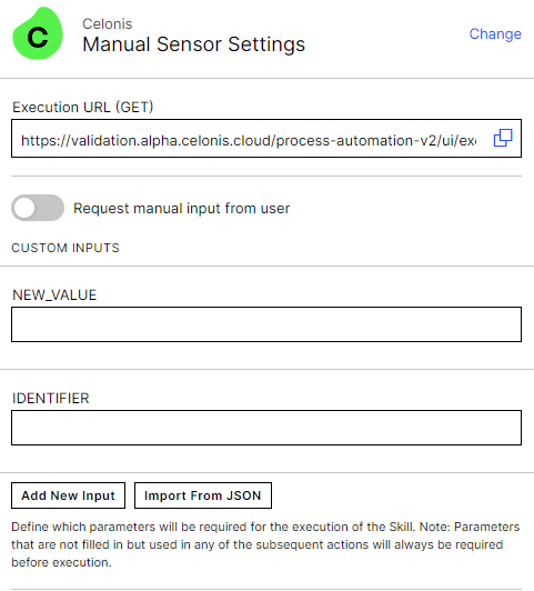
executeSkill | No | - | Defines if a skill should be executed when any augmented attribute is updated in the table. You can create a skill and link to the column using the skillKey. When creating the skill for this configuration, you can use the inputs "NEW_VALUE" and "IDENTIFIER" if you wish to include these in your skill (E.g. Send email notification with updated value to customer) Create a manual sensor with the following inputs:
| ||
updateAugmentedAttribute | No | Boolean | true false (default) | Defines if in-line editing should be enabled. This can only be used for augmented attributes. data: columns: ... ... - field: PIZZA.TYPE id: df08a98d-812d-4008-ae80-583375530f0e order: 400 - field: PIZZA.SIZE id: 3730ffb3-9e5b-40c2-85cc-f3d1c852e6d4 order: 500 - field: PIZZA.AUGMENTED_CATEGORY id: 8f04b729-cbbd-4185-8735-ada87bba5228 order: 600 - field: PIZZA.AUGMENTED_COMMENT id: c41d4c95-933d-47b3-81e7-256b2b1a50b9 order: 700 onEdit: updateAugmentedAttribute: allowBulkUpdate:true | |
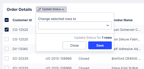
allowBulkUpdate | No | Boolean | true false (default) | Enables a bulk update action to be displayed at the top of the table when one or more table rows are selected. Users can choose to activate this feature for any augmented attributes in a table component. It supports updating up to 5,000 rows at once.
| |
onClick | No | Defines that the column should be displayed as link. columns: - field: SAMPLESALESDATAEXCELMOD_XLSX_ORDERS.REGION id: 7ebfa0ba-7afa-4193-b5ca-0e5acdbc2a1f order: 100 hide: true onClick: openView: profileView: true syncFilters: forward-only openInSideOverlay: true | |||
openView | No | Defines the view that will open onClick. You can link a Profile View (using the profileView selector) or any other view (using the viewKey) | |||
profileView | No | Boolean | true false (default) | Defines if a link to the record profile should be added. | |
viewKey | No | - | Defines the view the user wants to link to the table column using the View's Key. | ||
showInSideOverlay | No | Boolean | true false (default) | Defines if a modal gets opened or a slide in will appear. Default Slide in (true) Modal (false) | |
syncFilters | No | String | forward-only (default) backward-only disable both-ways | Defines if filters should be synced between the current View and the linked View. This setting will apply to all filters applied to the View (i.e. applied from dropdowns, quick-filters, tables, charts, etc.). Forward: Filters set on the main View and filters set on the component that is opening the linked View, will be immediately applied to the linked View. Backward: Filters set on the linked View will be immediately applied to the main View. Both-ways: Filters set on the linked View are immediately applied to the main View and filters set on the main View are immediately applied on the linked View. Note that filters set on the component that is opening the linked View, will only be applied forward. Disabled: No filters are carried to or from linked views. NoteSyncing filters between Views that are not using the same underlying Knowledge Model or Data Model can result in no data being found. Global filters will also be synced and may differ between Knowledge Models. - field: SALESDATA_ORDERS.CUSTOMER_ID id: 45808bdc-caf0-49f9-8358-55b3ebdde71d order: 400 onClick: openView: profileView: true syncFilters: both-ways openInSideOverlay: true | |
carrySelections | No | Boolean | true false | Defines if table selections should be carried from the current view to the linked view. This should only be enabled if both your current and linked view contain table components. | |
hrefAttribute | No | - | References a KM record, which contains a URL. This can be used to generate dynamically URLs, which depend on the information from the individual table row. SET-UP STEPS 1.) Create a new Attribute, which contains the URL structure inside pql attribute Knowledge Model - id: HREF_USERNAME displayName: Href Username pql: '''https://www.google.com/?q='' || "PizzaP2P-fixed_xlsx_Sheet_0"."USER_NAME"' #Defines URL structure filterIds: [] columnType: string 2.) Enable hrefAttribute for your table View - id: table type: table settings: data: columns: - field: ACTIVITY.CASEKEY order: 100 id: baffa132-b23a-4470-b2b6-36b069e6f893 onClick: hrefAttribute: ACTIVITY.HREF_USERNAME #References attribute from KM openInNewTab: true | ||
openInNewTab | No | Boolean | true false (default) | Defines if the URL should be opened in a new tab or not. This configuration only works if you also use hrefAttribute. | |
update variable: - name: variable1 - name: variable2 | No | - | You can use a table to update a variable upon clicking a link in a row of your table. This allows you for example display the details of a specific line item right underneath the table component, instead of opening it in a separate profile view.To learn more about Variables, see Views variables. View variables:
- name: demo #Defines demo variable.
defaultValue: demo text
...
components:
- id: table1
type: table
settings:
data:
columns:
- order: 100
field: ORDERS.ORDER_ID
id: 893b4d4a-37e3-400a-af89-13692a9cf2f1
onClick:
linkToRecordProfile: true
showTasks: true
- order: 150
field: ORDERS.CATEGORY
id: 149e396e-37ad-4d6b-a877-74fafb14ba88
onClick:
update:
variables:
- name:
- id: text
type: task-list
settings:
name: ${demo.ORDER_ID} | ||
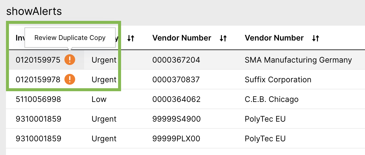
showAlerts | No | Boolean | true false (default) | Defines that Alerts are displayed in the column. It can be used to inform a user about a potentials issue. For more details on how create alerts, see Create Alerts.
| |
hide | No | Boolean | true false (default) | Defines if the column should be hidden or not. This configuration can be used in combination with allowInvisibleColumns: true (see above). By this columns are not visible by default but customers can still choose if they would like to have certain columns visible in their table. | |
copyToClipboard | No | Boolean | true false (default) | Defines to allow copy to clipboard functionality when hovering the cell in this column. | |
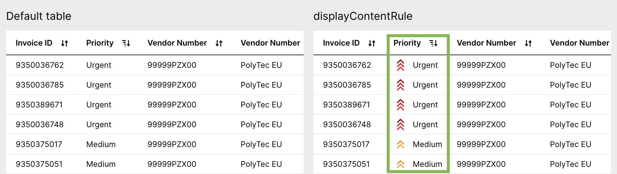
displayContentRule | No | Custom attribute | Defines custom formatting of individual attributes. You can change text formatting or apply icons based on different conditions. For more details check out the Display Rule documentation.
| ||
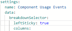
sticky | No | String | left right none | Defines whether a column is pinned and, if pinned, which side it should be pinned to. NoteIf wanting to pin the breakdown selector column, you will need to enable this in the YAML editor. The breakdown selector can also only be pinned to the left side of the Table.
|
The YAML example for column specific table configuration:
id: table-basic
type: table
settings:
  data:
     columns:
        - field: RECORD.ATTRIBUTE #Field: Column specific settings
                  id: 100
                  order: 100
                  sticky: left
                  onClick:
            openView:
              profileView: true
              openInSideOverlay: false
              carrySelections: true
              carryFilters: true
              variables:
                - name: Task
                  value: 5
            hrefAttribute: ACTIVITY.HREF_USERNAME
            openInNewTab: true
                        update:
                variables:
                  - name: variable1
                  - name: variable2
          showAlerts: true
                  hide: false
                  copyToClipboard: true
                  displayContentRule: <String>
        - field: RECORD.ATTRIBUTE2
                  id: 200
                  order: 200
Other advanced table configuration options
When configuring your table, the other following attributes are available:
Attribute | Required | Type | Possible values | Description | |
|---|---|---|---|---|---|
limit | No | Integer | Defines how many rows should be displayed per page. | ||
distinct | No | Boolean | true false (default) | Defines if only distinct values are displayed. It works only when options selectable, link, showTasks, showAlerts and task attributes are not enabled. | |
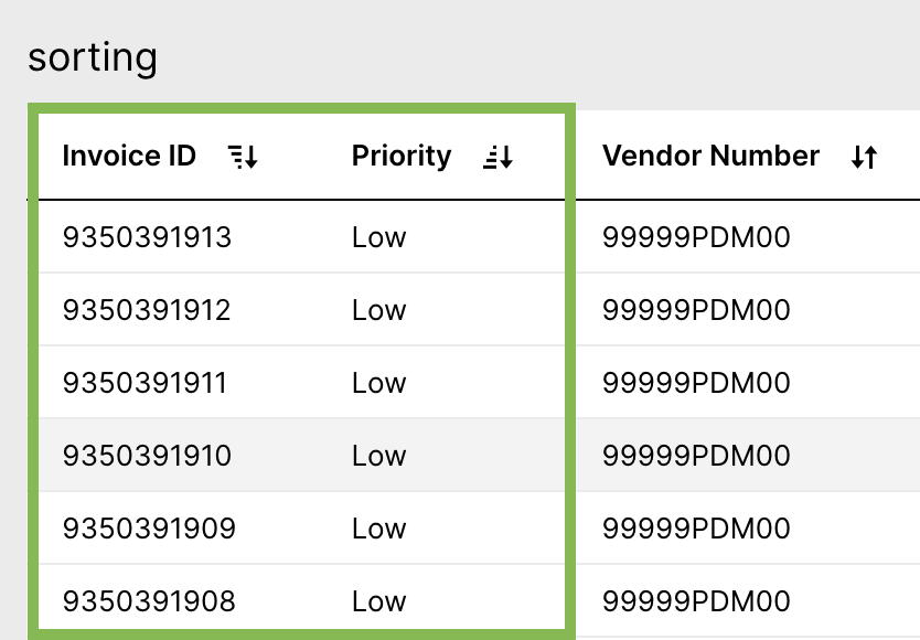
sortBy - field: RECORD.ATTRIBUTE | No | - | Defines the default sorting of the table. You need to define the field and which direction the table should be sorted. Multi-column sorting is possible. Sorting by KPI and Augmented Attributes is currently not supported.
| ||
direction: | No | String | ASC DESC | ||
interactions: filters: | No | Boolean | TRUE FALSE | Defines if the table will be filterable via cell selections or not. | |
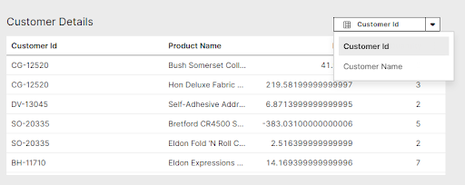
breakdownSelector: columns: -field | No | Record Attribute, KPI, Augmented Attribute, or Custom Object | - | Defines if the user will have a breakdown selector shown in their table. This breakdown selector will allow users to change the dimension that the data is aggregated by in the table.
The fields shown in the Breakdown selector can either be defined by listing the fields within the component or referencing a Custom Object. Both examples can be seen below: Fields defined in component: id: table-d2d7e5fc-3251-48a4-a861-63aafaf86d76 type: table settings: data: breakdownSelector: columns: - field: ORDERS.CUSTOMER_ID - field: ORDERS.CUSTOMER_NAME columns: - field: ORDERS.PRODUCT_NAME id: 3e68b67d-b460-4ec9-9059-568fb808e03e order: 100 - field: ORDERS.PROFIT id: dade401a-25ea-485b-a3b4-11f5911e34f5 order: 200 - field: ORDERS.QUANTITY id: b20417cd-8af3-431c-ae10-a75214960efd order: 300 name: Customer Details Fields defined by Custom Object from Knowledge Model: id: table-d2d7e5fc-3251-48a4-a861-63aafaf86d76 type: table settings: data: breakdownSelector: customObject:KPI_Display_Rule | |
scrollHorizontally preventLineBreak | No | True False | This controls the text wrapping settings in your table. Prevent line break defines if the text should be displayed in one row (true) or displayed in multiple rows (false). And the YAML example for this configuration: - id: table1
type: table
settings:
name: my table
data:
limit: 20
columns:
- id: ORDERS.ROW_ID
showTasks: true
order: 100
link: true
- id: ORDERS.ORDER_ID
order: 200
link: false
- id: ORDERS.SALES
order: 300
- id: ORDERS.PRODUCT_NAME
order: 400
- id: ORDERS.CUSTOMER_NAME
order: 500
- id: ORDERS.STATE
order: 600
options:
scrollHorizontally: false
preventLineBreak: true |