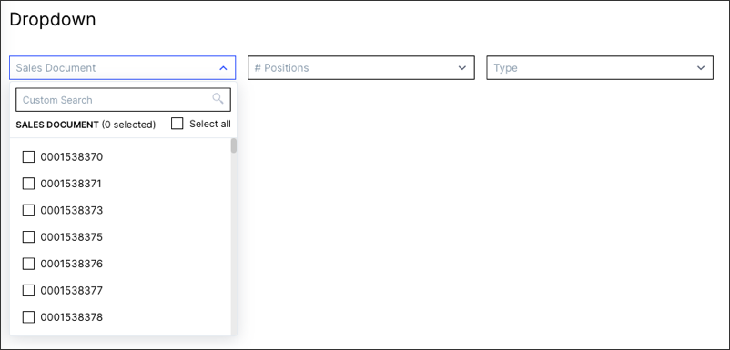
Celonis Product Documentation

Dropdowns
Overview

Placement

View

or

Profile View

Required KM objects

Record.Attribute

KPI

Augment Attribute

Custom Object

Introduction to Dropdowns

Use the "Dropdown" component on (Profile) Views to allow your users to filter the entire View based on attributes or changing variables which can be used e.g. for changing dimensions for other components.

41190206.png
Basic configuration

Please find below an example of the most basic configuration of a "Dropdown" component:

Attribute

Required

Type

Description

attribute

true

Record.Attribute

Custom Object

References objects defined in the Knowledge Model.

Important

In many use cases the record must have an identifier defined to use properly.

Info

In case you don't want certain dropdown options to appear in the dropdown. you can make use of the PQL functions.

id

true

String

Defines a unique identifier for the field. It gets auto-generated if not defined. It is important in the context of Base and Extension.

order

true

Integer

Defines the order of the table column. Gets auto-generated if not defined. It is important in context of Base and Extension.

Info

optimised for component editor

View

id: dropdown
type: dropdown-list
settings:
        data:
                columns:
            - attribute: RECORD.ATTRIBUTE1
                          id: 100
                          order: 100
            - attribute: RECORD.ATTRIBUTE2
                          id: 200
                          order: 200
Advanced configuration

In addition to the basic configuration, the following configuration options are also available.

Attribute

Required

Type

Possible values

Default Value

Description

floatingPlaceholder

false

Boolean

true

false

false

Defines that Strings are automatically left and numbers and timestamps right aligned.

Click here to see screenshot

55705995.png

styles

false

Enum

overflow

styles

Contains different styling options such as overflow or styles.

overflow

false

Enum

full-width

line-break

scroll

full-width

Defines the orientation of a list of dropdowns when the width of the selected dropdowns exceeds the component size.

styles

false

Enum

horizontal

vertical

-

Contains different style options such as horizontal and vertical alignment.

horizontal

false

Enum

full

right

center

left

full

Defines the horizontal alignment of the component.

vertical

false

Enum

top

center

bottom

bottom

Defines the vertical alignment of the component.

displayName

false

String

Defines a display Name that should be displayed instead.

Click here to see screenshot

57541913.png

selected

false

String

Defines the options which should be selected up-on page load.

Important

This setting is currently not fully functional so we advise not to use it.

scope

false

Enum

disabled

hidden

immutable

Defines the scope of the dropdown option. This can be used in the context of base and extensions.

onClick

update

false

Boolean

title

list

list

Defines an onclick variable update action.

variables:

- name

false

Views Variable

Runtime Variable

-

-

Defines the variable into which the selected value will be written. You can then make use of the variable at different components.

selection

false

Boolean

single

multiple

single

Defines if the dropdown should be single or multi-select when updating the variable value.

Info

optimised for component editor

View

id: dropdown
type: dropdown-list
settings:
        floatingPlaceholder: true
    styles:
        overflow: full-width
        position:
                        horizontal: right
                        vertical: center
        data:
                columns:
            - attribute: RECORD.ATTRIBUTE1
                          id: 100
                          order: 100
            - attribute: RECORD.ATTRIBUTE2
                          id: 200
                          order: 200
                          displayName: CustomName
                          scope: hidden
                  onClick:
                update:
                        variables:
                                - name: <DUMMY_VARIABLES>

Variables

Make use of variables in case your selection option should change e.g. the dimension on a table or chart. You can learn about the concept of variables here.

Configuration

Please find below an example of how to make use of Variables:

View

- id: DropDown
    type: dropdown-list
    settings:
      floatingPlaceholder: true
      data:
        columns:
            # dropdown for changing the variable, the suggested values of variable are from dataModel
            - attribute: ACTIVITY.USERNAME
                          id: 100
                          order: 100
              # current value of variable
              selected: ${currentUser1}
              onClick:
                update:
                  variables:
                    # list of the variables to change
                    - name: currentUser1
                    - name: currentUser2
            # dropdown for changing the variable, the suggested values of variable are from semantic-layer (DIMENSIONS)          
            - attribute: ACTIVITY.DIMENTIONS
                          id: 200
                          order: 200
              selected: ${currentDimension}
              onClick:
                update:
                  variables:
                    - name: currentDimension
            # dropdown for changing the variable, the suggested values of variable are from semantic-layer (CHARTS_TYPE_LIST)          
            - attribute: ACTIVITY.CHARTS_TYPE_LIST
                          id: 300
                          order: 300
              selected: ${currentChartType}
              onClick: #When referencing custom attributes in a dropdown you always need to define the "onClick" event.
                update:
                  variables:
                    - name: currentChartType

Knowledge Model

- customObjects:
  - id: CHARTS_TYPE_LIST
    displayName: Chart types
    customAttributes:
      list:
        - name: bar
        - name: line
  - id: DIMENTIONS
    displayName: Dimensions
    customAttributes:
      columns:
        - id: TOTAL_NUMBER_OF_INVOICES #In case you use 'text like this' then make sure to single quote it
        - id: TOTAL_NUMBER_OF_INVOICES_2
        - id: COUNT_ACTIVITIES
        - id: COUNT_USERS

Important

When referencing custom attributes in a dropdown you always need to define the "onClick" event.

Using Dropdown Component for Breakdowns
  1. Define all dimensions of the breakdown in the Knowledge Model.

    Knowledge Model

    customObjects:
      - id: BREAKDOWN_DIMENSIONS
        displayName: Dimensions
        customAttributes:
          columns:
            - id: INVOICE_VENDOR_ID_NAME
            - id: INVOICE_BUKRS_ID_TEXT
            - id: INVOICE_BLART_ID_TEXT
  2. Add a variable in the view configuration.

    View YAML configuration for input

    variables:
      - name: currentDimension_1
            defaultValue: INVOICE_BUKRS_ID_TEXT
            type: STRING
  3. Add the dropdown component.

    View YAML configuration for dropdown

    - id: DimensionSwitcher_1
      type: dropdown-list
      settings:
        data:
          columns:
          - attribute: ACTIVITY.BREAKDOWN_DIMENSIONS
            id: 100
            order: 100
            selected: INVOICE_BUKRS_ID_TEXT
            onClick:
              update:
                variables:
                - name: currentDimension_1
     
  4. Add the table the breakdown should be applied to.

    View YAML configuration for table

    - id: drilldown_table
      type: table
      settings:
        options:
          autoAlignment: true
          selectable: false
          allowSearch: false
          scrollHorizontally: false
          dense: true
        data:
          columns:
          - attribute: ACTIVITY.${currentDimension_1}
            id: 100
            order: 100
            copyToClipboard: true
          - attribute: ACTIVITY.ASSIGNEE
            id: 200
            order: 200
  5. Include the components in your layout.

    View YAML configuration for layout

    layout:
      rows:
      - id: "row1"
        columns:
        - id: "row1-col1"
          componentId: "textboxHeader"
          size: "3/4"
          order: 100
        - id: "row1-col2"
          componentId: "DimensionSwitcher_1"
          size: "1/4"
          order: 200
        order: 100
      - id: "row2"
        removePadding: true
        order: 300
        columns:
        - id: "row2-col1"
          componentId: "drilldown_table"
          size: "1"
          order: 100
Using Dropdowns To Created Inverted View Filters

There may often be times when you wish to filter a view for all variables, EXCEPT for one of two indicated selections. If you are in this situation, please follow the steps outlined below:

  1. Check Select all in the dropdown component.

    60362843.png
  2. De-select the entries you do not want to view.

    60362844.png
  3. Your view should now be filtered to show all values EXCEPT those you de-selected.