YAML for view components
Note
You're currently viewing a topic describing a Studio feature that's in limited availability. For more information, see: Studio (new experience).
For all other Studio features, see: Studio.
The new Studio experience allows you to edit your views using YAML.
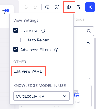
When editing your views using the new Studio experience, you can switch to the YAML editor by clicking View Settings - Edit View YAML:
 |
You're then in the YAML editor and can use the following YAML references:
Basic attribute list configuration
Attribute | Required | Type | Description |
|---|---|---|---|
field | Yes | Record Attribute KPI Augmented attribute | References objects defined in the Knowledge Model. ImportantIn many use cases, the record must have an identifier defined to use properly. |
id | Yes | String | Defines a unique identifier for the field. It gets auto-generated if not defined. . |
order | Yes | Integer | Defines the order of the table column. Gets auto-generated if not defined. . |
Advanced attribute list configuration
Attribute | Required | Type | Possible values | Default Value | Description |
|---|---|---|---|---|---|
filteredByUserFilters | Yes | Boolean | true false | true | Defines if user-applied filters are applied on the component. |
position | No | Enum | vertical horizontal | vertical | Defines the orientation of the list. |
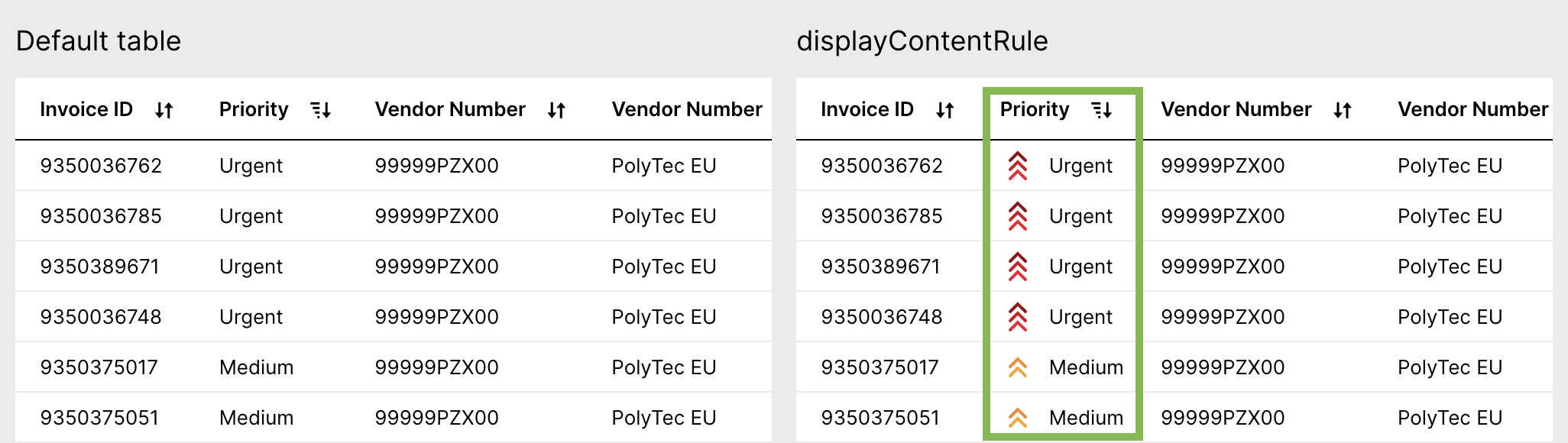
displayContentRule | No | Custom Attribute | Defines custom formatting of individual attributes. You can change text formatting or apply icons based on different conditions. For more details check out the Display Rule documentation. In order to make the display rule fully functional an additional Custom Object is required in the Knowledge Model. This custom object contains all the information on how to display the attribute. |
Basic button configuration
Attribute | Required | Type | Description |
|---|---|---|---|
label | No | String | Defines the description text that will be shown on the button. Try to keep the button's label short and precise. It is also possible to create a button without a label by only using an icon instead of a label. |
id | No | String | Defines a unique identifier for the field. It is important in context of Base and Extension. |
Advanced button configuration
Attribute | Required | Type | Possible values | Default Value | Description |
|---|---|---|---|---|---|
label | No | String | - | - | Defines the description text that will be shown on the button. Try to keep the button's label short and precise. In the example below, the buttons are defined with the labels "Open Invoice", "Past Due", and "High Priority" |
size | No | Enum | small large | large | Defines what size you would like your buttons to show in the view. |
variant | No | Enum | neutral primary info danger | neutral | Defines the button's visual appearance. It is recommended to use a fitting variant to the use case, e.g. buttons that lead to deletions should be of variant |
OnClick configuration
Attribute | Required | Type | Possible values | Description |
|---|---|---|---|---|
onClick | No | Defines the underlying action of a button | ||
onClick: navigateTo: url: | No | String | - | Defines if a link should be added to the button. Can be another Celonis View or any external URL. YAML example: id: button-external-link type: button-list settings: buttons: - label: Celonis Website id: f825e378-e2bd-43eb-8c10-e6857fa33d34 order: 100 onClick: navigateTo: url: https://www.celonis.com/ openInNewTab: true When Linking to another Celonis view, you can simply copy and paste the View URL. Additionally,
|
openInNewTab | No | Boolean | true false | Defines if the linked URL should be opened in a new tab or not. |
placeholders | No | List of fields | - | Defines the required placeholders in the external URL link YAML example: id: button-external-link
type: button-list
settings:
name: Celonis Website
buttons:
- label: Celonis Website
onClick:
navigateTo:
url: https://www.celonis.com/de/{0}/{1}
openInNewTab: true
placeholders: #Defines the required placeholders
- field: NUMBER_OF_SOLD_PRODUCTS_EX
- field: INVOICE.PRODUCT_NAME |
update variable: - name: variable1 - name: variable2 | No | - | You can use a button to update a variable when clicking the button. For information about variables, click here. | |
executeSkill skillKey: button variables: - name: value1 - value: ${value1} | No | Defines if clicking the button should trigger a defined skill. Please also consult the Help Page on Provide default actions to learn more about manual Skill executions. YAML example: id: button-skill
type: button-list
settings:
name: Trigger Skill
buttons:
- icon: product-workflows
label: Trigger
onClick:
executeSkill:
skillKey: button-test
inputs:
- name: value1
value: ${value1} | ||
routerLink | No | String | - | Defines if clicking the button should open another asset using a router link. router links allow you to navigate to different views without reloading the current view. To open a router link, copy the portion of the asset's URL display after "package-manager/" and paste into the routerLink configuration. To define if you want the user to be directed to the view in the Studio or Apps, you can edit the first part of the link shown below: Studio Link: /ui/studio/ui/... Views Link: /ui/views/ui/.. YAML example: id: button-router-link type: button-list settings: name: Navigate through router link buttons: - icon: kpi label: Check KPI Bowler onClick: routerLink: /ui/studio/ui/package/6f104d9f-3661-4962-bbc7-26b1abf60d0f/workbench-assets/ce4e3a7d-2373-409d-bf03-9d40fcf92c83 |
openView | No | - | Defines the view that will open onClick. You can link a Profile View (using the knowledgeObjectID) or any other view (using the viewKey) | |
KnowledgeObjectID | No | Defines the Profile View the user wants to link to the button using the Knowledge Object ID / Record ID for which the registered default profile view is then opened. Click here to learn how to create a Profile View. Click here to learn more about View Variables. The record must have an identifier defined in the Knowledge Model to use properly. YAML example: id: button type: button-list settings: name: Open a Profile View (of type Activity) buttons: - icon: product-workflows label: Activity View onClick: openView: viewKey: VIEW_KEY #Reference the key of the Profile View variables: #Below some optional settings to carry variables to the view key - name: Variable name value: 20 carryFilters: false carrySelections: false | ||
viewKey | No | String | Defines the view the user wants to link to the button using the View's Key. YAML example: - id: "kpi-button-list" type: "button-list" settings: type: "default" buttons: - label: "Detailed Risk Overview" variant: "primary" size: "large" icon: "info" block: true onClick: openView: viewKey: "Risk-Overlay" openInSideOverlay: true carryFilters: true carrySelections: true | |
openInSideOverlay | No | Boolean | true false | |
syncFilters | No | String | forward-only (default) backward-only disable both-ways | Defines if filters should be carried from the current view to the linked view. This will apply to all filters applied to the view (i.e. applied from dropdowns, quick-filters, table, charts, etc.) Forward: Filters set on the main View and filters set on the component that is opening the linked View, will be immediately applied to the linked View. Backward:Filters set in the linked view will be immediately applied back to the main view. Both-ways: Filters set on the linked View are immediately applied to the main View and filters set on the main View are immediately applied on the linked View. Note that filters set on the component that is opening the linked View, will only be applied forward. Disabled: No filters are carried to or from linked views. NoteSyncing filters between Views that are not using the same underlying Knowledge Model or Data Model can result in no data being found. Global filters will also be synced and may differ between Knowledge Models. |
carrySelections | false | Boolean | true false | Defines if table selections should be carried from the current view to the linked view. This should only be enabled if both your current and linked view contain table components.
|
variables - name: value1 - value: ${value1} | false | - | - | Defines a list of variables from your base view that you like to utilize in your linked view.
|
Button list configuration
Attribute | Required | Type | Possible values | Default Value | Description |
|---|---|---|---|---|---|
size | No | Enum | small large | large | Defines what size you would like your buttons to show in the view. |
overflow | No | Enum | full-width line-break scroll | full-width | Defines the overflow behavior that happens when the button list size is larger than the defined component size in the layout. |
position | No | Defines that the position of the component within the given layout. | |||
horizontal | No | Enum | full left center right | full | Defines the horizontal alignment position within the given layout. |
vertical | No | Enum | top center bottom | bottom | Defines the vertical alignment position with the given layout. |
Attribute | Required | Type | Possible values | Description |
|---|---|---|---|---|
name | No | String | Defines the case explorer name that will be displayed on the top left corner of the component. | |
data record | No | string | Record Ids from the Knowledge Model | If you don’t want to use the default auto-generated record in the Knowledge Model for the Case Table, you can configure your own record in the KM with the appropriate attributes and correct unit/format. Then use the RecordId from the record you configured as the main record rendered in the case table section of this CaseExplorer component. NoteThe attributes and PQL statements used in this record should have a data model relation with the actual case table. Otherwise the component will not be able to render and you will get an error message. |
Basic comment configuration
Attribute | Required | Type | Description |
|---|---|---|---|
objectId | Yes | String | Defines the identifier that the commments are associated with. Note that the comments are then only visible within the view, rather than across the Celonis platform.
|
Advanced comment configuration
Attribute | Required | Type | Possible Values | Default | Description |
|---|---|---|---|---|---|
name | No | String | Comments | Defines the name shown at the top of the comments component. | |
commentLimit | No | Integer | 5 | Defines the number of comments displayed on one page. | |
dateFormat | No | Boolean |
| yyyy-MM-dd hh:mm | Defines the format of the comment timestamp. |
Basic dropdown configuration
Attribute | Required | Type | Description |
|---|---|---|---|
attribute | Yes | Record.Attribute Custom Object | References objects defined in the Knowledge Model. ImportantIn many use cases the record must have an identifier defined to use properly. |
id | Yes | String | Defines a unique identifier for the field. It gets auto-generated if not defined. It is important in the context of Base and Extension. |
order | Yes | Integer | Defines the order of the table column. Gets auto-generated if not defined. It is important in context of Base and Extension. |
Advanced dropdown configuration
Attribute | Required | Type | Possible values | Default Value | Description |
|---|---|---|---|---|---|
floatingPlaceholder | No | Boolean | true false | false | Defines that Strings are automatically left and numbers and timestamps right aligned. |
styles | No | Enum | overflow styles | Contains different styling options such as overflow or styles. | |
overflow | No | Enum | full-width line-break scroll | full-width | Defines the orientation of a list of dropdowns when the width of the selected dropdowns exceeds the component size. |
styles | No | Enum | horizontal vertical | - | Contains different style options such as horizontal and vertical alignment. |
horizontal | No | Enum | full right center left | full | Defines the horizontal alignment of the component. |
vertical | No | Enum | top center bottom | bottom | Defines the vertical alignment of the component. |
displayName | No | String | Defines a display Name that should be displayed instead. | ||
selected | No | String | Defines the options which should be selected up-on page load. | ||
scope | No | Enum | disabled hidden immutable | Defines the scope of the dropdown option. This can be used in the context of base and extensions. | |
onClick update | No | Boolean | title list | list | Defines an onclick variable update action. |
variables: - name | No | - | - | Defines the variable into which the selected value will be written. You can then make use of the variable at different components. | |
selection | No | Boolean | single multiple | single | Defines if the dropdown should be single or multi-select when updating the variable value. |
Basic histogram configuration
Attribute | Required | Type | Description |
|---|---|---|---|
attribute | Yes | References attributes defined in the Knowledge Model. This is the data table column that will be used to create the buckets distribution. NoteOnly attributes with numerical (integer and float) data types are supported. | |
name | Yes | String | Defines the histogram name that will be displayed on the top left corner of the component. |
Advanced histogram configuration
Attribute | Required | Type | Possible values | Description |
|---|---|---|---|---|
orientation | No | String | vertical horizontal | Defines if the bars in the histogram should be drawn on the horizontal or vertical axis. |
distributionAxis | No | - | - | Defines display settings for the main distribution axis. |
format | No | Format type | Defines the format display for the indicated attribute on the distribution axis. | |
title | No | String | Defines the title displayed for the indicated attribute on the distribution axis. | |
occurrenceAxis | No | - | - | Defines display settings for the histogram’s occurrence axis. This axis shows the frequency count for each bucket on the distribution axis. |
format | No | Format type | Defines the format display for the indicated attribute on the distribution axis. | |
title | No | String | - | Defines the title displayed for the indicated attribute on the distribution axis. |
displayContentRule | No | - | Defines custom coloring rules that can be used to color specific bars in the histogram. NoteThe buckets displayed will be updated based on the “value” defined in the display rule. | |
suggestedBucketCount | No | Integer | - | Defines the number of buckets that will be displayed in the histogram. This count does not include outliers buckets. NoteAny value indicated here will be treated as a suggestion. The bucket calculation will always prioritize “nice” bucket sizes with integer bounds (i.e. avoiding decimal values). Also, including annotation lines or custom coloring groups will also impact these bucket calculations. The histogram calculation will always aim to keep the bucket count as close to the indicated values while keeping nice bucket sizes and taking into account position lines and coloring groups. |
suggestedBucketWidth | No | Integer | - | Defines the width for each bucket that will be displayed in the histogram. NoteAny value indicated here will be treated as a suggestion. The bucket calculation will always prioritize “nice” bucket sizes with integer bounds (i.e. avoiding decimal values). Also, including annotation lines or custom coloring groups will also impact these bucket calculations. The histogram calculation will always aim to keep the bucket width as close to the indicated values while keeping nice bucket sizes and taking into account position lines and coloring groups. |
additionalKPIs | No | - | Define additional KPIs to be displayed in the histogram tooltip. | |
annotations: | No | - | Add custom annotation lines to the distribution axis. | |
value | No | Integer View or runtime variable | Defines the value on the distribution axis that the annotation line should be placed on by either a hardcoded integer or variable value. NoteThe “value” and “kpi'' fields should not both be used. You should define the annotation line with either an integer value or a defined KPI. | |
kpi | No | Defines the value on the distribution axis that the annotation line should have with a defined KPI from the Knowledge Model. NoteThe “value” and “kpi'' fields should not both be used. You should define the annotation line with either an integer value or a defined KPI. | ||
line | No | boolean | solid (default) dashed none | Defines the type of annotation line displayed.
|
label | No | string | - | Defines the label displayed for the annotation line. |
labelalign | No | boolean | start middle end | Defines how the label is displayed with the position line. These will appear differently depending on the histogram’s orientation. |
color | No | boolean | BLUE, GREEN, RED, PURPLE, YELLOW, BLACK, CYAN, GRAY, PINK, PURPLE, ORANGE, TEAL, RED, WHITE | Defines the color of the annotation line. |
forceBucketBoundary | No | boolean | true false | Defines if the bucket sizes should be calculated to ensure a bound falls along the position line. |
interactions: filters: true | No | boolean | true false | Defines if the histogram bars can be selected to apply view filters. If set to false, these bars can not be selected. |
Attribute | Required | Type | Possible values | Description |
|---|---|---|---|---|
description value: placeholders:
| No | String | - | Defines description/supporting text that is displayed below the KPI value. You can also define attributes, KPIs, or variables from your knowledge model that you want to reference in this text. Once these have been defined in your parameter configuration, you can use them by referencing them using the format "Placeholder {X}" where "X" is the order placement you listed it in. NoteWhen referencing the parameter in the text field, the ordering reference should start at {0}. If you have three fields listed, you can reference these as
|
relatedKPIs:
| No | Define related KPIs to be displayed on the KPI card component. These KPIs should be used to support the main KPI with additional metrics. | ||
trend: timeDimension: range: growthRates: | No | Defines if trend visualizations should be displayed on the KPI card component. Trends can be added to gauge how your KPI has been trending across the selected time period. There are two types of trend visualizations that can be added:
| ||
showTarget | No | Boolean | true false | Defines if target information is displayed. Target information will only be displayed if the data is available. A red/green target icon will display next to this target based on how you are currently tracking towards your target. NoteIn the Knowledge Model, you can define default target information for each KPI. Once set, the target is stored for the KPI and automatically propagated to all components that use it. |
shorwPriority | No | Boolean | true false | Defines if priority information is displayed. Priority information will only be displayed if the data is available. NotePriority selection can only be set using the priority switcher tool and must be first added to your view to use it. For details on how to set this up, see Views Tools. |
displayContentRule | No | String | - | References a Display Rule in the Knowledge Model. |
kpiParams
value | No | - | Defines parameters that are also used in the Knowledge Model. For details on how to set a KPI parameter in the KPI, see KPI list. The ID value defines the ID value of the parameter defined. The ID value must match the KPI parameter ID defined in KM to work correctly. Thevaluedefines the parameter that will be passed from the knowledge model. This value should be defined using a variable with the input coming from e.g. a dropdown component. |
Basic KPI list configuration
Attribute | Required | Type | Description |
|---|---|---|---|
kpi | Yes | list of buttons | References a KPI(s) from the Knowledge Model that the user wants to include in their KPI List. |
show | Yes | Boolean | Defines if a KPI should be hidden or not. It gets auto-generated as "true" if not defined. The lowest number is displayed on the left side. |
id | Yes | String | Defines a unique identifier for the field. It gets auto-generated if not defined. It is important in the context of Base and Extension. |
order | Yes | Integer | Defines the order of the KPI list. Gets auto-generated if not defined. It is important in the context of Base and Extension. |
Advanced KPI list configuration
Attribute | Required | Type | Possible values | Default Value | Description |
|---|---|---|---|---|---|
size | No | Boolean | sm lg | non-interactive: small interactive: large | Defines the font size of the KPIs. View with large KPIs:  View with small KPIs:  |
showSettings | No | Boolean | true false | false | Defines if a setting modal will be displayed for the KPI List in the user interface of the view. From this setting's modal, users can edit or define target values, re-order the KPIs, and hide/show KPIs in their view. NoteIn the Knowledge Model, you can define default target information for each KPI and specify whether end-users can edit these targets within the component. Once set, the target is stored for the KPI and automatically propagated to all components that use it. KPI List with setting's modal enabled:  KPI setting's modal:  |
showTarget | No | Boolean | true false | true | Defines if target information is displayed. Target information will only be displayed if the data is available. A red/green icon will display next to this target based on how you are currently tracking towards your target. NoteTarget values can only be set in the settings modal from the component user interface. To enable the interface set showSettings: true and click on the gear icon. The target is set and stored for the KPI itself, it will be reflected in all components that the KPI is used in. 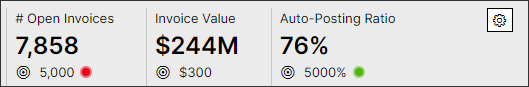 |
showBenchmark | No | Boolean | true false | true | Defines if benchmark information is displayed. Benchmark information will only be displayed if the data is available. Benchmarking details can be specified for each individual KPI in the Knowledge Model. |
shorwPriority | No | Boolean | true false | true | Defines if priority information is displayed. Priority information will only be displayed in the data is available. NotePriority selection can only be set using the priority switcher tool and must be first added to your view to use it. Details on how to set this up can be found here. KPI List with priority enabled: 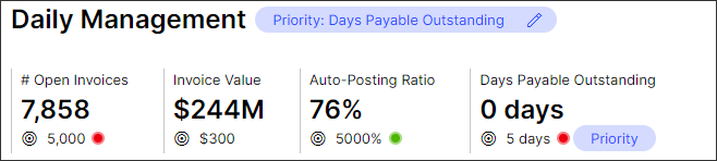 |
sortBy | No | Boolean | value name order | order | Defines what method the KPI list should be sorted based on. Sorting options include:
|
sortDirection | No | Boolean | DESC ASC | ASC | Defines the sorting direction of the KPIs based sorting method defined above. |
Data for KPI list configuration
Attribute | Required | Type | Possible values | Default Value | Description |
|---|---|---|---|---|---|
selectedKpi | No | KPI | - | - | References a KPI which should be selected up-on page load. |
onClick update: variables: id: | No | - | - | You can use a KPI list to update a variable when clicking the KPI. After your KPI has an onClick event enabled, it will be displayed as an interactive tile. | |
kpis | No | List of KPIs | - | - | Requires a list of KPIs you would like to configure. |
displayContentRule | No | String | - | References a display rule in the Knowledge Model NoteThis configuration option is currently only currently available for interactive KPI List. | |
kpiParams | No | - | - | - | Allows defining Parameters that are also used in the Knowledge Model. |
id | No | String | - | - | Define the ID value of the parameter defined NoteThe KPI Parameter ID value record in the view must match KPI parameter ID defined in KM to work correctly. |
value | No | - | - | Defines the value of the parameter that will be passed from the knowledge model. NoteThis value should be defined using a variable with the input coming from e.g. a dropdown component. | |
trend: timedimension: range: | No | Defines if a general trend marker should be displayed on the KPI List component. The general trend marker displays the percentage of change in the KPI value (also known as slope). You must define the time dimension (i.e. invoice date, closing date, etc.) and range (daily, weekly, monthly, or yearly) that the trend is calculated over. Once these are defined, a badge will be added to show the average increase or decrease per time period defined. |
Styles for KPI list configuration
Attribute | Required | Type | Possible values | Default Value | Description |
|---|---|---|---|---|---|
styles | No | ||||
overflow | No | Boolean | line-break scroll full-width | full-width | Defines the orientation of the KPI list component when the width of the selected KPIs exceeds the given component container size.
|
position | No | Defines the position of the KPI list | |||
horizontal | No | Boolean | center full left right | full | Defines the horizontal position of the component within its layout
|
vertical | No | Boolean | top bottom center | bottom | Defines the vertical position of the component within its layout |
Basic table configuration
Attribute | Required | Type | Description |
|---|---|---|---|
field | Yes | KPI, or | References objects defined in the Knowledge Model. In many use cases the record must have an identifier defined to use it properly. |
id | Yes | String | Defines a unique identifier for the field. The identifier is auto-generated if you don't define it. |
order | Yes | Integer | Defines the order of the table column. The order is auto-generated if you don't define it. |
Advanced table configuration
Attribute | Required | Type | Possible values | Description | |||
|---|---|---|---|---|---|---|---|
setFilters | Yes | Boolean | true (default) false | Defines if the component can set filters. | |||
filteredByUserFilters | Yes | Boolean | true (default) false | Defines if user-applied filters are applied on the component. | |||
resizeMode | Yes | Boolean | fit expand (default) | Defines how table columns are spaced, and how they behave as users resize them. The two options are:
| |||
allowContentLineBreak | Yes | Boolean | true false (default) | Defines if long text should appear in multiple lines in column cells.
| |||
allowHeaderLineBreak | Yes | Boolean | true false (default) | Defines if long text should appear in multiple lines in column headers.
| |||
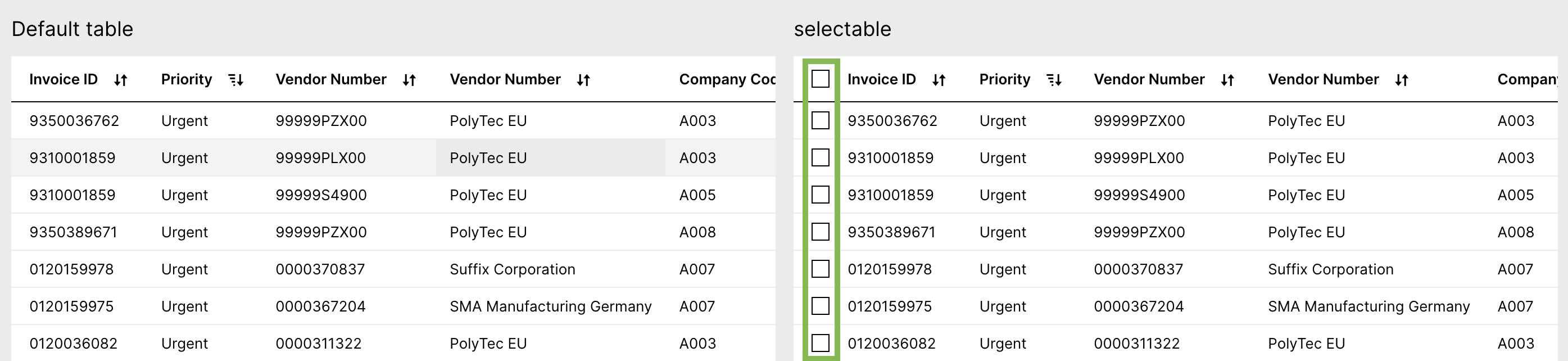
selectable | No | Boolean | true false (default) | Defines that checkboxes are displayed in the first column. This is required for displaying default actions above the table.
| |||
showPagination | No | Boolean | true (default) false | Defines if paginations at the bottom of the table should be displayed. Infinite scrolling will be used if pagination is not defined or set to "false".
| |||
allowDataExport | No | Boolean | true false (default) | Lets end users export the table as a comma-separated file (.csv) or an Excel file (.xlsx). Keep in mind that the download might take some time depending on how much data gets exported. The export button is grayed out while the export is running. When using this configuration also use the "name" attribute. Otherwise the layout won't look good. | |||
density | No | Boolean | standard (default) compact relaxed | Defines if the table should be shown with a standard, relaxed, or compact view by changing the row height. Standard
Compact
Relaxed
|
Column specific advanced table configuration
Attribute | Required | Type | Possible values | Description | |
|---|---|---|---|---|---|
onEdit | No | Defines if the column should enable inline editing. This feature is only currently available for augmented attributes. id: table1-c124731f-480a-49f8-b72e-2fc5f26dcd30
type: table
settings:
data:
columns:
- field: ORDERS.augmentedattribute_example
id: 53fc5dbe-971d-4147-9d02-996c57d4577d
order: 100
onEdit:
updateAugmentedAttribute:true | |||
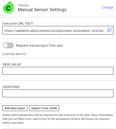
executeSkill | No | - | Defines if a skill should be executed when any augmented attribute is updated in the table. You can create a skill and link to the column using the skillKey. When creating the skill for this configuration, you can use the inputs "NEW_VALUE" and "IDENTIFIER" if you wish to include these in your skill (E.g. Send email notification with updated value to customer) Create a manual sensor with the following inputs:
| ||
updateAugmentedAttribute | No | Boolean | true false (default) | Defines if in-line editing should be enabled. This can only be used for augmented attributes. data: columns: ... ... - field: PIZZA.TYPE id: df08a98d-812d-4008-ae80-583375530f0e order: 400 - field: PIZZA.SIZE id: 3730ffb3-9e5b-40c2-85cc-f3d1c852e6d4 order: 500 - field: PIZZA.AUGMENTED_CATEGORY id: 8f04b729-cbbd-4185-8735-ada87bba5228 order: 600 - field: PIZZA.AUGMENTED_COMMENT id: c41d4c95-933d-47b3-81e7-256b2b1a50b9 order: 700 onEdit: updateAugmentedAttribute: allowBulkUpdate:true | |
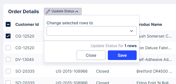
allowBulkUpdate | No | Boolean | true false (default) | Enables a bulk update action to be displayed at the top of the table when one or more table rows are selected. Users can choose to activate this feature for any augmented attributes in a table component. It supports updating up to 5,000 rows at once.
| |
onClick | No | Defines that the column should be displayed as link. columns: - field: SAMPLESALESDATAEXCELMOD_XLSX_ORDERS.REGION id: 7ebfa0ba-7afa-4193-b5ca-0e5acdbc2a1f order: 100 hide: true onClick: openView: profileView: true syncFilters: forward-only openInSideOverlay: true | |||
openView | No | Defines the view that will open onClick. You can link a Profile View (using the profileView selector) or any other view (using the viewKey) | |||
profileView | No | Boolean | true false (default) | Defines if a link to the record profile should be added. | |
viewKey | No | - | Defines the view the user wants to link to the table column using the View's Key. | ||
showInSideOverlay | No | Boolean | true false (default) | Defines if a modal gets opened or a slide in will appear. Default Slide in (true) Modal (false) | |
syncFilters | No | String | forward-only (default) backward-only disable both-ways | Defines if filters should be synced between the current View and the linked View. This setting will apply to all filters applied to the View (i.e. applied from dropdowns, quick-filters, tables, charts, etc.). Forward: Filters set on the main View and filters set on the component that is opening the linked View, will be immediately applied to the linked View. Backward: Filters set on the linked View will be immediately applied to the main View. Both-ways: Filters set on the linked View are immediately applied to the main View and filters set on the main View are immediately applied on the linked View. Note that filters set on the component that is opening the linked View, will only be applied forward. Disabled: No filters are carried to or from linked views. NoteSyncing filters between Views that are not using the same underlying Knowledge Model or Data Model can result in no data being found. Global filters will also be synced and may differ between Knowledge Models. - field: SALESDATA_ORDERS.CUSTOMER_ID id: 45808bdc-caf0-49f9-8358-55b3ebdde71d order: 400 onClick: openView: profileView: true syncFilters: both-ways openInSideOverlay: true | |
carrySelections | No | Boolean | true false | Defines if table selections should be carried from the current view to the linked view. This should only be enabled if both your current and linked view contain table components. | |
hrefAttribute | No | - | References a KM record, which contains a URL. This can be used to generate dynamically URLs, which depend on the information from the individual table row. SET-UP STEPS 1.) Create a new Attribute, which contains the URL structure inside pql attribute Knowledge Model - id: HREF_USERNAME displayName: Href Username pql: '''https://www.google.com/?q='' || "PizzaP2P-fixed_xlsx_Sheet_0"."USER_NAME"' #Defines URL structure filterIds: [] columnType: string 2.) Enable hrefAttribute for your table View - id: table type: table settings: data: columns: - field: ACTIVITY.CASEKEY order: 100 id: baffa132-b23a-4470-b2b6-36b069e6f893 onClick: hrefAttribute: ACTIVITY.HREF_USERNAME #References attribute from KM openInNewTab: true | ||
openInNewTab | No | Boolean | true false (default) | Defines if the URL should be opened in a new tab or not. This configuration only works if you also use hrefAttribute. | |
update variable: - name: variable1 - name: variable2 | No | - | You can use a table to update a variable upon clicking a link in a row of your table. This allows you for example display the details of a specific line item right underneath the table component, instead of opening it in a separate profile view.To learn more about Variables, see Views variables. View variables:
- name: demo #Defines demo variable.
defaultValue: demo text
...
components:
- id: table1
type: table
settings:
data:
columns:
- order: 100
field: ORDERS.ORDER_ID
id: 893b4d4a-37e3-400a-af89-13692a9cf2f1
onClick:
linkToRecordProfile: true
showTasks: true
- order: 150
field: ORDERS.CATEGORY
id: 149e396e-37ad-4d6b-a877-74fafb14ba88
onClick:
update:
variables:
- name:
- id: text
type: task-list
settings:
name: ${demo.ORDER_ID} | ||
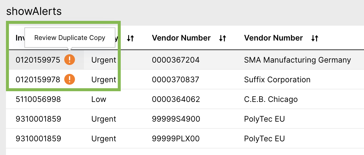
showAlerts | No | Boolean | true false (default) | Defines that Alerts are displayed in the column. It can be used to inform a user about a potentials issue. For more details on how create alerts, see Create Alerts.
| |
hide | No | Boolean | true false (default) | Defines if the column should be hidden or not. This configuration can be used in combination with allowInvisibleColumns: true (see above). By this columns are not visible by default but customers can still choose if they would like to have certain columns visible in their table. | |
copyToClipboard | No | Boolean | true false (default) | Defines to allow copy to clipboard functionality when hovering the cell in this column. | |
displayContentRule | No | Custom attribute | Defines custom formatting of individual attributes. You can change text formatting or apply icons based on different conditions. For more details check out the Display Rule documentation.
| ||
sticky | No | String | left right none | Defines whether a column is pinned and, if pinned, which side it should be pinned to. NoteIf wanting to pin the breakdown selector column, you will need to enable this in the YAML editor. The breakdown selector can also only be pinned to the left side of the Table.
|
Other advanced table configuration options
Attribute | Required | Type | Possible values | Description | |
|---|---|---|---|---|---|
limit | No | Integer | Defines how many rows should be displayed per page. | ||
distinct | No | Boolean | true false (default) | Defines if only distinct values are displayed. It works only when options selectable, link, showTasks, showAlerts and task attributes are not enabled. | |
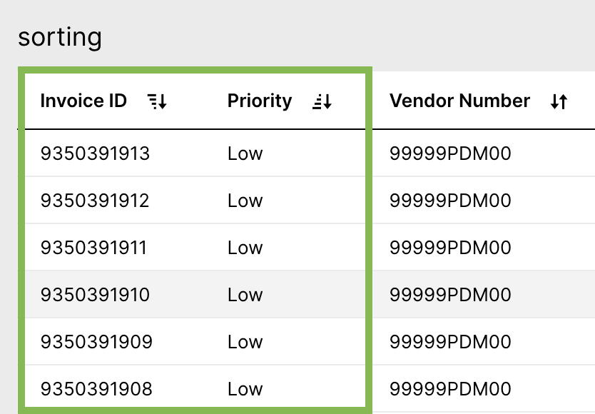
sortBy - field: RECORD.ATTRIBUTE | No | - | Defines the default sorting of the table. You need to define the field and which direction the table should be sorted. Multi-column sorting is possible. Sorting by KPI and Augmented Attributes is currently not supported.
| ||
direction: | No | String | ASC DESC | ||
interactions: filters: | No | Boolean | TRUE FALSE | Defines if the table will be filterable via cell selections or not. | |
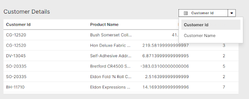
breakdownSelector: columns: -field | No | Record Attribute, KPI, Augmented Attribute, or Custom Object | - | Defines if the user will have a breakdown selector shown in their table. This breakdown selector will allow users to change the dimension that the data is aggregated by in the table.
The fields shown in the Breakdown selector can either be defined by listing the fields within the component or referencing a Custom Object. Both examples can be seen below: Fields defined in component: id: table-d2d7e5fc-3251-48a4-a861-63aafaf86d76 type: table settings: data: breakdownSelector: columns: - field: ORDERS.CUSTOMER_ID - field: ORDERS.CUSTOMER_NAME columns: - field: ORDERS.PRODUCT_NAME id: 3e68b67d-b460-4ec9-9059-568fb808e03e order: 100 - field: ORDERS.PROFIT id: dade401a-25ea-485b-a3b4-11f5911e34f5 order: 200 - field: ORDERS.QUANTITY id: b20417cd-8af3-431c-ae10-a75214960efd order: 300 name: Customer Details Fields defined by Custom Object from Knowledge Model: id: table-d2d7e5fc-3251-48a4-a861-63aafaf86d76 type: table settings: data: breakdownSelector: customObject:KPI_Display_Rule | |
scrollHorizontally preventLineBreak | No | True False | This controls the text wrapping settings in your table. Prevent line break defines if the text should be displayed in one row (true) or displayed in multiple rows (false). And the YAML example for this configuration: - id: table1
type: table
settings:
name: my table
data:
limit: 20
columns:
- id: ORDERS.ROW_ID
showTasks: true
order: 100
link: true
- id: ORDERS.ORDER_ID
order: 200
link: false
- id: ORDERS.SALES
order: 300
- id: ORDERS.PRODUCT_NAME
order: 400
- id: ORDERS.CUSTOMER_NAME
order: 500
- id: ORDERS.STATE
order: 600
options:
scrollHorizontally: false
preventLineBreak: true |
Basic textbox configuration
Attribute | Required | Type | Description | |
|---|---|---|---|---|
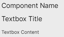
name | No | String | Defines the component name that will be displayed at the top of the textbox.
| |
title | No | String | Defines the title that should be displayed above the textbox content.
| |
content | No | String | Defines the content that should be displayed within the textbox component.
|
Advanced textbox configuration
Attribute | Required | Type | Description |
|---|---|---|---|
placeholders | No | String | Defines attributes, KPIs, or variables from your knowledge model that you want to reference in the textbox content. Once these have been defined in your parameter configuration, you can use them in your textbox by referencing them using the format "Placeholder {X}" where "X" is the order placement you listed it in. NoteWhen referencing the parameter in the text field, the ordering reference should start at {0}. Therefore, if you have three fields listed, you can reference these as :
|
Additional HTML design elements
Additional Design Properties | Description |
|---|---|
HTML Elements | Defines additional stylist properties using HTML elements within the content configurations. Some HTML elements used in the example above:
Further HTML elements can be used such as e.g.: <code> <p> <hr> <ul> <ol> <li> <a> <b> <i><div> If you are new to HTML, we recommend the following external resource. |