Studio App Building Guidelines - Use case deep dive
Use case deep dive views let users find opportunities for improvement, identify which inefficiencies are affecting the performance of processes, and find solutions to problems. They also allow users to track the KPI performance over time and give reports on the current status. Users will come to these use case deep-dive views after having validated the data and framed the value of the use case to narrow down the scope of analysis. Users will then return to the use case deep-dive tab regularly to check for changes over time.
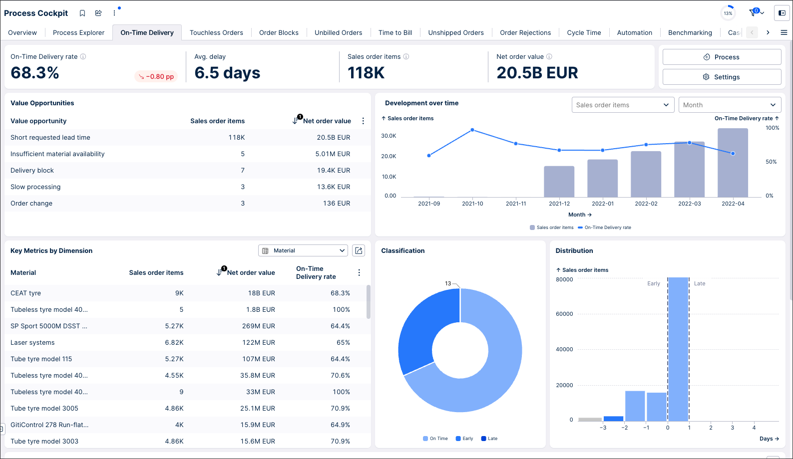
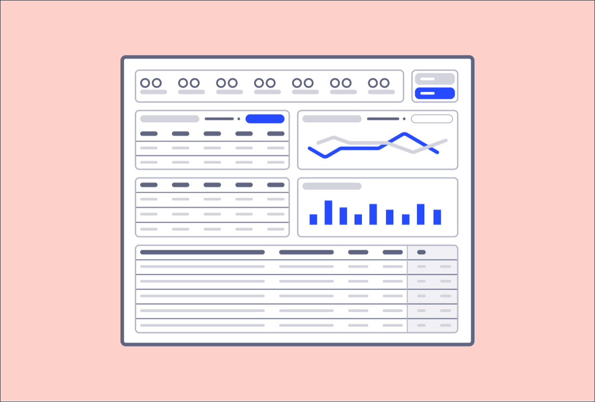
Example use case deep dives can be found in any Starter Kit in the Celonis Marketplace. This screenshot is from the On-Time Delivery tab in the Order Management Starter Kit (object-centric):
 |
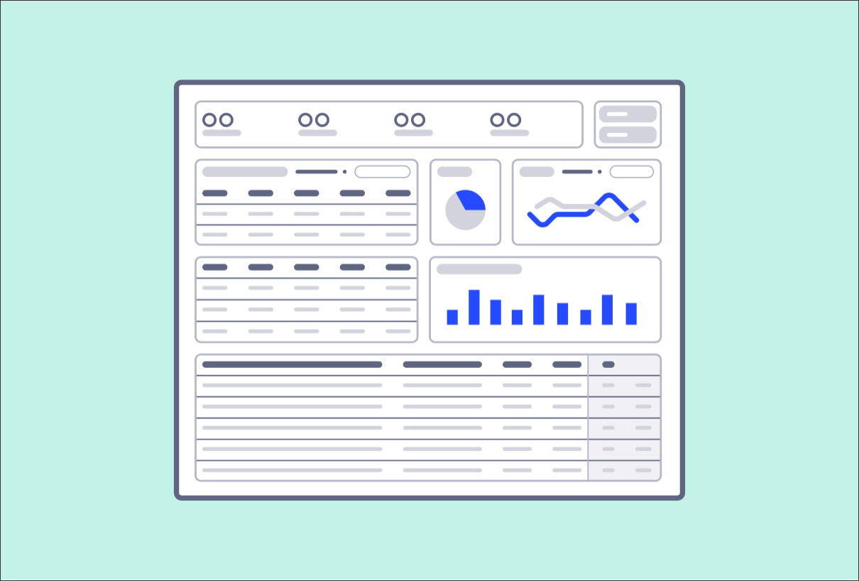
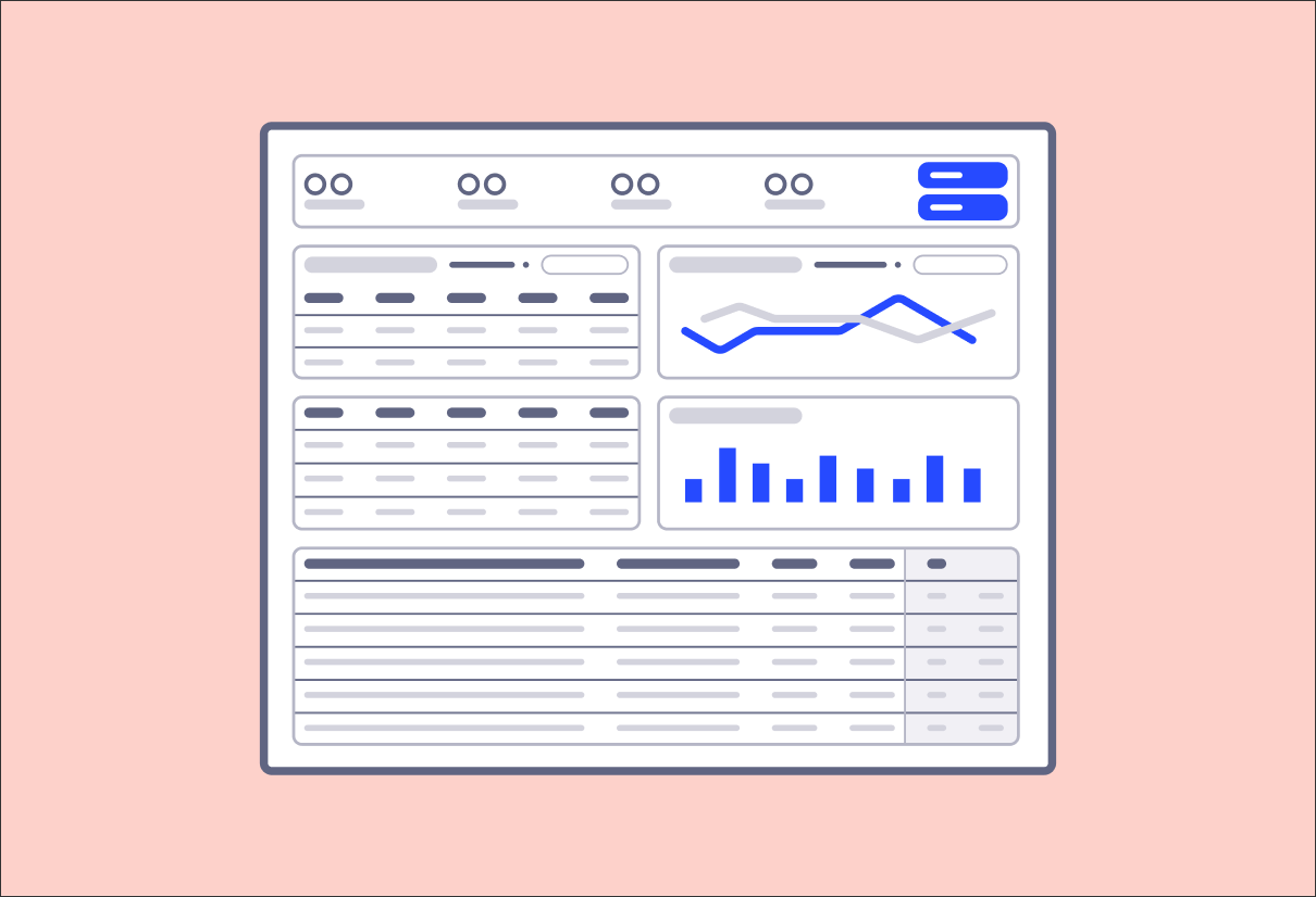
A use case deep dive view is divided into three sections:
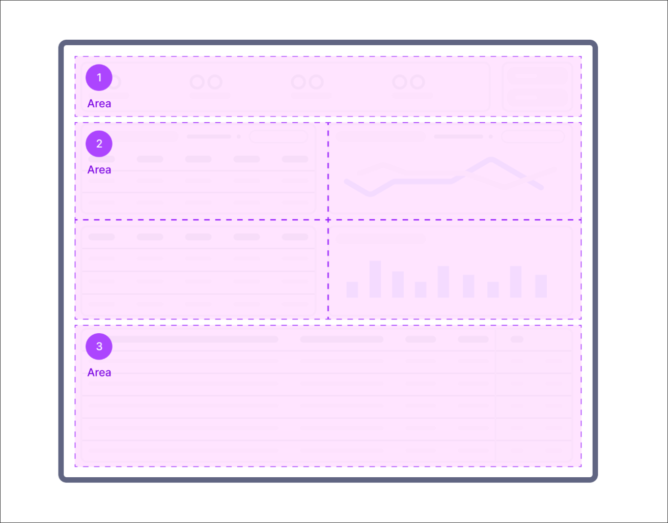 |
It is also recommended that the filter bar be enabled and customized to the use case.
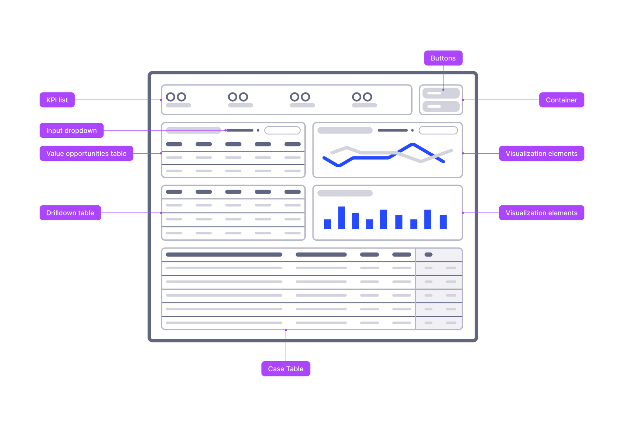
This view can then be created using a combination of Studio components:
 |
Tip
Configure the view layout to “custom height” and change the view height to the minimum needed to fit all components.
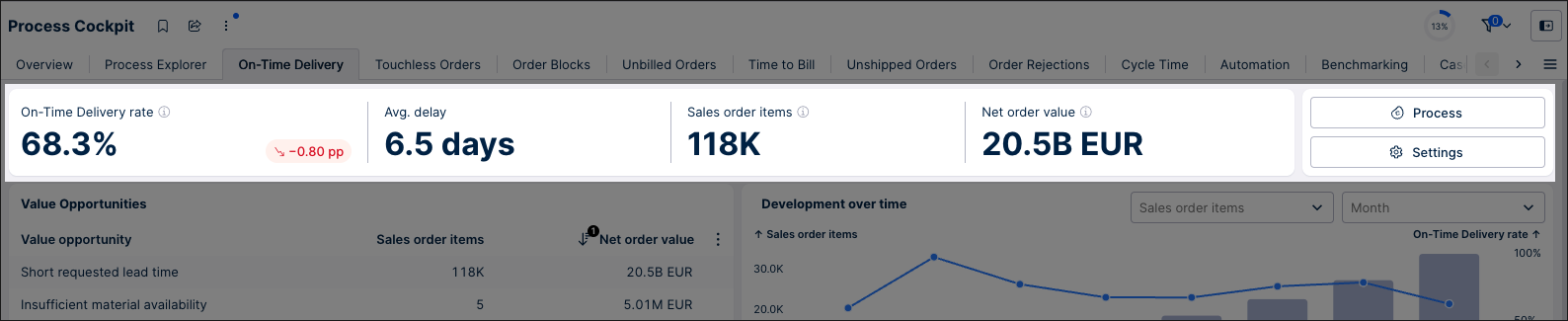
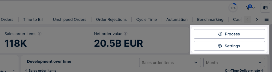
In the top part of the view, the user can check the current status of the use case. They do that by checking the current value of the main KPIs and the scope KPIs. They can also access other views or make changes to settings by clicking on the button components to the right of the KPIs.
KPI list to check the current state of the use case
This KPI list is created using both main and scope KPIs:
Main KPIs displayed here should be the ones that best define your use case.
Examples of main KPIs include:
Percentage of cases that conform
Percentage of cases that are non-conformant
Total value
Averages
Scope KPIs define the data scope the user is currently looking at. They usually include a case count and a total value. It is essential to give transparency into scope KPIs and not only business-relevant main KPIs so that the business user can understand the impacted scope and, thus, the relevance of the insight. User filters influence scope KPIs and should change accordingly.
 |
Tip
Tip 1: We recommend that the total number of KPIs doesn't exceed 5 KPIs in the KPI list.
Tip 2: If you have target KPIs for each, we'd recommend including these here.. Also, add the time dimension to show the trend of whether the KPI is on the right track.
Button components to open overlay views, change settings, and perform
To the right side of the KPI list, you can have a set of buttons for other controls or extra information through a side panel. The most common buttons serve to access a process explorer side view and a settings panel. We recommend always having a process explorer accessible so you never lose sight of how the process flows.
Other uses for buttons are to perform actions like running Action Flows or opening URLs. We recommend using the secondary styling by default on buttons unless every user must take action when visiting this view. In that case, use the primary styling. Buttons should be grouped in a single container separate from the KPI list.
The main content section is where the app user finds value opportunities by applying filters with the various aggregation levels and visualizations.
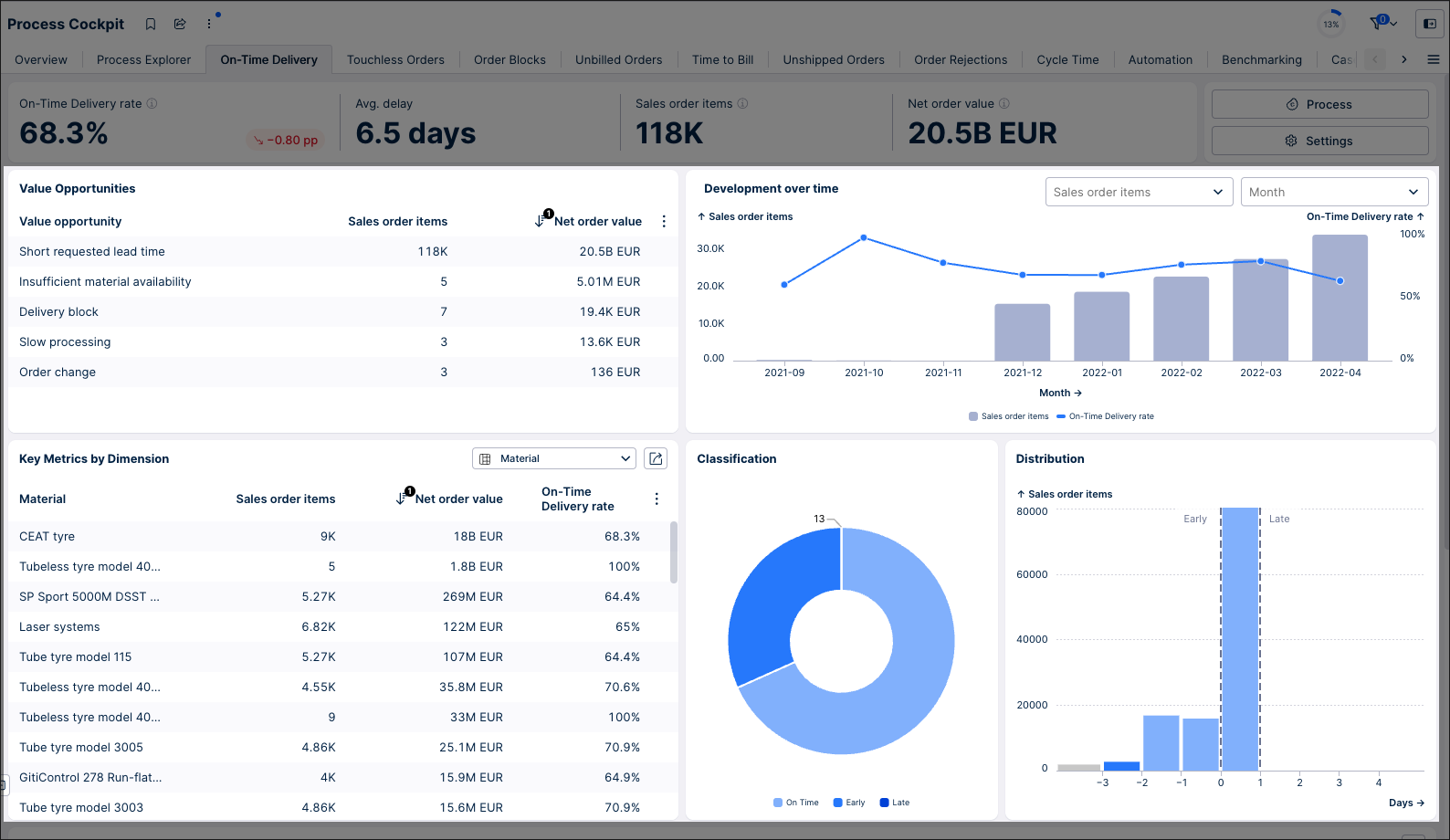 |
The most common components in this section are:
Value opportunities table
The value opportunities table is usually located in the top right corner of the section as it is the most critical component. This table shows the user the most common root causes of poor KPIs performance, ordered by the impact. These root causes come from previous experience in the field, such as talking to business users and discovering their problems. The impact can be defined as a percentage or as a sum of value.
Tip
A value opportunity defines a specific aspect you can improve in your process.
Examples include: reducing unbilled orders, avoiding contract leakage, and resolving payment blocks.
To learn more about identifying value opportunities, see: Celonis Academy - Utilize Celonis to Identify Value.
Development over time chart
The development over time chart is used to discover anomalies in the data over time in order to focus on them and discover the root cause. The most common configuration is a column-line chart where the columns represent the context information, and the line is the primary KPI. Color plays a big role here, and we recommend the columns to be colored in a context color which is normally a grey, while the line is colored in the primary color of your color theme.
To adapt the chart to the app users needs, you can use either a dimension or time switcher:
Dimension switcher: This is commonly configured to allow the app user to change the context columns between the scope KPIs (eg. Sales Order Items and Net Order Value). There might be times when there is only one scope KPI, so you won't need a dimension switcher.
Time switcher: This allows the app user to change the unit of time that the chart displays. The most common are days, months, quarters, and years.
For more information, see: Input dropdowns with loaded inputs.
Key dimensions table
This table allows experienced app users to find value opportunities and dig deeper into the use case. When deciding what dimensions to include in the table, we recommend basing this on how app users traditionally filter the use case. This should include dimensions that affect the performance of a KPI, too.
When configuring a key dimension table, we recommend keeping the number of columns to a minimum. In our example, we've limited this is dimension, one scope KPI, and the main KPI.
Tip
Always sort the table by either the main KPI or the scope KPI. Looking at the table sorted by each one will give you a different way to look at the table, so encourage the user to change the sorting to discover more and better insights.
Classification chart
Use classification when categorizing data into distinct groups or segments, such as customer types or product categories. This is useful for identifying patterns and making targeted decisions based on specific characteristics. One common way of displaying classifications is with a pie chart.
Typical categories of data are the status of cases (Open / In Progress / Closed), classification of the issue (Case with block / without block), and relevant dimension (Region, Organization).
When you design classification charts, consider that charts allow for filtering cases, so select the classification that would allow a rapid selection available for users. More comprehensive filters are shown in the filter bar.
Distribution chart
Display metrics as a distribution when you want to understand the spread or variability of data across a range, such as delay or value. This helps identify trends, outliers, and the overall shape of the data, providing insights into the underlying patterns and behaviors.
We recommend displaying distribution with a histogram chart.
Tip
An important thing to keep in mind is to color the columns when there are distinct categories (eg. early, on-time, late).
The last section is dedicated to showing the individual cases that result from the analysis and filtering from before. This lets the builder users validate the grounding of your analysis and lets users trust the aggregated data they see above. This table also lets analysts check the individual cases that result from applying filters in the components above.
The recommendation way to show is using a table on a case-level. This table can be set up to show:
ID columns: Use data points that uniquely identify the case you are analyzing.
Context data columns: These can be useful to let the user identify the case if the ID is insufficient.
Calculation parameters: The parameters used to calculate the main KPI or use case/every data point the user would need to calculate the KPI. For example, in on-time delivery, the columns we would need are the due date and the actual delivery date.
Classification: This shows the final classification of the use case. Color coding this column is a good idea to let the user quickly identify the relevant cases.
When configuring this table, we recommend the following settings:
Full width
Allow export
Fit-to-content
Fix the first (ID) and the last (Classification) columns
Tip
Keep colors consistent in the view. If you are coloring a pie chart and then showing the classification in the table, use the same colors.
Filter bar
The filter bar should include a mix of quick filters on the top, data range filters and filter dropdowns for each relevant dimension in this use case.
For more information about configuring a filter bar, see: Configuring a filter bar for your View
When creating your use case deep dive Views, we recommend the following:
Select visualization components that align with your specific use cases.
Allocate more space to the components that require it rather than making all components a uniform size. For example, it's acceptable to allocate more space to column charts than to pie charts. Screen space should be distributed according to the importance of the job. Different charts can have different sizes in case they are contributing to business user insights in different ways. Some visualizations also require a higher level of detail and thus require more space.
 |
We'd also discourage:
Grouping buttons together with KPIs.
Using primary buttons where the action of the button is not the primary action for that View.
Overcrowding the KPI list (we recommend a maximum of 5 KPIs per list)