Studio App Building Guidelines - Benchmarking
This topic provides an overview of benchmarking and gives you best practice advice for creating your own benchmarking Views. Creating benchmarking Views allows you to compare business processes and performance metrics between dimensions, over time, or when considering specific activities.
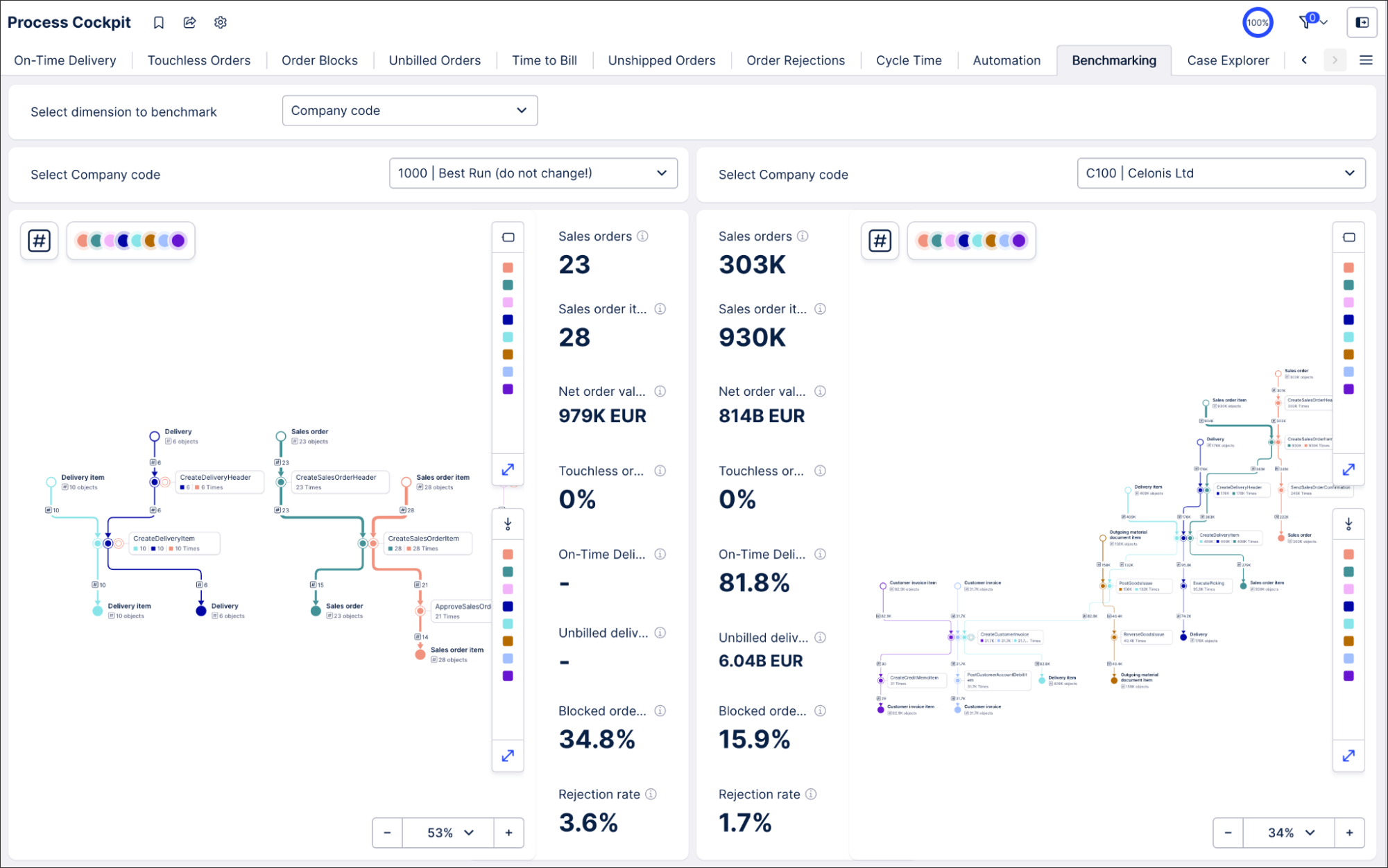
An example Benchmarking View can be found as part of the Starter Kits in the Marketplace. For a more in depth look at this example, see: Benchmarking
 |
The most common uses for benchmarking include:
Dimensional benchmarking
This is when you compare your company’s departments, operating regions or countries, or customers. Dimensional benchmarking provides helpful insights to analyze and improve KPI performance, allowing you to develop a plan to scale or adapt best practices.
The dimensions you offer on the View depend on your specific process and use case. Commonly used dimensions include geographic benchmarking (by continent, market, region, country, etc.) and analysis by different business partners (customer, supplier, partner, etc.). You can also include process specific dimensions, e.g. in Order Management you could compare different materials, plants and distribution channels.
The questions you can answer with dimensional benchmarking include:
Can this division learn from a similar one in the same organization?
What are the process best practices that you could use for a specific organization?
In which areas is this division performing particularly poorly or especially well?
Is this the best flow for this particular process?
Time split benchmarking
Another form of comparison is looking at the same process and performance metrics but in different time intervals. A very common scenario is comparing before and after a process change or improvement initiative.
The questions you can answer with time split benchmarking include:
Did these metrics change after a certain date?
How does this process compare before and after a change?
Activity comparison benchmarking
Another form of comparison is looking at the same process and performance metrics but with specific activities included or excluded.
Activity comparison is a great way to check for undesired activities and define their impact on key metrics. For example, in Order Management we could compare the process with and without the activity “remove delivery block”. Looking at the process explorer and core KPIs (e.g. cycle times, automation rate, etc ) you can see the impact of that activity on the overall process and its performance.
Tip
We recommend using separate View tabs for dimensional benchmarking, time split and activity comparison (instead of combining them in the same View). The type of benchmarking should be readable in the tab name. You could bundle all benchmarking types in a dedicated benchmarking View.
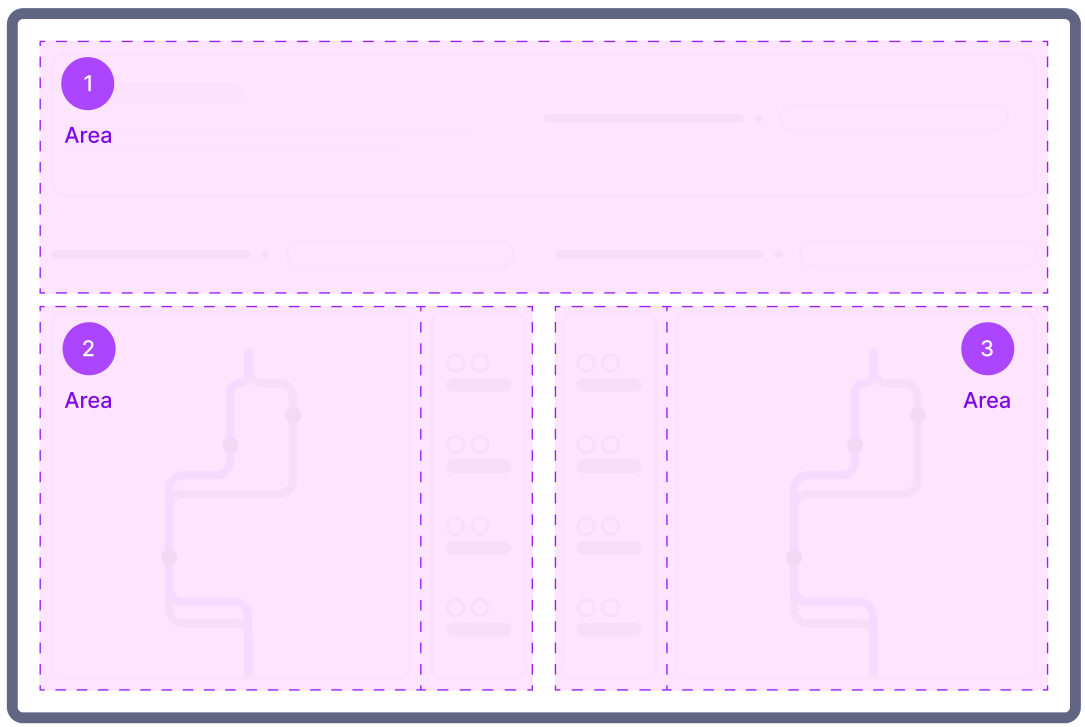
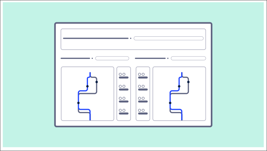
A benchmarking View consists of three different parts: A selection area on top of the View (1 in the diagram below) and two symmetrical benchmarking areas on the left (2) and right side (3) for the two entities being compared.
 |
This view can then be created using a combination of Studio components:
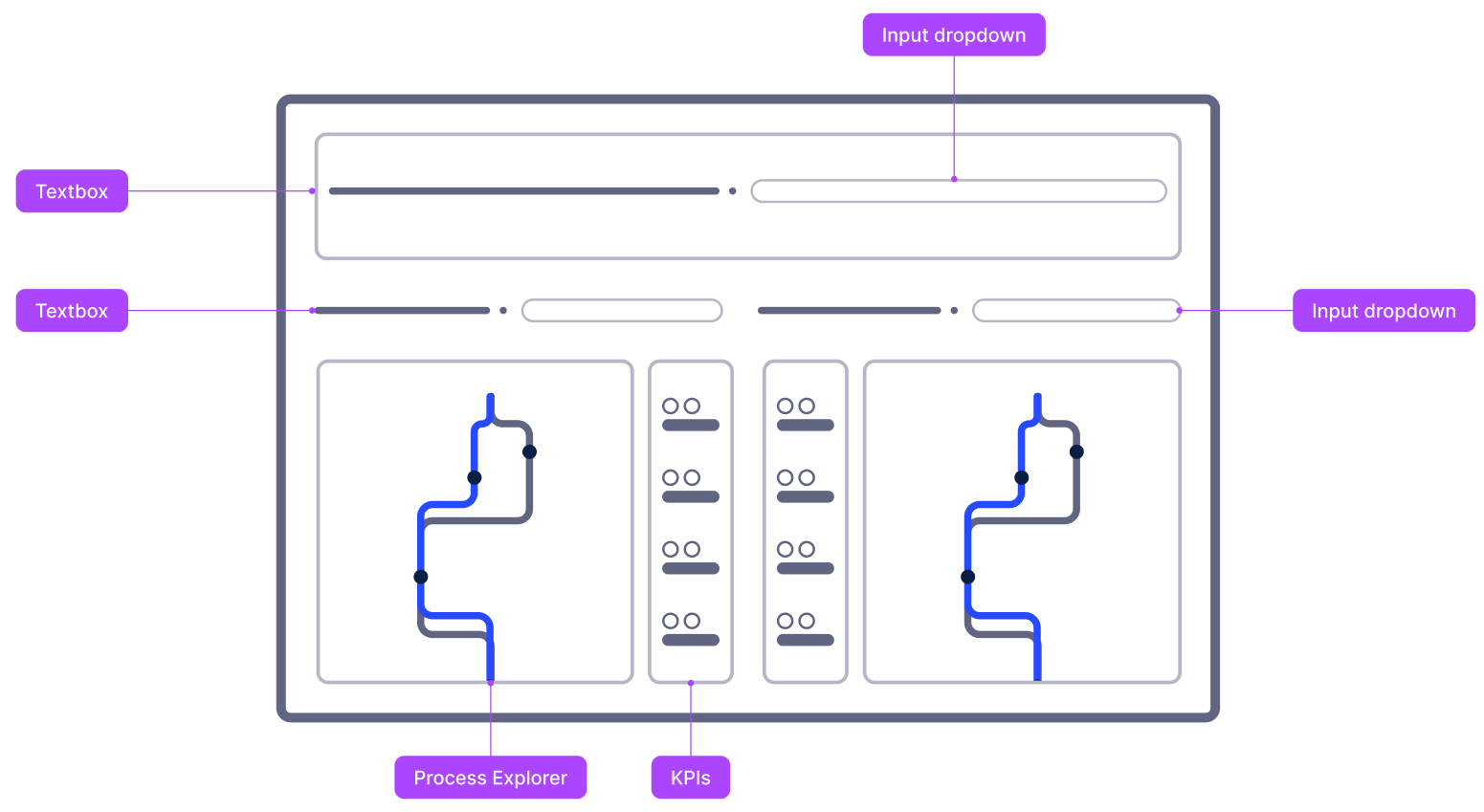 |
Selection area (1)
In the top part of the View, the user can select the dimensions they want to base their benchmarking on. Since it is the most common scenario, we focus here on the content breakdown on the dimensional benchmarking.
Use an input dropdown to let the user choose which dimension they want to use for the benchmarking.
To choose the right dimensions, ask yourself: “In which aspects of my data do I expect the most deviations?” Another way to think about this: the dimensions offered here are the same you would usually add to a table breakdown selector or as filtering options in your filter bar.
To learn more about inout dropdowns, see: Input dropdowns with manual input.
Tip
Ensure the dimension titles are readable and understandable by end users (pretty table names), e.g. use Company Code instead of BUKRS (technical field names from your source system)
After the user chooses the dimension to compare by, the View offers them input dropdowns to select which specific entities they want to compare.
To learn more about configuring input dropdowns with loaded inputs, see: Input dropdowns with loaded inputs.
When creating a time split benchmarking, the input box or date picker component can be used to gather end user input to define the target date for the before/after comparison.
Tip
When offering a free text input, guide the user on the expected date format.
 |
First entity for comparison (2)
We split the width of the View in two to compare the selected entities. Give the section a dynamic title that updates based on the selected entity. This way your user can see at first glance what data scope they look at. As long as the same components are used on both sides you are flexible in the choice of visualizations. We recommend as a best practice to show a process visualization such as the process explorer as well as some top level KPIs.
Tip
Use a container to add a shared background for the section so it is easy for the eye to distinguish between them.
Process Explorer offers your end user a great way for explorative benchmarking. With its ability to switch between KPIs being presented in the graph as well as its filtering capabilities, users can do detailed benchmarking.
When you identify differences between entities, the process explorer is a great starting point for discussions with business stakeholders. It is a common practice to discuss with process experts “Why do you do it like that?” to get qualitative insights. The process explorer is a great tool to start these conversations since it allows the parties to look together at the true process flow.
For more information about configuring the Process Explorer, see: Configure Process Explorer in views.
Tip
Select the slider instead of the panel to enable the user to control the graph. This saves horizontal space and allows the visualization itself to be displayed bigger.
The KPI section helps you spot differences between entities at first glance. It makes the analysis more guided so even users with a lower data literacy can get insights from the comparison.
Ensure to use the exact same KPIs for both entities (left and right side of the comparison) and limit the number of KPIs displayed to the core metrics to not overwhelm the user. To further guide the analysis, group the KPIs by scope KPIs (example: how many sales orders are processed by this company code?) and actual use case KPIs (example: what is our automation rate for this company code?).
The KPIs you choose here should be consistent throughout the application.
Tip
Show definitions of the KPIs via the info icon so that users know the exact definitions of the information that is provided to them. This can be achieved by adding a description to the metric’s definition.
Second entity for comparison (3)
This section should be symmetrical to the second section. Ensure to use the same components and configure them identically, only the filters applied to dynamically defining the entity scope should differ.
Tip
Start by building section two and tbhen duplicate it. You can then just change the variables leading to the filtering by entity.
When creating your benchmarking Views, we recommend the following:
Define the layout of the View in the way you'd like your app users to view it:
Start by selecting the scope of the benchmarking analysis.
Then, conduct the benchmarking by comparing both sides.
The two benchmarking areas should differ in data scope but be identical otherwise, such as same size of the section, same styling of components, same metrics displayed.
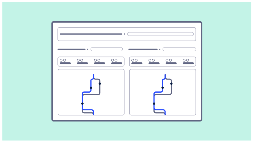
KPIs can be arranged vertically or horizontally.
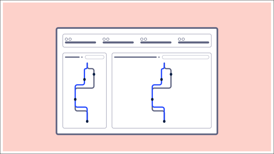
Putting them in close proximity to each other and arranged vertically is our recommendation (see below). It's then easier for the eye to compare the values:
Whereas horizontally adds an additional mental load on the app user:
Using a scale-to-fit layout so all information is visible at a glance without scrolling.
We'd also discourage the following:
Asymmetrical benchmarking sections (where one entity is bigger than the other), for example: