Studio App Building Guidelines - Take an action on a case level
Action Views allow you to operationalize insights to perform actions. Action Views have a lean and simple design, clearly outlining what are the main findings and the cases that need the most attention.
The main users of Action Views are the personas working in the day-to-day operations, such as Buyers, Accounts Payable Specialists, Planners. Other secondary users are Business Managers, using the view to monitor how their team is working and impacting relevant metrics. As the users are not analysts, but have huge business knowledge, we suggest to avoid technical definitions, and to always include their feedback to have a view they can really leverage in day-to-day tasks. Another important differentiating factor with respect to transactional systems is the prioritization, so include information and insights that can really guide them in their tasks.
By adopting this view, organizations move from using Celonis as a purely analytical tool, to adopting Celonis as a core support in their operations. this includes identifying value opportunites for process improvements. Examples include: reducing unbilled orders, avoiding contract leakage, and resolving payment blocks. To learn more about how to identify value opportunities, please refer to the Academy Course - Utilize Celonis to Identify Value Opportunitie.
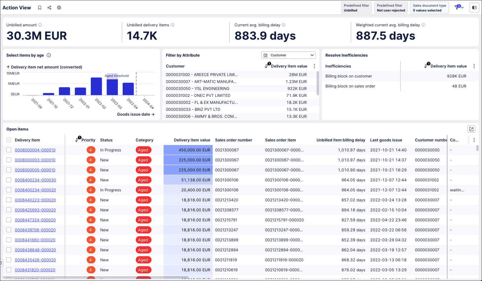
Examples of how to take action on a case level can be found in Apps developed by the Celonis team available in the Marketplace, such as: Open order Processing, Duplicate Checker, Open PO Management. This screenshot is from the Shipped Not Invoiced (object-centric) App.
 |
Depending on the volume of opportunities you want to display, you can choose between single or multiple use case Action Views. While it's possible to create complex Action Views, combining analytical capabilities with actionable insights, these require high levels of customization and are not covered in these guidelines.
Single use case Action Views
Single use case Action Views focus on a specific value opportunity and a set of actions that a user has to perform. This is then an operational View, where the insights should show both the scope and the main performance indicators. This type of Action View allows for fast and targeted decision making.
Usually, the main user looking extensively at insights is the Business Manager, whereas the Operations users will spend more time identifying the cases that need their attention, and deciding which corrective action to take.
The Actions performed by users include:
Defining the scope of the issue.
Sharing the cases in need of a corrective action (through different means: email, data export, view export).
Directly performing a corrective action (through write back, offline actions).
Assigning another employee to cases that need to be investigated.
Updating the status of the object/case they’re assigned to.
Multiple use case Action Views
With multiple use case Action Views, users may identify different value opportunities when viewing a specific object. For this operational view, the insights must clearly show the scope of the cases, and the main performance indicators, while including all the value opportunities and the amount of cases associated with them.
Users of this view are both the Business Manager and the Operations specialist. The former will derive insights from the charts, and understand the performance of their team. The latter will need to act on the cases that are most critical and decide which corrective action to take.
The Actions performed by users include:
Defining the scope that requires action.
Identifying the most common value opportunities.
Sharing the cases in need of a corrective action (through different means: email, data export, view export).
Directly performing a corrective action (through write backs, offline actions).
Assigning another employee to the cases that need to be investigated.
Updating the status of the object/case they’re assigned to.
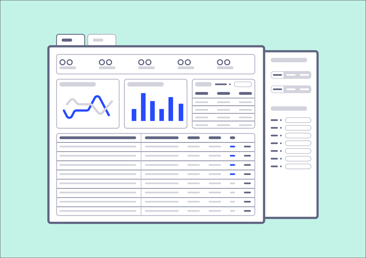
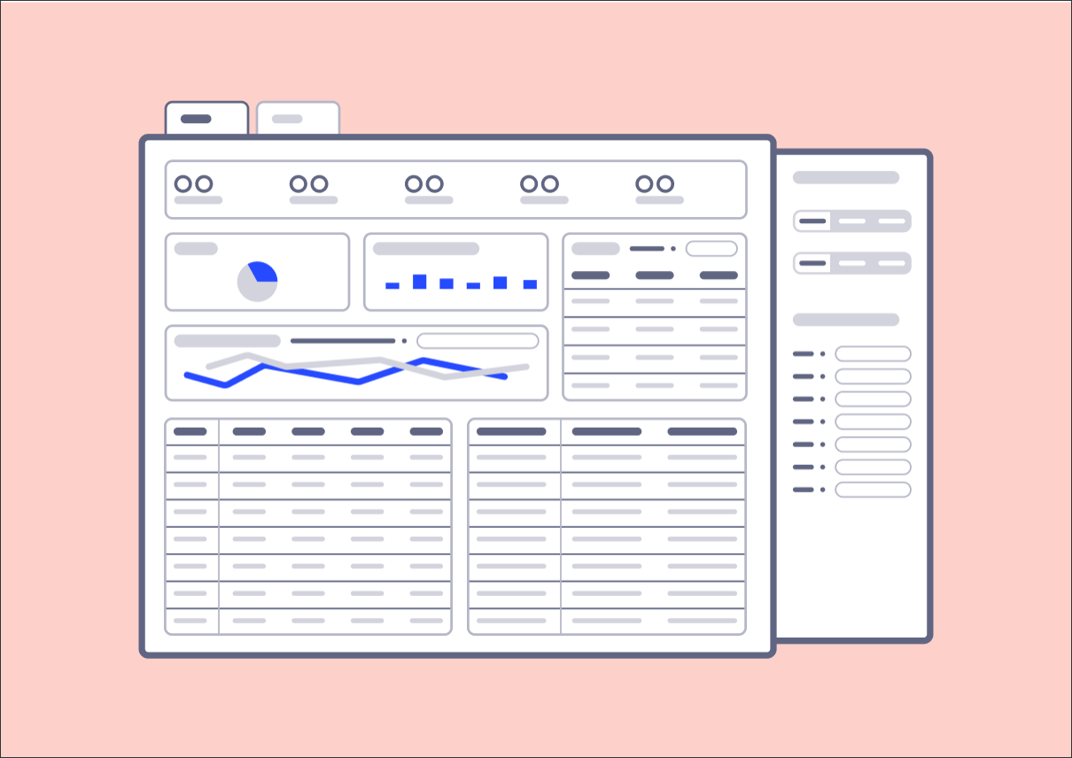
An Action View is composed of four main sections:
One Action View should show one type of case (object) only. If a different object is also required in the same Action View, create a specific tab per object, specifying the object as Tab name.
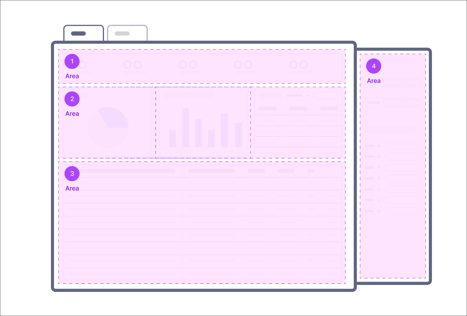 |
In the top part of the View, the user can access the main metrics. These metrics help them to understand the scope they need to to focus on and then to quantify the issue they need to work on.
When creating your KPI area:
KPI List for scope: Use a KPI list to define the scope, i.e. the number of cases that require the attention of the user. To choose which KPIs to include for the scope, think about what are the main dimensions the users need to track their work. Typically these are the cases, so the count of unique IDs identifying an invoice / order / material.., or the value associated with the cases, or an aggregation of relevant attributes linked to the cases (company codes/material groups/purchasing orgs).
KPI List for Value Opportunities: Value Opportunities KPIs need to be very clear and guide the user in quickly identifying the size of the Value Opportunity (issue). To do so, think about what is the main metric that immediately tells users whether they’re performing well or not.
You should also think about the defined metrics that organizations normally use to quantify performance. Usually, Value Opportunities KPIs are either a rate (% of cases/value with the issue), or the sum of total value linked to the issue.
Tip
Ensure the KPI Names titles are concise, readable and understandable by end users (pretty metric names). If an additional description of a metric is required, update the description for it to appear as a tooltip.
Below the KPI List, the users can access the main insights to better understand the patterns and value opportunities interesting their data. This area enables you to quickly filter the cases based on the insights and relevant dimensions. The analytics area shows insights by category, over time, or distribution.
The different components in the analytics area are ordered from left to right based on their relevance, so the chart with the most importance should always be on the left side. Usually in this area, we'd recommend a maximum of four components.
Tip
In the analytics area you will have to use multiple charts / tables, so use a container to add a shared background, so it is easy for the eye to distinguish between them.
Insights can be shown through the chart and table components. We focus on the most used components here:
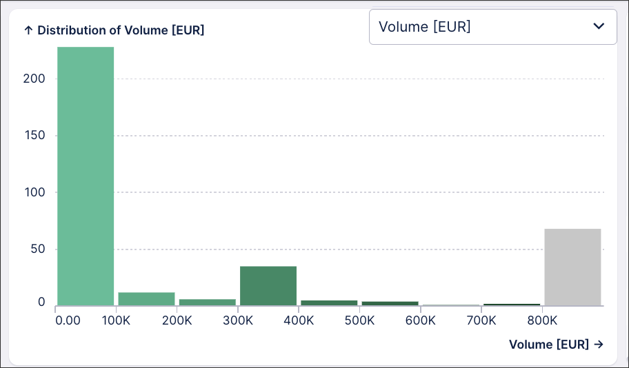
Distribution charts: Histogram
Histograms help users understand the distribution of frequency of data within a continuous range, such as the cycle times, number of days past a SLA / due date, count of defective cases. The data shown in the distribution is usually one key dimension critical for measuring operational users performance (e.g. time to process a case).
Histograms let users filter outlier cases, as they are the ones impacting the performance metrics the most, or as opposite behavior, include only the ones that are in specific targets.
When configuring an Histogram, think “what's the main dimension that lets the user take a quick prioritization decision? What is the dimension that becomes an issue if it exceeds a specific value?”
Tip
To help categorize data, if you have already defined specific thresholds you want to consider in your distribution (e.g. days late, early, SLA, specific value) you can input it using annotation lines.
 |
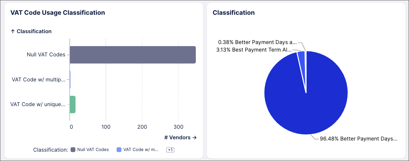
Category Charts: Pie, Grouped Bar, Bar and points
Category charts allow for easy comparisons, identifying patterns and exploring relationships with the data.
Status of cases (Example: Open / In Progress / Closed)
Classification of the issue (Example: Case with block / without block)
Relevant dimension (Example: Region / Organization)
When you design category charts, take into account that charts allow for filtering cases, so select the classification that would allow a rapid selection available for users.
When configuring a category chart, think “which categorization helps users in their day-to-day tasks? Which case definition do they need to take into account?”.
Tip
To allow faster access to insight, define color categories based on the Categorization definition in the Coloring section.
 |
Table
Tables allow for accessing dynamic insights within the data, as they change based on the dimension the table is set on. The table shown in the Analytics Area should only contain as rows the breakdown dimensions and not cases.
This table should show a limited number of columns, that should include the relevant metric and the related scope metrics.
As an example, this table shows the number of late cases, total number of cases and total value of cases:
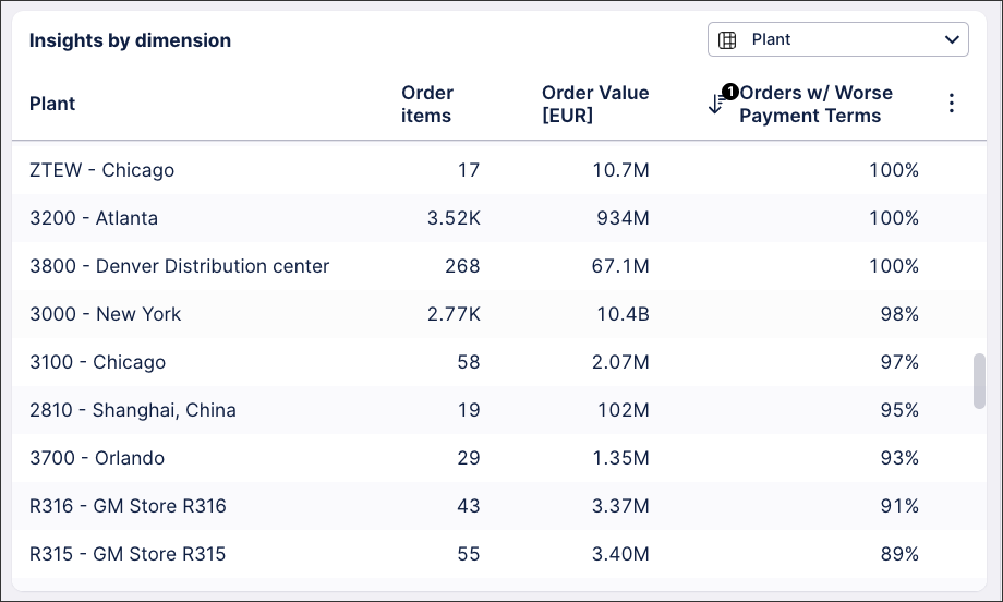 |
The breakdown dimensions in the table allow easy performance comparison between different organizations, plants, locations.
When configuring a table, think “what dimensions do the users compare performance between? Do they need to compare specific stakeholders? Are users working across different organizations/systems?”
Tip
When configuring your table, make sure you set a default sorting option.
Below the Analytics Area, users access the main table. This is where the users analyze the cases they identified by applying filters in the analytics area, and then they take a subsequent action on.
The main component is a table, showing the cases grouped by unique ids and properly prioritized. Providing prioritization is essential, as it guides the actions of the users. The table must allow users to open a specific case view, perform a bulk action over selected cases and export the table with the selected cases. This action is called a linked view. For more information about linked views, see: Linked Views
The main table should include the following mandatory columns:
Unique case identifier
The first column always defines the unique case in a clear format. The unique identifier comes usually from the system definition, such as: Invoice Number, Order Number, Case Number, Vendor Number, Customer Number. You can also concatenate more information, to have a more readable format, such as: Customer Number & Name, Vendor Number & Name.
The Unique case identifier column always contains an interaction, to open a Linked View in overlay, where the user can analyze the case-specific information and get additional insights. To learn more about the Detailed Case View, see: App Building - Detailed case overview.
The unique case identifier column should allow the user to copy its values, so to allow a fast validation of the case and its information with respect to what is present in the customer’s system.
Tip
Pin this column to the left to ensure it always stays as first column
Status
The second column should be the Status. The Status column is dynamic, meaning the user can edit it by clicking on it. This allows users to see which cases have already been touched and to change that information if that is required.
In order to create a dynamic column, you need to define an Augmented Attribute and to enable Inline Editing in the specific column. To learn more about Augmented Attributes, see Augmented attributes.
Prioritization
The third column should include a clear prioritization of the cases. You should define a customized logic, based on the specific use case definitions, to categorize cases in prioritization buckets. Prioritization classification should always be associated with a clear color mapping.
To learn more about Column colors, see Column colors.
Tip
Prioritization classification should always be associated with a color mapping to highlight the urgent/important cases. In the color mapping, use darker colors for Higher priority, while lighter colors for lower.
Relevant dimensions
After the unique id, the status and the prioritization, the table should include all most relevant dimensions, such as date, fields, classification definitions. It is always advisable to include a comprehensive set of relevant dimensions, and to allow users to hide them in case they’re not needed.
Tip
If a dimension includes a classification, make sure to include a color mapping.
Value
The last column of the table should include the value associated with the case. The value should always be converted, as you may need to compare cases over different currencies. Sorting should be set in a descending order, to allow users to see high priority, high value cases first.
Tip
Set the Format in the Value definition to abbreviated.
On the right-hand side of the View, you need to set the collapsable filter bar. In the Action View Case, the Filter Bar is extremely important, as it allows users to filter only the information relevant to their team and their tasks.
To learn more about Filter Bars, see: Configuring a filter bar for your View.
The filter bar should guide users in the filtering process, by highlighting the main dimensions where they can filter on: Date, Organization, Case Information.
Date
Date filters allow users to focus on what has happened in the specific previous period.
To set Date Filters, you can use either the Date Range component, or Quick filters. With the Date Range component, users can select exactly the time frame they need to analyze. With Quick filters, you can provide some standard predefined options, for example: last 12 months, last quarter.
Organization
Organization-related filters define the areas users may be more interested in filtering. For instance, some users are interested only in seeing cases from a specific entity, as they’re not responsible for other units.
Case information
Case Information filters select specific cases based on case information, such as document type, status indicators. The goal is to only get the cases where it’s relevant to perform an action.
When creating your Actions Views, we recommend the following:
Keep the view simple, don't add insights / components that aren't required.
Limit the number of components in the Analytics area to a maximum of four.
Provide a comprehensive set of filters in the filter bar.
Put Scope KPIs and Insights in the KPI area.
Reuse color coding across areas. I.e. the color coding of a chart should be reused in a table status.
Highlight important dimensions with coloring in the main Action table.
 |
We'd also discourage:
Including multiple objects as part of the case table in one view. If you need to provide action on another object, add another tab.
Including more than one line of charts in the Analytics area.
Including more than one line of KPIs in the KPI area.
Including technical names in definitions
Providing Value Framing Metrics / Calculations if unsure about the logic. E.g. If users do not understand the logic, they might lose trust in it.
 |